Community Blog Articles

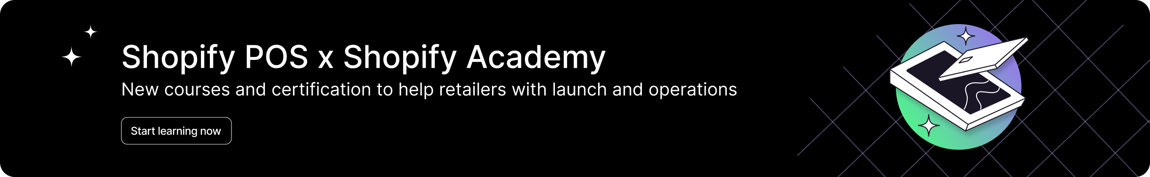
A guide to Shopify POS Launch and Operations success
Are you ready to take your business to the next level? Look no further than the latest ...
By SarahF_Shopify Apr 15, 2024
Community Connect: Recap March 24’
We’re keeping the ball rolling to make sure you’re always ahead of the game. So buckle ...
By JasonH Apr 8, 2024
Shopify Store Design: Expert Advice from Stephen’s World
Portrait of Stephen positioned next to an image of planet Earth, with the Stephen's World ...
By JasonH Mar 18, 2024