I have added two images to my footer section. I want to add separate links to these two images and place the images in the center. I am using Dawn theme. Here are two links:
Store URL: https://urbanglowingstore.myshopify.com/
Password: Admin
I have added two images to my footer section. I want to add separate links to these two images and place the images in the center. I am using Dawn theme. Here are two links:
Store URL: https://urbanglowingstore.myshopify.com/
Password: Admin
Hello @dreamtechzone_5 ,
You can try to follow these steps:
Go to Online Store → Themes → Actions → Edit code
Go to Sections → footer.liquid file
Add anchor () tags around the images and set the href attribute to the desired URLs. It can look like this:
  [](https://urbanglowingstore.myshopify.com/)
  [](https://blue-chic-clothes.myshopify.com/)
Go to Assets folder → base.css file or theme.scss.liquid file
Add this following code at the bottom of page
.footer-images {
  display: flex;
  justify-content: center;
  align-items: center;
}

.footer-images a {
  margin: 0 20px;
}
Save and preview
Hope this can help.
Transcy
Where should I paste this code in the footer of the liquid folder?
I have pasted the code here.
As a result the footer section looks like this.
Hi @dreamtechzone_5 ,
This is David at SalesHunterThemes.
If you want to add links to images, you will need to use custom code.
You can try to follow these steps:
Go to Online Store → Themes → Actions → Edit code.
Go Section folder → footer.liquid file.
You can search with Cmd + f: “ footer-block-image”.
You will see a code like the image below:
Replace it with this code:
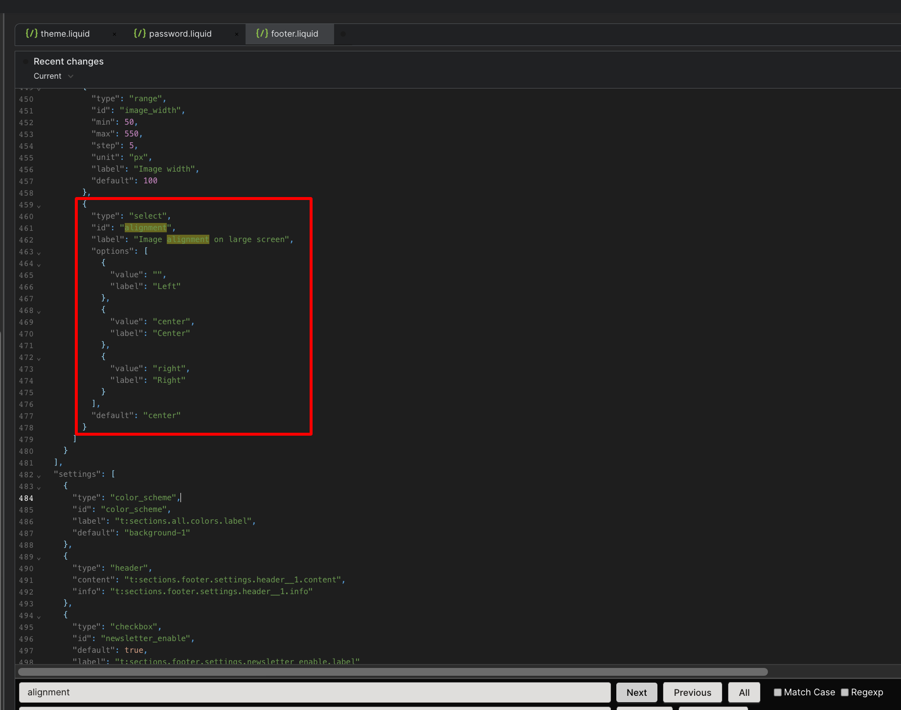
The next step, you can search with Cmd + f: “alignment”.
You will see a code like the image below:
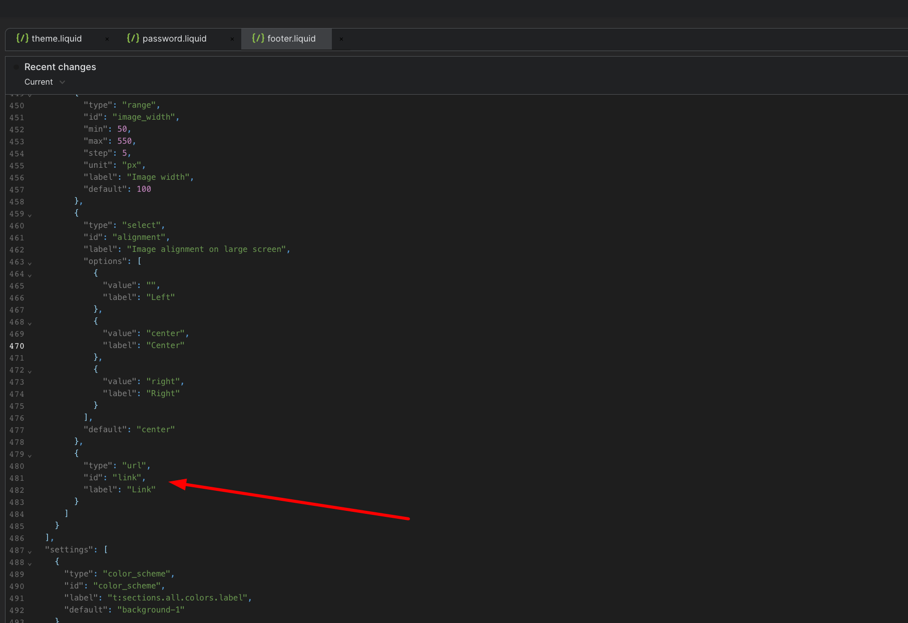
Add this code:
{
    "type": "url",
    "id": "link",
    "label": "Link"
}
Here is result after adding the code:
Save and In the theme editor.
Footer → block image → select link.
Here is the final result:
Hope this can help.
David | SalesHunterThemes team
Thank you so much, Sir! It worked.
Can the two logos be placed on the same line in the mobile version and the two logos centered in the desktop version?
Besides, when I click on the logo, I want to open a new tab.
Hi @nafijhossain10 ,
About the two logos centered in the desktop version,
Go to Online Store → Themes → Actions → Edit code.
Go Assets folder → base.css file.
Add this following code at the bottom of page.
@media screen and (min-width: 750px)
 .footer .footer__blocks-wrapper {
  align-items: center;
 }
}
About you want click on the logo and it opens a new tab.
You can add this code in footer.liquid like the image below:
target="_blank"
Here is result after adding the code:
Save and preview.
About logos be placed on the same line in the mobile version. In this case if you don’t know the code, I think you should hire an expert, they can help you add some custom code to make the section exactly as you want.
Hope this can help.
David | SalesHunterThemes team
I want the collection list text to be centered in the mobile version.
I want to reduce the size of the images as well. Thank you, Sir!
Hi @nafijhossain10 ,
About collection list text to be centered in the mobile version,
Is your problem in collections page?
Go to Online Store → Themes → Actions → Edit code.
Go Assets folder → base.css file.
Add this following code at the bottom of page.
@media screen and (max-width: 749px){
 #shopify-section-template--20589353697592__main h1.title {
   text-align: center;
 }
}
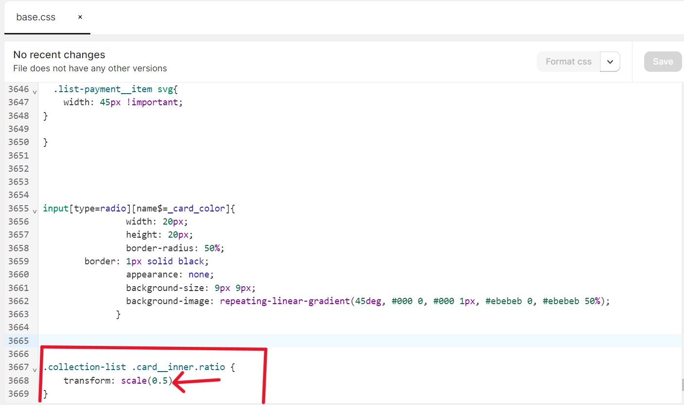
About reduce the size of the image,
In base.css file.
Add this following code at the bottom of page.
.collection-list .card__inner.ratio {
    transform: scale(0.8);
}
Save and preview.
Hope this can help.
David | SalesHunterThemes team
Hello Sir!
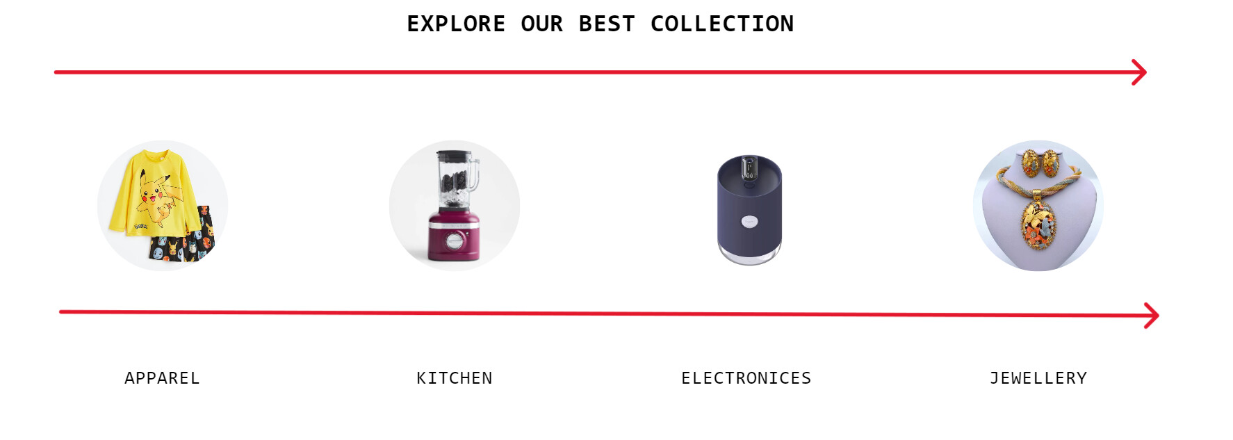
When I add 0.5 here the image is smaller but the space above the collection name is more. Also, there is more space under the heading title of the collection. Thank you.
It looks like this:
I have pasted this code:
Still not fixed:
Hi @dreamtechzone_5 ,
About reduce the size of the image,
I suggest you other solution:
You can try to follow these steps:
Go to Online Store → Themes → Actions → Edit code.
Go Assets folder → base.css file.
Add this following code at the bottom of page.
.collection-list .card__inner.ratio {
    max-width: 150px;
    margin-inline: auto;
}
About collection list text to be centered in the mobile version,
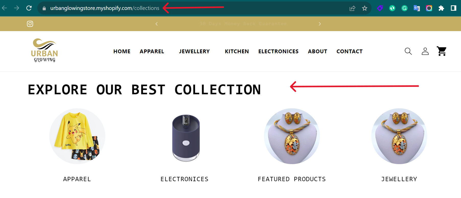
The code which i provided before just can be applied for this collection page: https://urbanglowingstore.myshopify.com/collections.
If you want to fix for the other page, please give me url of that page.
Hope this can help.
David | SalesHunterThemes team
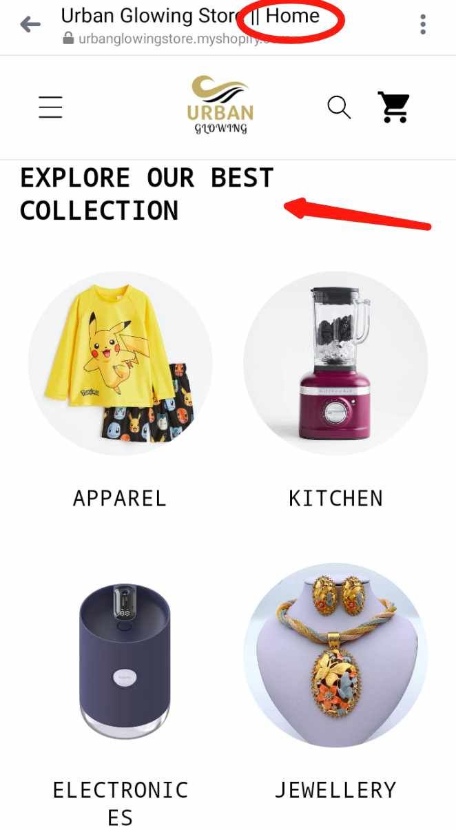
I want to center the collection list text on the home page in the mobile version.
https://urbanglowingstore.myshopify.com/
Also, I want to center the text of the collection list on the collection page in the desktop version. Thank you so much Sir!
Thank you so much , i have struggle with this for over 6 hours, Thank you so much
I fount this on youtube, I think it will help you.

you are a legend. Thanks.