Hi All,
My mega menu on desktop has overlapped and the font size if different to other menu drop downs, any help appreciated.
URL: https://label-source.co.uk/
Thank you,
Users are experiencing issues with mega menu formatting on desktop, specifically overlapping elements and inconsistent font sizes.
Initial Problem & Solution:
.thb-full-menu class to make the menu display as flexbox with wrapped columnsOngoing Issues:
Related Requests:
Status: The thread remains open with multiple users seeking similar multi-column menu customizations but no comprehensive solution provided yet.
Hi All,
My mega menu on desktop has overlapped and the font size if different to other menu drop downs, any help appreciated.
URL: https://label-source.co.uk/
Thank you,
Hi @Danielparsons ,
This is Richard from PageFly - Landing page builder, I’d like to suggest this idea:
Step 1: Go to Online Store->Theme->Edit code
Step 2: Asset->/app.css->paste below code at the bottom of the file:
@media screen and (min-width: 1068px) {
    .thb-full-menu li.menu-item-has-children {
        position: static;
    }
    .thb-full-menu .sub-menu {
        width: 100%;
        display: flex;
        flex-wrap: wrap;
    }
    .thb-full-menu .sub-menu li {
        width: 20% !important;
    }

}
I hope it would help you
Best regards,
Richard | PageFly
Hi Pagefly,
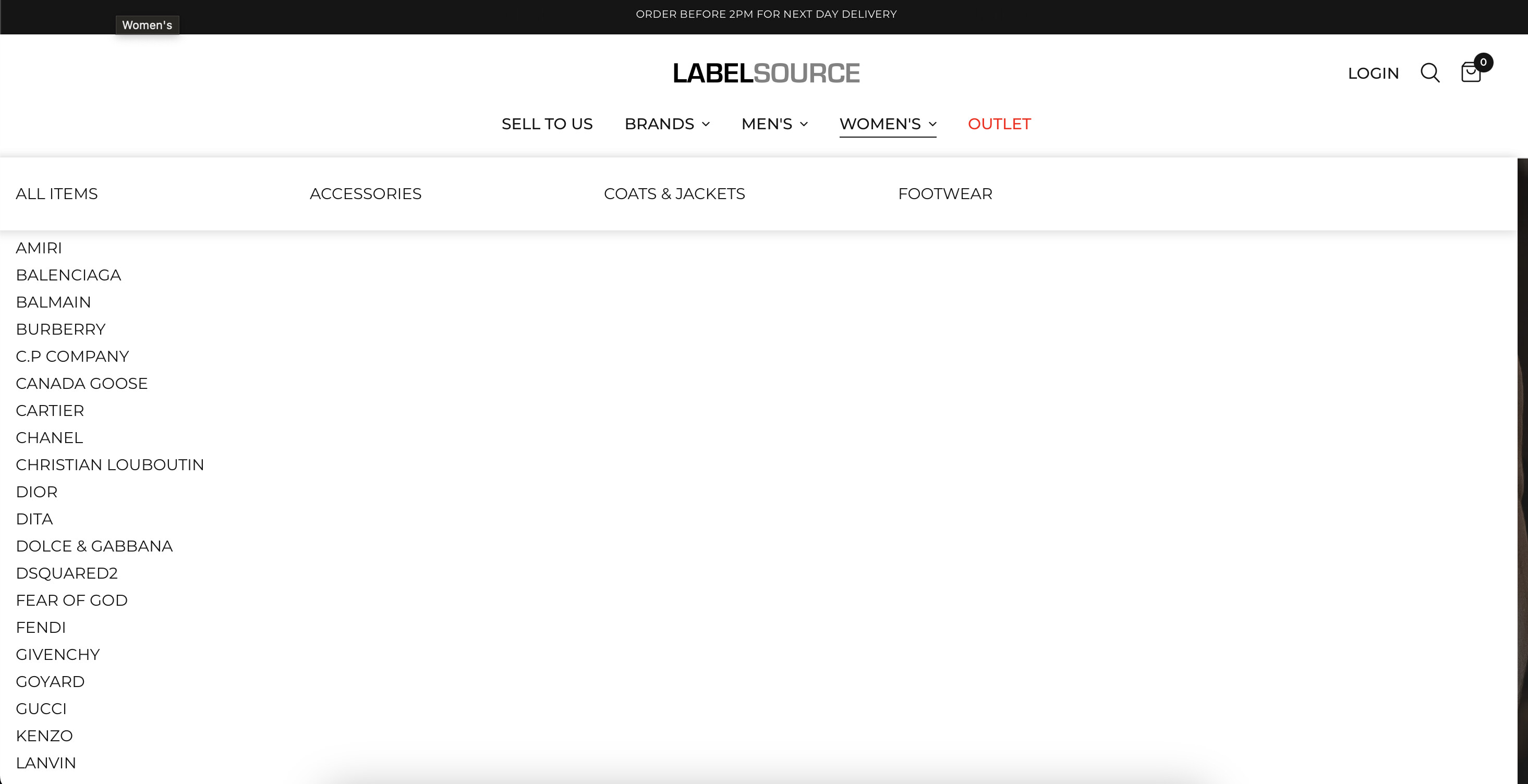
I have noticed an issue with this menu. When you click on a category the menu changes to the below. Please help, thank you.
Hi @Danielparsons ,
I did not check this error. Looks like you already have the solution, right?
Let me know if you have any questions
Best regards,
Richard | PageFly
I have the same problem and I would like to change it into multi-columns single menu. Each column should have 8 collections as long as it looks neat and tidy. Can you please help me with this ? I am using Dawn 11.0. Many thanks