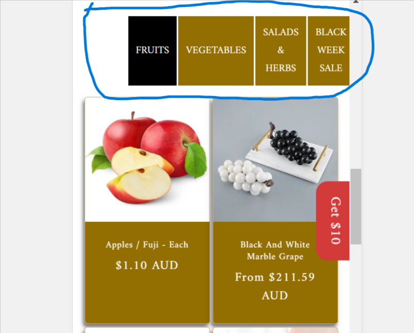
Here is the full code of the Collection tab. Also, is it possible to add a View More button below each collection?
.tabs {
display: flex;
margin-bottom: 20px;
cursor: pointer;
width: 60%;
margin: 0 auto;
}
.tabs button {
flex: 1;
padding: 10px;
background: #936E00;
color: white;
border: none;
margin-right: 2px;
transition: background 0.3s;
}
.tabs button:hover, .tabs button.active {
background: #000;
color: white;
}
.tab-content {
display: none;
}
.tab-content.active {
display: block;
}
{% for block in section.blocks %}
{% if block.settings.collection %}
{{ block.settings.collection.title }}
{% endif %}
{% endfor %}
{% for block in section.blocks %}
{% if block.settings.collection %}
{% assign collection = block.settings.collection %}
{%- for product in collection.products limit: section.settings.products_per_page -%}
{% assign lazy_load = false %}
{%- if forloop.index > 2 -%}
{%- assign lazy_load = true -%}
{%- endif -%}
-
{% render 'card-product',
card_product: product,
media_aspect_ratio: section.settings.image_ratio,
image_shape: section.settings.image_shape,
show_secondary_image: section.settings.show_secondary_image,
show_vendor: section.settings.show_vendor,
show_rating: section.settings.show_rating,
lazy_load: lazy_load,
show_quick_add: section.settings.enable_quick_add,
section_id: section.id
%}
{%- endfor -%}
{% endif %}
{% endfor %}
{% schema %}
{
“name”: “Collections Tabs Blocks”,
“settings”: [
{
“type”: “range”,
“id”: “products_per_page”,
“min”: 8,
“max”: 24,
“step”: 4,
“default”: 16,
“label”: “Products per page”
},
{
“type”: “range”,
“id”: “columns_desktop”,
“min”: 1,
“max”: 5,
“step”: 1,
“default”: 4,
“label”: “Columns on desktop”
},
{
“type”: “color_scheme”,
“id”: “color_scheme”,
“label”: “Color scheme”,
“info”: “Has cards info”,
“default”: “scheme-1”
},
{
“type”: “header”,
“content”: “Image settings”
},
{
“type”: “select”,
“id”: “image_ratio”,
“options”: [
{
“value”: “adapt”,
“label”: “Adapt”
},
{
“value”: “portrait”,
“label”: “Portrait”
},
{
“value”: “square”,
“label”: “Square”
}
],
“default”: “adapt”,
“label”: “Image ratio”
},
{
“type”: “select”,
“id”: “image_shape”,
“options”: [
{
“value”: “default”,
“label”: “Default”
},
{
“value”: “arch”,
“label”: “Arch”
},
{
“value”: “blob”,
“label”: “Blob”
},
{
“value”: “chevronleft”,
“label”: “Chevron left”
},
{
“value”: “chevronright”,
“label”: “Chevron right”
},
{
“value”: “diamond”,
“label”: “Diamond”
},
{
“value”: “parallelogram”,
“label”: “Parallelogram”
},
{
“value”: “round”,
“label”: “Round”
}
],
“default”: “default”,
“label”: “Image shape”,
“info”: “Image shape info”
},
{
“type”: “checkbox”,
“id”: “show_secondary_image”,
“default”: false,
“label”: “Show secondary image”
},
{
“type”: “checkbox”,
“id”: “show_vendor”,
“default”: false,
“label”: “Show vendor”
},
{
“type”: “checkbox”,
“id”: “show_rating”,
“default”: false,
“label”: “Show rating”,
“info”: “Show rating info”
},
{
“type”: “checkbox”,
“id”: “enable_quick_add”,
“default”: false,
“label”: “Enable quick add”
},
{
“type”: “header”,
“content”: “Filtering settings”
},
{
“type”: “checkbox”,
“id”: “enable_filtering”,
“default”: true,
“label”: “Enable filtering”,
“info”: “Enable filtering info”
},
{
“type”: “select”,
“id”: “filter_type”,
“options”: [
{
“value”: “horizontal”,
“label”: “Horizontal”
},
{
“value”: “vertical”,
“label”: “Vertical”
},
{
“value”: “drawer”,
“label”: “Drawer”
}
],
“default”: “horizontal”,
“label”: “Filter type”,
“info”: “Filter type info”
},
{
“type”: “checkbox”,
“id”: “enable_sorting”,
“default”: true,
“label”: “Enable sorting”
},
{
“type”: “header”,
“content”: “Mobile settings”
},
{
“type”: “select”,
“id”: “columns_mobile”,
“default”: “2”,
“label”: “Columns on mobile”,
“options”: [
{
“value”: “1”,
“label”: “1”
},
{
“value”: “2”,
“label”: “2”
}
]
},
{
“type”: “header”,
“content”: “Padding settings”
},
{
“type”: “range”,
“id”: “padding_top”,
“min”: 0,
“max”: 100,
“step”: 4,
“unit”: “px”,
“label”: “Padding top”,
“default”: 36
},
{
“type”: “range”,
“id”: “padding_bottom”,
“min”: 0,
“max”: 100,
“step”: 4,
“unit”: “px”,
“label”: “Padding bottom”,
“default”: 36
}
],
“blocks”: [
{
“type”: “collection”,
“name”: “Collection”,
“settings”: [
{
“type”: “collection”,
“id”: “collection”,
“label”: “Select Collection”
}
]
}
],
“presets”: [
{
“name”: “Collections Tabs Blocks”,
“category”: “Custom”
}
]
}
{% endschema %}