Hi Guys,
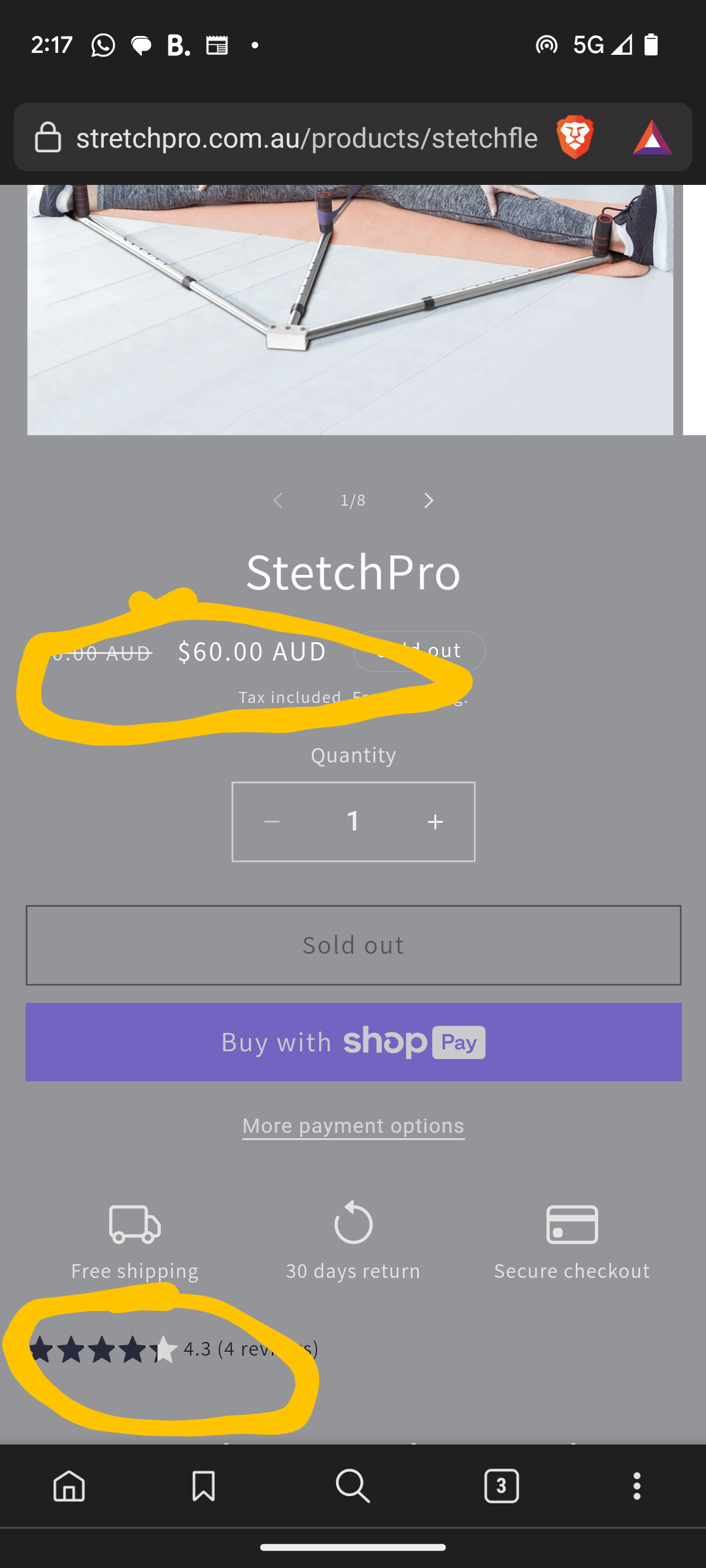
I’m trying to centre the pricing and Alireviews star on my product page. The pricing is centre on my web view, but not on my mobile view. And the stars I need to centre for both.
Also, I would like to centre the Alireviews badge on my homepage as well.
Any help would be greatly appreciated! See pictures attached.
www.stretchpro.com.au
Thanks so much.
.
1 Like
Hello @jackthomasp
You can try this code: it will be helpful to you
Go to the Online Store->Theme->Edit code->Assets->base.css>Add this code at the bottom.
@media only screen and (max-width: 767px) {
.price--large {
    text-align: center;
}
.product-form__input {
    max-width: 100%;
}
.product-form__buttons {
    margin: 0 auto;
}
.product__info-container>*+* {
    text-align: center;
}
}
Thanks for the quick reply, unfortunately nothing changed, on mobile pricing and review stars are to the left like in the picture.
Also, did you have any ideas for the review badge on the main page?
Thanks
Jack
Hello @jackthomasp
You can try this code: it will be helpful to you
Go to the Online Store->Theme->Edit code->Assets->section-main-product.css>Add this code at the bottom.
@media only screen and (max-width: 600px) {
.price--large {
    text-align: center !important;
}
.product-form__input {
    max-width: 100% !important;
}
.product-form__buttons {
    margin: 0 auto !important;
}
.product__info-container>*+* {
    text-align: center !important;
}
}
Unfortunately its not changing anything like before, but thanks for trying 
Hi @jackthomasp
Try this one.
- From your Shopify admin dashboard, click on “Online Store” and then “Themes”.
- Find the theme that you want to edit and click on “Actions” and then “Edit code”.
- In the “Assets” folder, click on “base.css, style.css or theme.css” file, depending on which file your theme uses to store its CSS styles. At the bottom of the file, add the following CSS code:
@media only screen and (max-width:785px){
div#price-template--21233365418264__main {
    text-align: center !important;
}
}
.alireviews-review-star-rating {
    text-align: center !important;
}
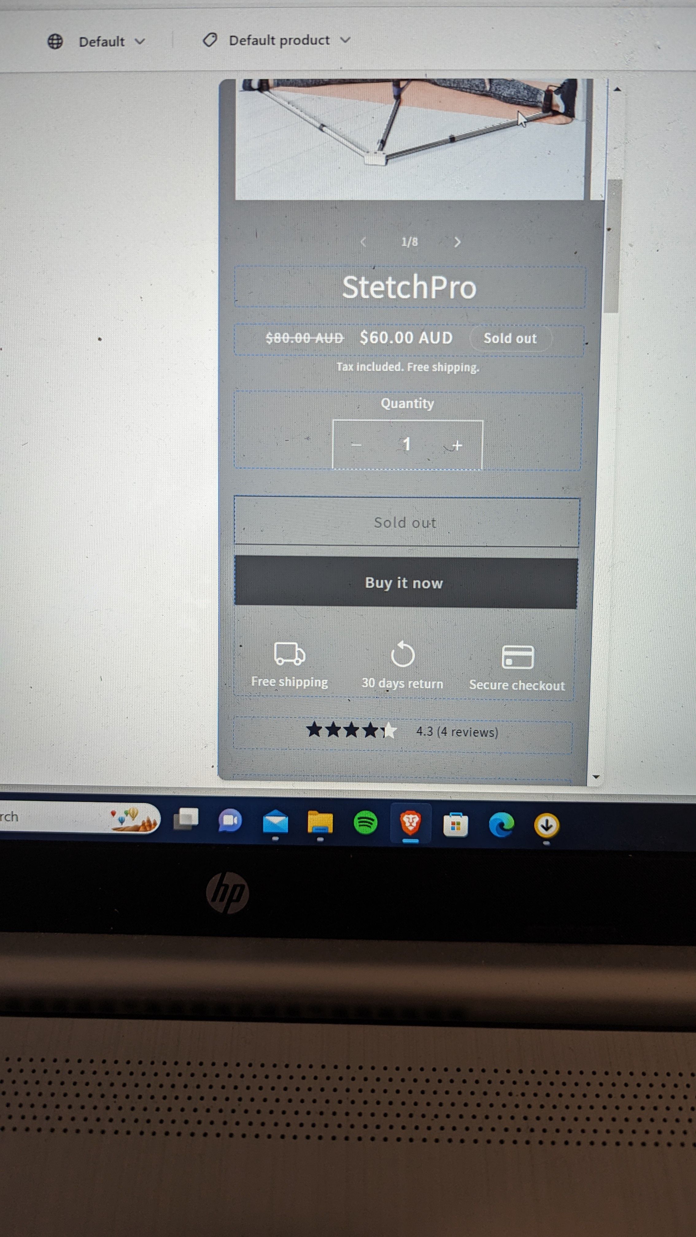
Thanks for your reply, it has solved the problem for desktop view. However on mobile they are both still to the left. When I view through the Shopify customise store mobile view, the problem appears solved. However when I visit the store via URL on mobile the problem still persists, https://stretchpro.com.au/products/stetchflex-pro. Strange.
Do you have any suggestions? Thanks for your help