Hello ketan,
can you help me? On desktop you see the text come up in the picture overlay. Hoe can I fix that for mobile screen?
Hello ketan,
can you help me? On desktop you see the text come up in the picture overlay. Hoe can I fix that for mobile screen?
Hi..Ketan Kumar,
We have exact same issue on the slideshow on mobile and saw your few codes to resolve it… As we are very new and afriad to do it wrong, can you please help to put those few codes you have given into a single screen so we can copy and paste to solve the text over image, shop button, opacity and image outline issues. Thank you so much.
Hello! This code for me, trying to fix the same issue:
@media only screen and (max-width: 749px) {
.slideshow__btn {
    display: inline-block !important;
}
}
The problem is, I now have two buttons! A new one perfectly aligned in the center of the slide show (mobile version), and the old one right underneath the slide show. How could I delete the old one?
Thanks so much in advance!
I tried this, it didn’t work for me.
Sorry you are facing this issue, it would be my pleasure to help you.
Welcome to the Shopify community! 
Thanks for your good question.
Please share your site URL,
I will check out the issue and provide you a solution here.
Hey Ketan,
I am also having the same issue. This code is not working for me.
my URL is www.clubsportgarage.co.uk
Many thanks,
Jack
I managed to fix the issue from another thread. However is it possible to reduce the slideshow button size for the mobile version?
sorry but i can’t see
Hi,
I am experiencing a similar issue with the mobile view text and button layout being inconsistent. I have tried pasting in the script but it did not work and changed a number of other features.
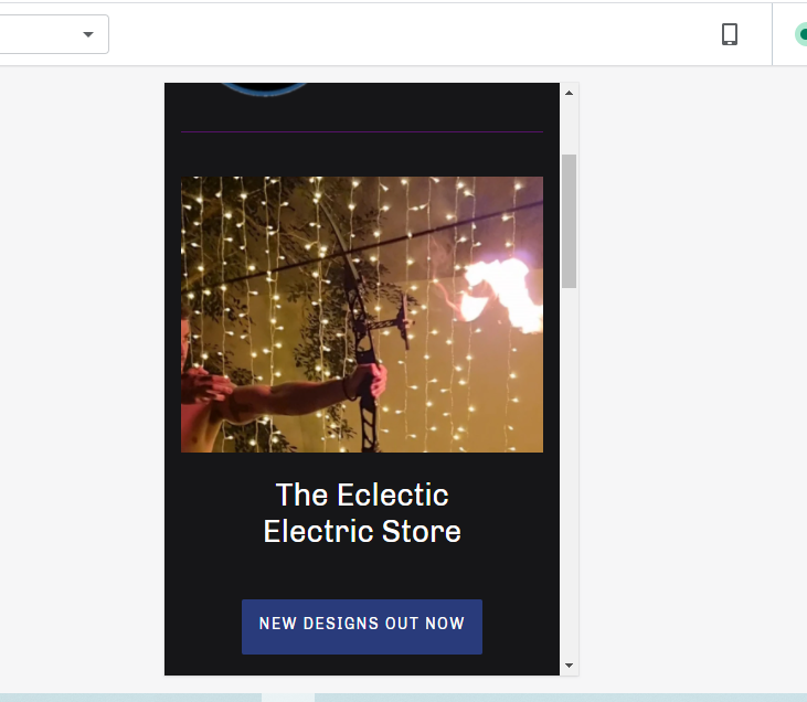
Would You be able to help me out also? my shop url is (https://theeclecticelectricofficial.com/)
Kind regards
Karlie
Absolutely.
See how in the web page view it is only a portion of the image showing (mainly focusing on the fairy lights and a little bit of the flame) and the opacity is quite blurred not to draw too much attention to the picture, more just background imagery. And the Store name and button is overlaying the picture. This is what I’m hoping to achieve when the view is converted to mobile.
Instead it is showing the full picture, not just the top right portion, and the text and button are displaying underneath the picture.
This image isn’t meant to be a center piece more just a slightly noticeable backdrop
how do you have like this proper look desktop or mobile?
Desktop is the propper look please.
Thank you!
So much better!
Are you able to crop the feature slide picture a little so it doesn’t show the mans face?
See the website image only shows the top right of the full picture.
Thank you so much for your help!
thanks for confirming please add this code
@media only screen and (max-width: 768px) {
.slideshow__mobile-text-container {
    display: none;
}
.slides-text-content-wrapper-left {
    width: 100%;
}
.slides__title, .slides__btn {
display: block;
}
}
Thanks very much. that worked perfectly.
Appreciate the help
it’s my pleasure to help us
How do I display my logo at start up or at opening of my website in début theme. Thank