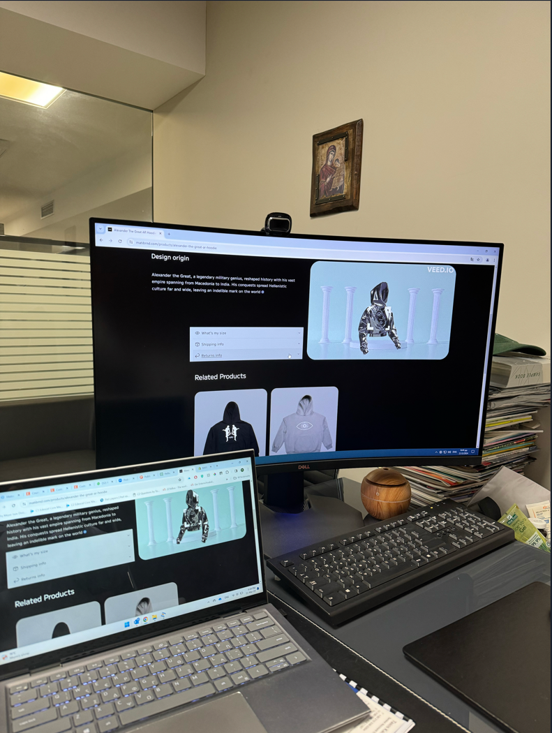
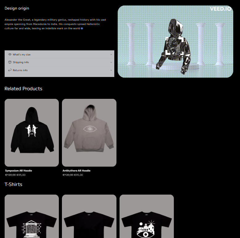
Hi, can you please help me make my product page the same for every desktop size? for all the sections to align with the ‘‘Design origin’’ on the left. Like the laptop. Thank you very much
The code is pretty poorly done. I don’t understand why you have ids as classes, and the sections are mispositioned within the code. You’re adding too many with position: absolute and adjusting margins with negative values, which is bad practice. Anyway, with this code (add in your base.css file), you’ll get what you want:
hi, thank you so much! I am new to coding and I am trying but for sure making a lot of mistakes. Your code worked perfectly for the Collapsible content but for the two sections bellow (related products, t-shirts) it didn’t work in other products. Ca you please help with the code in order to be like that for all product pages
There’s an issue with your code. I honestly believe it’s with the theme itself; each theme uses different templates and source code. In this case, there are no ids for your sections, meaning it uses dynamic classes to establish custom individual adjustments. In my opinion, it’s much better to add standard classes to all sections and then add ids (dynamic identifiers) to adjust them individually later.
In short, if all sections have the same class, CSS styles can be easily adjusted. Having different classes for each section means you’ll need to adjust each one individually to achieve the desired result.
More optimal code for editing:
Less optimal code for editing (your website):
So, there are three solutions to this problem:
Manually set the desired CSS change one by one, in this case max-width: 157rem !important; (not recommended).
Create a capable of detecting classes starting with featured-collection-wrapper- and then adding the CSS style we’re interested in to all of them (very complex solution).
Manually add a unique class (for example, width-section-collection) in the source code within the desired container, and then add the desired CSS style (easy and recommended solution).
For this third solution, you’ll need to go to the code of your website and find the .liquid file of that section (it might be named something like feature-collection.liquid). Inside the appropriate
, add a class called width-section-collection. Then, go to your base.css file to add the following code:
Thank you for your well-thought-out answer, I like solution 3 but not sue where to add a class called width-section-collection. I found the right section on theme.liquid. can you tell me in which line it is. Thank you
In red, you’ll see the classes (pay attention to this within your code), you can search for this term: “featured-collection-wrapper” by pressing CTRL + F
If you find it, add the new class at the beginning:


