Hi @mdmiddl2 ,
I’m Garcia from PageFly - Shopify Advanced Page Builder App.
I love your store’s design, it looks so elegant and professional. From my CRO expertise, I’d like to give you my suggestions as hereby:
1. Resize the sticky header
It’s great when you have a sticky header which makes it more convenient for your vistors to navigate around the site.
Another thing you might care about is that the sticky header with the current logo might take significant space while scrolling with the logo above the navigation buttons. So I would like to suggest that you resize the logo and place the logo alongside the navigation buttons in the same row to save more space to showcase the products.
2. Add a CTA button to the hero banner
A primary call to action button is one of the important things for the home page of an online store.
With this button, you will redirect customers to the page you want them to take action mostly. It can redirect to a collection page, a product page, etc.
It’s such a loss when you miss a “Shop now” button on your banner. A CTA button here will urge visitors to make the purchase and it is a great way to optimize your home page.
And please rest assured that all CTA buttons should have the same styling to boost the conversion rate.
3. Make sure the styling is consistent
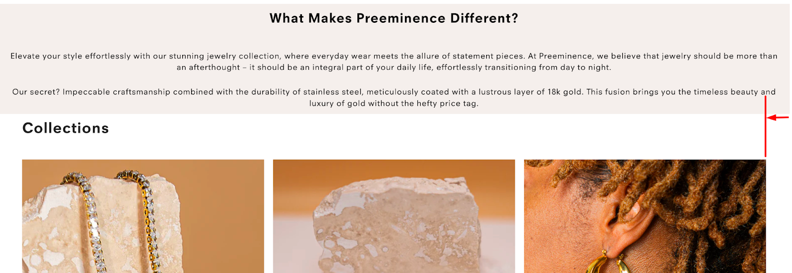
If you can increase the spacing of both sides inside the “What Makes Preeminence Different” section, I bet this section will not be easily overlooked anymore.
Note that the text inside should be vertically well aligned with the spacing in the section below it, like this:
This tactic should apply to all texts, images, and CTA buttons.
For example, the icons in this part are not the same size, and some have thicker borders than others so I think you should recheck:
4. Add testimonials - customer reviews as photos
This section will help you build customers’ trust, so it’s awesome when you have it on your homepage.
However, it’s much better if you can show rating stars for each product and add customer reviews as photos because it’s much more valid for your customers.
For instance:
And that’s my feedback! Hope it helps you boost the conversion rate.
You worked hard in 2023 so I hope you get all the rest you need in 2024. Happy selling!!!
Cheers!
Garcia | PageFly Team