Hello Everyone!
I am using shopify prestige theme. I want to keep the footer section menu like below image, Is it possible? Thank you.
Store: https://puppies-paws-shop.myshopify.com/
Password: Admin
A user seeks to customize the footer menu layout in Shopify’s Prestige theme to display horizontally instead of the default vertical arrangement.
Solution Provided:
base.css, style.css, or theme.css in the theme’s Assets folderOngoing Refinements:
padding-top: 30px, margin: 0px, etc.)Current Status:
flex-wrap and media queries at breakpoints (749px, 1170px)Technical approach: Custom CSS targeting .Footer__Block, .Linklist classes with flexbox properties and media queries.
Hello Everyone!
I am using shopify prestige theme. I want to keep the footer section menu like below image, Is it possible? Thank you.
Store: https://puppies-paws-shop.myshopify.com/
Password: Admin
Yes, it’s possible to customize the footer section menu in the Prestige theme to match the layout shown in the image.
Great, How can I do this? Send me the code. Thank you.
Do you mean like this?
If it is I use this code.
From your Shopify admin dashboard, click on “Online Store” and then “Themes”.
Find the theme that you want to edit and click on “Actions” and then “Edit code”.
In the “Assets” folder, click on “base.css, style.css or theme.css” file, depending on which file your theme uses to store its CSS styles. At the bottom of the file, add the following CSS code:
@media only screen and (min-width: 749px){
.Footer__Block ul.Linklist {
    display: flex;
}
.Footer__Block.Footer__Block--links {
    width: 80%;
}
h2.Footer__Title.Heading.u-h6 {
    text-align: center;
}
}
And Save.
Thank you
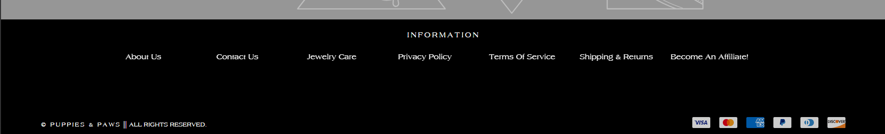
Great. It worked. I want to reduce space in desktop and mobile mode. Thank you very much.
Desktop Mode
Mobile Mode
One More thing, When I add multiple menus the texts get mixed up. I want to put 8 menus on the first line and put the rest at the bottom and will start from the center.
Check this one if its good.
footer#section-footer {
    padding-top: 30px;
}
.Footer__Block.Footer__Block--links {
    margin: 0px;
}
.Footer__Inner+.Footer__Aside {
    margin-top: 40px;
}
@media only screen and (min-width: 749px){
.Footer__Block.Footer__Block--links {
     display: flex;
     flex-direction: column;
}
.Footer__Block ul.Linklist {
    display: flex;
}
}
@media only screen and (max-width: 1170px){
.Footer__Block ul.Linklist {
    flex-wrap: wrap;
    }
.Footer__Block li.Linklist__Item {
    flex: 0 1 20%;
}
}
@media only screen and (max-width: 749px){
    .Footer__Inner+.Footer__Aside {
    margin-top: 25px;
}
    .Footer__PaymentList {
        margin-top: 25px;
}
}
And Save.
Result:
Please don’t forget to Like and Mark Solution to the post that helped you. Thanks!
It will fit but not responsive. In one line when the screen gets smaller they are more closer to. If it 2 words it automatic to go down.
Im not sure which screen size it will last. Do you want me to try? You need to save the 8menus so I can give you the result.