Hi there,
I would like to change the width from the footer newsletter block, how can I do that?
A user seeks to adjust the width of their footer newsletter block on their Shopify store to achieve consistent sizing across footer elements.
Initial Request:
Desktop Solution Provided:
BSS-Commerce supplied CSS code targeting .footer__block-list elements:
flex: 2flex: 1flex: 2 with max-width: 24remMobile Adjustment:
User requested different mobile layout. After clarification with screenshots, BSS-Commerce provided additional CSS:
justify-content to initial instead of centerStatus: Issue appears resolved with provided CSS solutions for both desktop and mobile views. User shared live website URL for verification.
Hi there,
I would like to change the width from the footer newsletter block, how can I do that?
Hi @admintb
You can change the width by editing the following code:
.footer__inner {
  width: 80%;
  margin: 0 auto;
}
Good luck, if this solution helps you, please mark the solution, thanks!
Hi @admintb
I hope you are doing good and welcome to the Shopify Community!
I am San from MS Web Designer.
Please add this css in your bottom of the theme.css file:
@media only screen and (max-width: 1024px) {
.footer bordered-section .container {width: 1000px !important; margin: 0 auto;}
}
Regards,
San
@BSS-Commerce & @INA_MSWEB I only need to change the the footer newsletter block width
Hi @admintb
The page link has expired. Can you re-issue it for us and take a picture of the exact part you need to adjust?
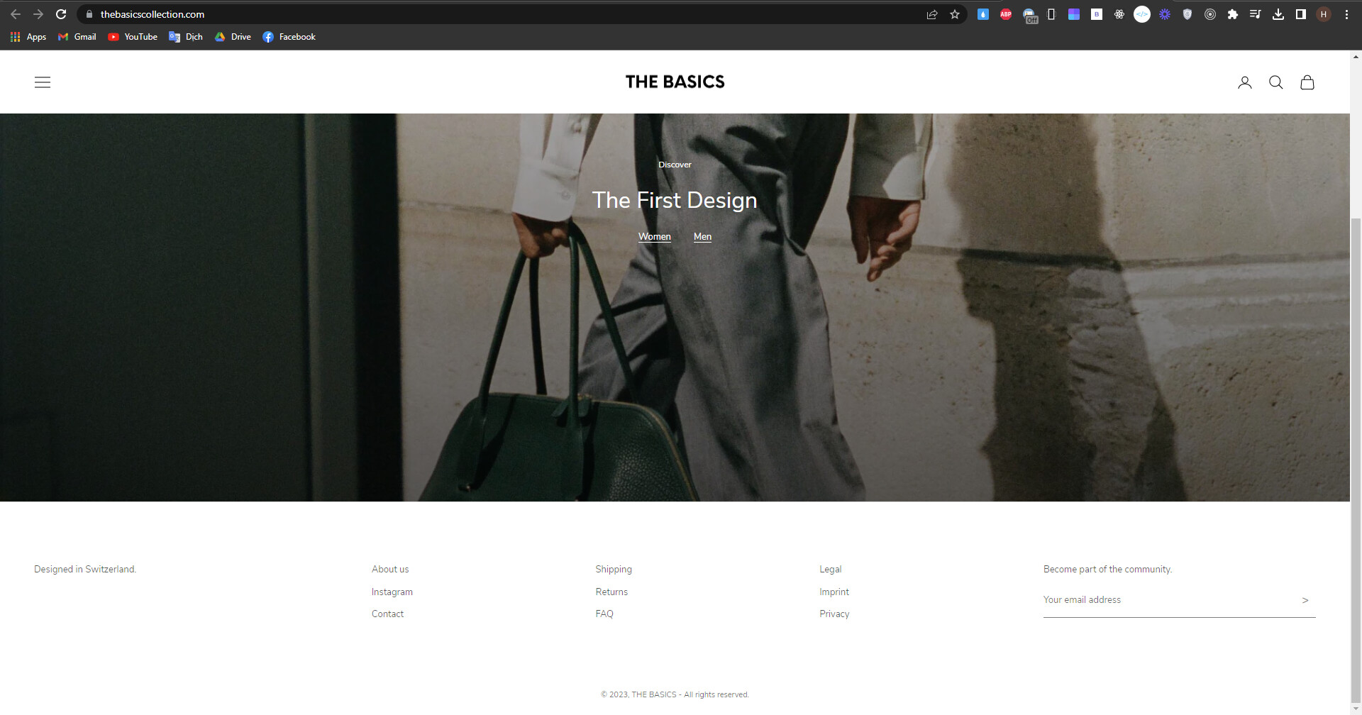
@BSS-Commerce I want to have the block “Designed in Switzerland” and “Become Part of the community” same size and the three middle blocks should also have all the same size and they need to be centered.
Please use this url and use on top right this PW: Gina8802!!!
Hi @admintb
You can add the following code at the end of the theme.css file:
.footer__block-list .footer__block--text {
  flex: 2 !important;
}

.footer__block-list .footer__block--links {
  flex: 1 !important;
}

.footer__block-list .footer__block--newsletter {
  flex: 2 !important;
  max-width: 24rem !important;
}
Result
Hope this helps you.
@BSS-Commerce Thank you! Can you make in on the mobile version like this:
Hi @admintb
You add the last paragraph below:
@media screen and (max-width: 999px) {
  .footer__block-list {
    justify-content: center !important;
  }
}
Good luck, if this solution helps you, please give it a like and mark the solution, thanks!
@BSS-Commerce There is a missunderstanding, I want like this:
Hi @admintb
Can you send us your website link so we can check it?
Please use this url: THE BASICS (thebasicscollection.com)
Hi @admintb
You can add this code:
@media screen and (max-width: 999px) {
  .footer__block-list {
    justify-content: initial !important;
  }
}
Hope this helps you.
BSS Commerce - Shopify Apps & Development Services Provider
Level up your Shopify store with our B2B & B2C apps