Hi All,
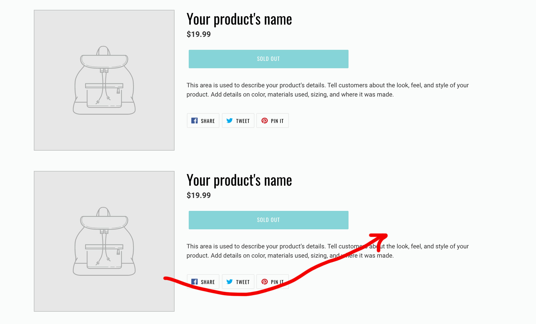
Can someone please let me know how can I align the featured product image to the right as shown in the picture here?
I want to do this only for the second section.
And this change must be mobile friendly as well.
Thanks!
A user seeks to align a featured product image to the right on Shopify’s Debut theme, specifically for the second featured product section, while maintaining mobile responsiveness.
Solution Provided:
theme.css file via Online Store → Theme → Edit Code → Assetsflex-direction: row-reverse to reposition the imageOutcome:
The solution successfully aligned the product image to the right on both desktop and mobile devices. Another user requested similar help for alternating image positions (right-left-right) across multiple featured products, excluding mobile. A third user also expressed interest in implementing this feature.
Hi All,
Can someone please let me know how can I align the featured product image to the right as shown in the picture here?
I want to do this only for the second section.
And this change must be mobile friendly as well.
Thanks!
Sorry for facing this issue, it’s my pleasure to help us.
Welcome to the Shopify community!
and Thanks for your Good question. 
Please share your site URL,
So I will check and provide a solution here.
Thanks a lot for the prompt reply @KetanKumar
Here is the link, https://osticare-pro.myshopify.com/
Highly appreciate any help.
Thanks for details
#shopify-section-1611841169ca3e3a76 .product-single {
    display: flex;
    flex-direction: row-reverse;
    flex-wrap: wrap;
}
Thanks @KetanKumar
It works fine on desktop but looks weird on mobile. 
Can we stop this code change happening on mobile?
Legend @KetanKumar
All works fine. Thanks heaps!
it’s my pleasure to help us
Can you please tell us what the small code change is so the element gets right for mobile? Loved your comment by the way, AWESOME! Can you please share it with us?
can you please share your store url so i will guide you
https://www.bolsastassen.com/products/leather-glass-cases And the the cow case one is just looking strange in mobile(it’s just a proto type name by the way haha).
thanks for your fast reply by the way. Password is style058  You are the best
https://www.bolsastassen.com/products/leather-glass-cases And the the cow case one is just looking strange in mobile(it’s just a proto type name by the way haha).
thanks for your fast reply by the way. Password is style058
You are the best,
greets Chris
i have check it work what’s issue can you please share issue images?
Can you help me with the same? i want the first feattured product picture to be on the right, then the second featured product picture to be on the left, then the third to be on the right again. on the mobile i dont want these features.