How can I fix a mobile account logo sizing issue?

Topic summary

Mobile account logo in the Shopify store header isn’t resizing correctly on mobile; screenshots show it appearing larger than other header icons.

  • Context: Issue occurs on a Shopify site (link provided). Images are attached and central to understanding the sizing mismatch on mobile.
  • Proposed fix: A participant suggested adding custom CSS in the theme (Online Store → Theme → Edit code → Assets → style.scss) using a mobile media query to set “.header-actions li.mbl-watch { vertical-align: top !important; }”. This targets alignment on small screens.
  • Outcome: The alignment change worked, but the icon still does not scale down; its height remains larger than adjacent icons.
  • Next need: Guidance to reduce the account icon’s height on mobile so it matches the size of other header icons (likely additional CSS targeting the icon’s size rather than alignment).

Status: Unresolved/ongoing. OP is awaiting further CSS-based instructions to adjust the icon height on mobile.

Summarized with AI on February 20. AI used: gpt-5.

Hey all,

For some reason, the account logo in the header isn’t properly changing sizes for mobile.

See the attached images for reference.

Does anyone have a quick fix for this?

Here is the site link: https://french-bazaare.myshopify.com/

Hi @mattpermute ,

You can follow the instruction below:

  1. Go to Online Store->Theme->Edit code
  2. Asset->/style.scss->paste below code at the bottom of the file:
@media (max-width: 768px){
.header-actions li.mbl-watch {
    vertical-align: top !important;
}
}

If you feel like my answer is helpful, please mark it as a SOLUTION. Let me know if you have any further questions.

1 Like

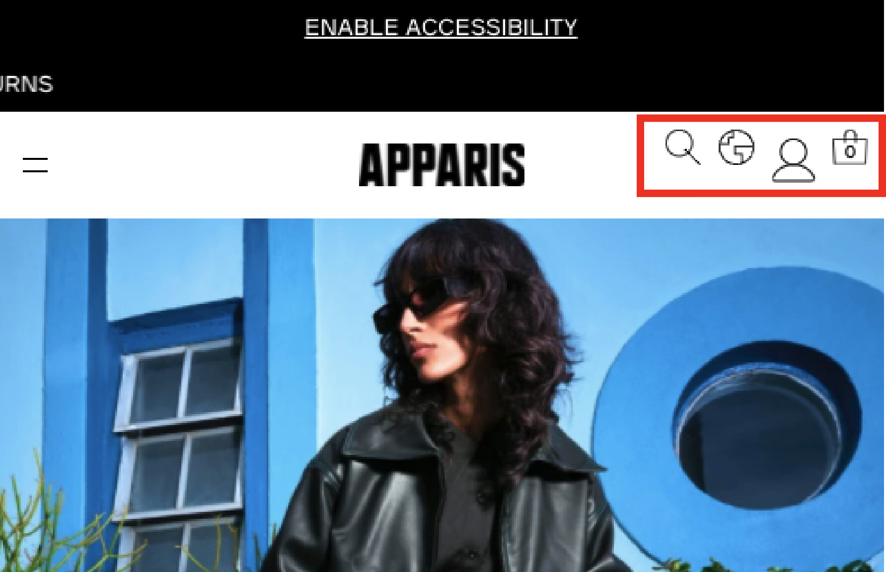
@AvadaCommerce thanks for the reply! it looks like the alignment worked, but the icon is still not sizing down properly. See the attached image for reference

Is there any fix to make the icon height smaller as well to match the others?

Thanks!