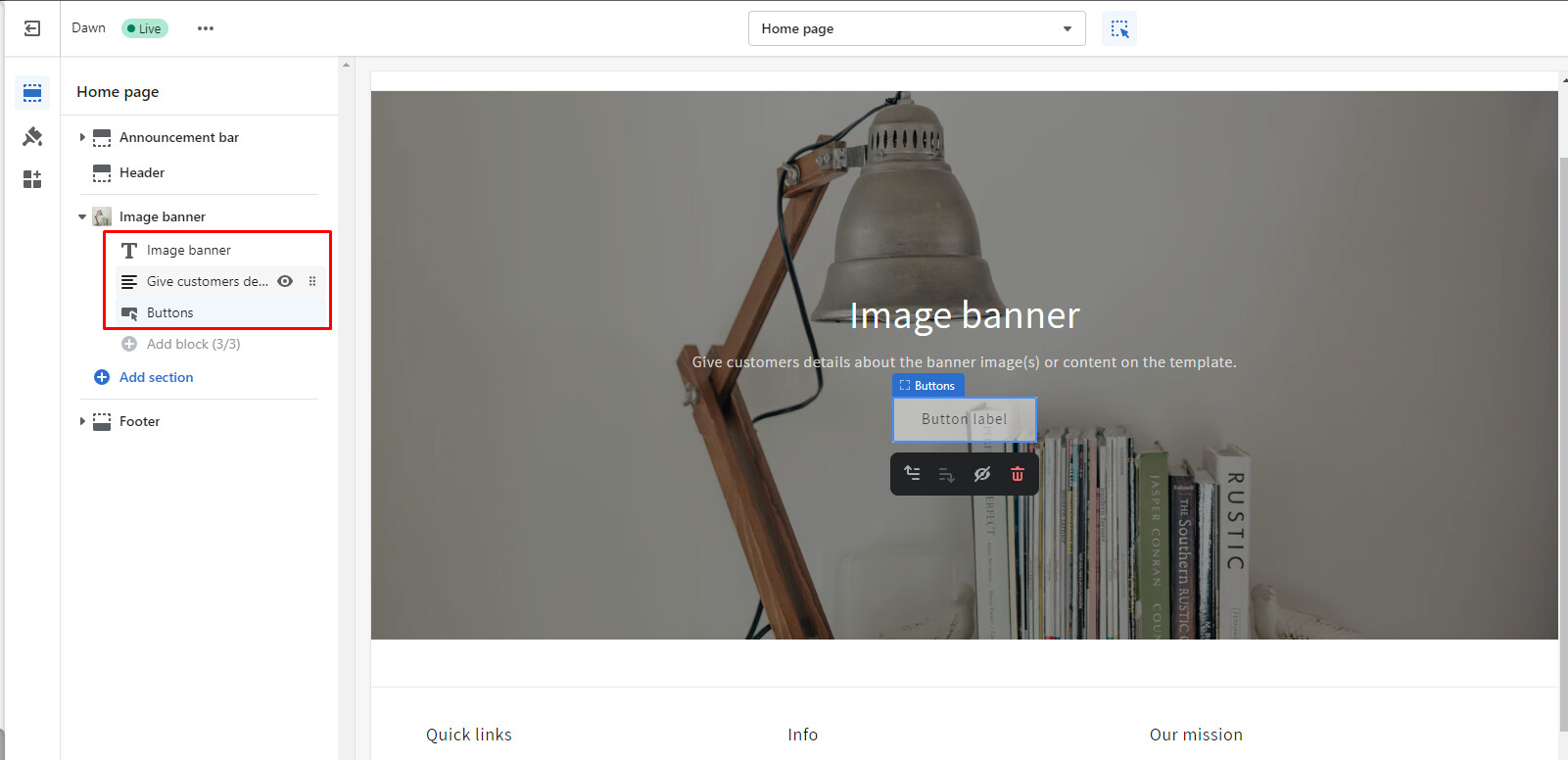
Added the code to the theme.css file, but there was no change.
There is a hero-banner.css file. My assumption is the code needs to be edited within there. I pasted my hero banner code below.
(I am not a developer so forgive my ignorance)
I see that my code has periods in front of them where yours uses “#”. Not sure if that would effect anything but just wanted to point that out.
Let me know what I need to do. Thanks
.hero-banner {
z-index: 0;
}
.hero-banner .hero-banner-row {
max-width: 500px;
margin-left: auto;
margin-right: auto;
}
@media (min-width: 1024px) {
.hero-banner .hero-banner-row {
max-width: unset;
}
.hero-banner .hero-banner-row .hero-banner-left {
max-width: 555px;
}
.hero-banner .hero-banner-row .hero-banner-left h1 {
max-width: 462px;
}
}
@media (min-width: 1536px) {
.hero-banner .hero-banner-row .hero-banner-left h1 {
max-width: 502px;
}
}
@media (min-width: 1750px) {
.hero-banner .hero-banner-row .hero-banner-left h1 {
max-width: 552px;
}
}
@media (min-width: 1280px) {
.hero-banner .hero-banner-row .hero-banner-left p {
max-width: 518px;
}
}
@media (min-width: 1024px) {
.hero-banner .hero-banner-row .hero-banner-right {
width: 50%;
}
}
.hero-banner .hero-banner-row .hero-banner-right .link__circle {
width: 50px;
height: 50px;
border-radius: 100%;
display: inline-flex;
justify-content: center;
align-items: center;
transition-property: background-color, border-color, color, fill, stroke, opacity, box-shadow, transform;
transition-duration: 0.5s;
transition-timing-function: cubic-bezier(0.4, 0, 0.2, 1);
color: #fff;
transform: translate(-50%, -50%);
position: absolute;
z-index: 40;
cursor: pointer;
}
.hero-banner .hero-banner-row .hero-banner-right .link__circle .circle {
width: 20px;
height: 20px;
display: block;
–bg-opacity: 1;
background-color: #fff;
background-color: rgba(255, 255, 255, var(–bg-opacity));
border-radius: 9999px;
}
@media (min-width: 640px) {
.hero-banner .hero-banner-row .hero-banner-right .link__circle .circle {
width: 24px;
height: 24px;
}
}
.hero-banner .hero-banner-row .hero-banner-right .link__circle:hover .dropdown-content-box {
display: block !important;
}
@media (hover: hover) {
.hero-banner .hero-banner-row .hero-banner-right .link__circle:hover .dropdown-content-box .dropdown-content-item {
filter: drop-shadow(0px 12px 44px rgba(89, 120, 122, 0.16));
}
}
.hero-banner .hero-banner-row .hero-banner-right .link__circle .dropdown-content-box {
bottom: 100%;
left: 50%;
transform: translateX(-50%);
width: -webkit-max-content;
width: -moz-max-content;
width: max-content;
display: none;
max-width: 320px;
position: absolute;
padding-bottom: 0.5rem;
}
@media (min-width: 640px) {
.hero-banner .hero-banner-row .hero-banner-right .link__circle .dropdown-content-box {
max-width: 370px;
}
}
@media (min-width: 768px) {
.hero-banner .hero-banner-row .hero-banner-right .link__circle .dropdown-content-box {
max-width: 600px;
}
}
.hero-banner .hero-banner-row .hero-banner-right .link__circle .dropdown-content-box:after {
content: “”;
display: block;
height: 70px;
position: absolute;
width: 100%;
top: 80%;
}
@media (min-width: 1024px) {
.hero-banner .hero-banner-row .hero-banner-right .link__circle .dropdown-content-box {
right: 0;
transform: none;
left: auto;
bottom: 110%;
}
}
.hero-banner .hero-banner-row .hero-banner-right .link__circle .dropdown-content-box .dropdown-content-item {
border-radius: 10px;
max-width: 600px;
position: relative;
–tw-bg-opacity: 1;
background-color: rgb(255 255 255 / var(–tw-bg-opacity));
padding: 1rem;
}
@media (min-width: 768px) {
.hero-banner .hero-banner-row .hero-banner-right .link__circle .dropdown-content-box .dropdown-content-item {
padding-left: 1.5rem;
padding-right: 1.5rem;
}
.hero-banner .hero-banner-row .hero-banner-right .link__circle .dropdown-content-box .dropdown-content-item {
filter: drop-shadow(0px 12px 44px rgba(89, 120, 122, 0.16));
}
}
.hero-banner .hero-banner-row .hero-banner-right .link__circle .dropdown-content-box .dropdown-content-item .dropdown-content-item-column {
display: flex;
align-items: flex-start;
}
.hero-banner .hero-banner-row .hero-banner-right .link__circle .dropdown-content-box .dropdown-content-item .dropdown-content-item-column span {
min-width: 11px;
margin-top: 9px;
}
@media (min-width: 768px) {
.hero-banner .hero-banner-row .hero-banner-right .link__circle .dropdown-content-box .dropdown-content-item .dropdown-content-item-column span {
margin-top: 10px;
}
}
.hero-banner .hero-banner-row .hero-banner-right .link__circle .dropdown-content-box .dropdown-content-item .dropdown-content-item-column h3 {
flex: 1 1 0%;
text-align: left;
font-size: 16px;
line-height: 24px;
font-weight: 700;
–tw-text-opacity: 1;
color: rgb(29 29 31 / var(–tw-text-opacity));
}
@media (min-width: 640px) {
.hero-banner .hero-banner-row .hero-banner-right .link__circle .dropdown-content-box .dropdown-content-item .dropdown-content-item-column h3 {
font-size: 18px;
line-height: 26px;
}
}
@media (min-width: 1024px) {
.hero-banner .hero-banner-row .hero-banner-right .link__circle .dropdown-content-box .dropdown-content-item .dropdown-content-item-column h3 {
font-size: 19px;
line-height: 29px;
}
}
@media (min-width: 1536px) {
.hero-banner .hero-banner-row .hero-banner-right .link__circle .dropdown-content-box .dropdown-content-item .dropdown-content-item-column h3 {
font-size: 20px;
line-height: 30px;
}
}
@media (min-width: 1750px) {
.hero-banner .hero-banner-row .hero-banner-right .link__circle .dropdown-content-box .dropdown-content-item .dropdown-content-item-column h3 {
font-size: 21px;
line-height: 31px;
}
}
.hero-banner .hero-banner-row .hero-banner-right .link__circle .dropdown-content-box .dropdown-content-item::before {
position: absolute;
display: inline-block;
bottom: -10px;
left: 50%;
content: " ";
border-style: solid;
border-width: 15px 13px 0 13px;
border-color: #ffffff transparent transparent transparent;
transform: translateX(-50%);
}
@media (min-width: 1024px) {
.hero-banner .hero-banner-row .hero-banner-right .link__circle .dropdown-content-box .dropdown-content-item::before {
transform: none;
right: 15px;
left: auto;
}
}
.hero-banner .hero-banner-row .hero-banner-right .link__circle:nth-child(4) .dropdown-content-box {
max-width: 320px;
left: auto;
transform: translate(0);
right: -91px;
}
@media (min-width: 640px) {
.hero-banner .hero-banner-row .hero-banner-right .link__circle:nth-child(4) .dropdown-content-box {
max-width: 400px;
transform: translateX(50%);
right: 50%;
}
}
@media (min-width: 1024px) {
.hero-banner .hero-banner-row .hero-banner-right .link__circle:nth-child(4) .dropdown-content-box {
max-width: 420px;
transform: translate(0);
right: 0;
}
}
@media (min-width: 1280px) {
.hero-banner .hero-banner-row .hero-banner-right .link__circle:nth-child(4) .dropdown-content-box {
max-width: 450px;
}
}
@media (min-width: 1536px) {
.hero-banner .hero-banner-row .hero-banner-right .link__circle:nth-child(4) .dropdown-content-box {
max-width: 591px;
}
}
.hero-banner .hero-banner-row .hero-banner-right .link__circle:nth-child(4) .dropdown-content-box .dropdown-content-item:before {
left: 63.5%;
}
@media (min-width: 640px) {
.hero-banner .hero-banner-row .hero-banner-right .link__circle:nth-child(4) .dropdown-content-box .dropdown-content-item:before {
left: 50%;
}
}
@media (min-width: 1024px) {
.hero-banner .hero-banner-row .hero-banner-right .link__circle:nth-child(4) .dropdown-content-box .dropdown-content-item:before {
left: auto;
}
}
.pulse {
-webkit-animation: pulse-animation 2s infinite;
animation: pulse-animation 2s infinite;
border-radius: 50%;
}
[email removed] pulse-animation {
0% {
box-shadow: 0 0 0 0px rgba(0, 0, 0, 0.7);
}
100% {
box-shadow: 0 0 0 20px rgba(0, 0, 0, 0);
}
}
@keyframes pulse-animation {
0% {
box-shadow: 0 0 0 0px rgba(0, 0, 0, 0.7);
}
100% {
box-shadow: 0 0 0 20px rgba(0, 0, 0, 0);
}
}
.banner-vector-img1 {
position: absolute;
bottom: 30%;
right: 37%;
z-index: -1;
max-width: 50px;
}
@media (min-width: 1280px) {
.banner-vector-img1 {
max-width: 68px;
}
}
.banner-vector-img2 {
position: absolute;
right: 39%;
top: 4%;
max-width: 60px;
z-index: -1;
}
@media (min-width: 1280px) {
.banner-vector-img2 {
max-width: 102px;
right: 37%;
top: 8%;
}
}
.banner-vector-img3 {
position: absolute;
right: 6%;
top: 28%;
max-width: 70px;
z-index: -1;
}
@media (min-width: 1280px) {
.banner-vector-img3 {
max-width: 80px;
top: 30%;
}
}
@media (min-width: 1536px) {
.banner-vector-img3 {
max-width: 130px;
top: 26%;
}
}
@media (min-width: 1750px) {
.banner-vector-img3 {
max-width: 130px;
top: 26%;
right: 10%;
}
}
.banner-vector-img4 {
max-width: 50px;
right: 2%;
bottom: 10%;
position: absolute;
z-index: -1;
}
@media (min-width: 1536px) {
.banner-vector-img4 {
max-width: 86px;
right: 2%;
bottom: 28%;
}
}
@media (min-width: 1750px) {
.banner-vector-img4 {
right: 5%;
bottom: 30%;
}
}
.banner-vector-img5 {
max-width: 70px;
z-index: -1;
right: 0;
top: 3%;
position: absolute;
}
@media (min-width: 1280px) {
.banner-vector-img5 {
max-width: 100px;
}
}
@media (min-width: 1750px) {
.banner-vector-img5 {
max-width: 152px;
}
}
.hero-banner .hero-banner-row .hero-banner-right .link__circle:hover {
z-index: 99;
}
.shopify-section-template–16609589166293__hero-banner .container {
max-width: 100% !important;
padding-left: 0 !important;
padding-right: 0 !important;
}
.shopify-section-template–16609589166293__hero-banner .hero-banner .hero-banner-row {
position: relative;
min-height: 560px;
}
.shopify-section-template–16609589166293__hero-banner .hero-banner .hero-banner-left {
z-index: 2 !important;
color: #fff;
padding-left: 1.25rem !important;
}
@media (min-width: 768px) {
#shopify-section-template–16609589166293__hero-banner .hero-banner .hero-banner-left {
padding-left: 50px !important;
}
}
.shopify-section-template–16609589166293__hero-banner .hero-banner .hero-banner-left *{
color: #fff !important;
}
.shopify-section-template–16609589166293__hero-banner .hero-banner .hero-banner-right {
width: 100% !important;
height: 100% !important;
position: absolute !important;
z-index: 1 !important;
top: 0;
left: 0;
overflow: hidden !important;
}
.shopify-section-template–16609589166293__hero-banner .hero-banner .hero-banner-right:before {
content: ‘’;
background: #000;
width: 100%;
height: 100%;
left: 0;
top: 0;
position: absolute;
opacity: 0.4;
}