Hello,
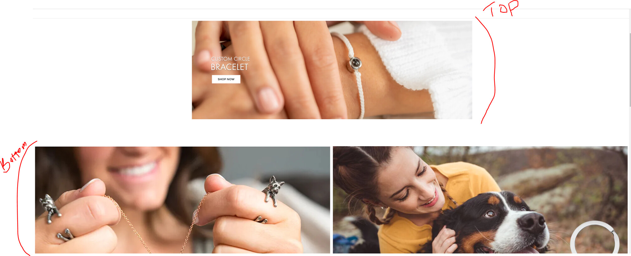
I have two multi columns (up and down) as shown below, but I want the image in the top multi-column to fill the width of the multicolumn and the bottom padding to be a little closer to the bottom multi-column. Please note that I already used the code below to adjust the size of the bottom multi-column which I found in this discussion.
.multicolumn-card-spacing {
padding-top: 0.5rem !important;
margin-left: 0.5rem !important;
margin-right: 0rem !important;
}
.multicolumn-card__image-wrapper–half-width {
width: 100% !important;
To achieve the desired layout with the image in the top multi-column filling the width and adjusting the padding of the bottom multi-column, you can modify the existing CSS code and add some additional CSS rules. Here’s an example of how you can achieve this:
.multicolumn-card-spacing {
  padding-top: 0.5rem !important;
  margin-left: 0.5rem !important;
  margin-right: 0rem !important;
}

.multicolumn-card__image-wrapper--half-width {
  width: 100% !important;
}

.multicolumn-card__wrapper {
  display: flex;
  flex-direction: column;
  justify-content: space-between;
}

.multicolumn-card__top {
  flex: 1;
}

.multicolumn-card__bottom {
  padding-bottom: 0.2rem; /* Adjust the padding as desired */
}
In this example, we add two new CSS rules: .multicolumn-card__wrapper and .multicolumn-card__bottom. The .multicolumn-card__wrapper class is applied to the parent container of the two multi-columns, and it is set to display: flex with a flex-direction of column to stack the columns vertically. The justify-content: space-between property is added to create spacing between the top and bottom multi-columns.
Thanks but it didn’t work.
Please I really need your help in solving this issue. I am also not knowledgeable in coding, so, I will appreciate your step-by-step direction in solving the issue. Thanks