Is My Conversion Rate Drop-Off Too High? Looking for Deeper Insights

Hey everyone! I’m running a small Shopify store that sells a niche, high-quality kids’ furniture product. I’ve put a lot of effort into building a clean, professional website — great product photography, clear product descriptions, and a streamlined layout. I use Shopify’s default checkout, so it’s the same flow most people are familiar with.

Right now, I’m seeing around a 1.8% conversion rate, and what’s puzzling me is the drop from “Initiated Checkout” to “Completed Purchase.” It feels steep — people are clearly interested, adding to cart, even initiating checkout — but many don’t follow through.

Here are my two questions:

  1. Are these numbers typical for stores like mine (premium niche product, $300–$400 price range)?
  2. If not, what might be causing the drop-off? I’m not looking for generic advice like “make sure your photos are good” or “simplify checkout” — those areas have already been polished. I’m hoping for more nuanced insights (e.g. price psychology, trust signals at the final step, mobile quirks, etc.).

Any help from those who’ve dealt with something similar would be amazing. Thanks in advance!

I should add this that the main traffic to my website, is through instagram (Influencers) and meta and google ads, I also get around 2K organic traffic a month.

Here is my google analytics screenshot

Hi @moosaes,

I have checked your website just now and would like to give you some feedback based on store SEO, so that you can know more about current store situation via different ways.

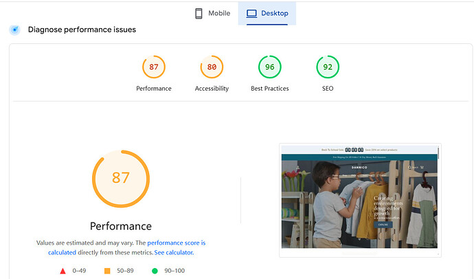
  1. Slow Page Speed. I visit your store in the role of a visitor and the first situation I notice here is, the page reaction is quite slow when I click explore button on the homepage. This will prevent the potential customers from further accessing your store pages, as they may have no enough patience of waiting and will leave your store directly. In order to verify if my sensation is correct, I made a speed test meanwhile and here are the results below I attach for your reference. The speed on desktop is a bit higher than the one on mobile, but both of them can be improved in a better way actually. Consider eliminating some unnecessary elements or plugins on your website, it shall be helpful to fasten the speed of page loading while visiting.


  2. Multiple H1 tag. When I intend to check more about your store content by accessing source code page, I notice there exist three H1 tags on the backend and this is not a good sign honestly, as it will confuse search engines like Google and leaves it a bad impression to hardly identify your page title and index page details clearly. The excessive H1 tags may be added by other plugins or elements when you optimize the store pages, please note here that always keep one H1 tag only, so that it shall have a clear structure and a standard format also in the eye of Google.

  3. The Animations on the homepage. I can feel that you would like to make the main product more vivid and live to customers when they firstly access your store. But owing to the application of animation on the store, it will have a very apparent delay and look like not smooth as well as fluent. For some customers who has a lower quality device, they will fail to see the full contents and encounter some blanks like this screenshot below. It is fine to use animation effort on the website, but better not too many at the same time, it will affect your page performance very much.

Lastly, it is happy to know your store has a very clear product description, and it will be better if consider doing the store SEO Scan regularly and pay more attention to the interaction on the store. I feel quite sure that you will pay off for what you optimize eventually. Cheers!

1 Like

Thank you very much Jeffery, your insight is very valuable and I will try to fix those.

Looking at the funnel statistics that I showed , how bad is my website compare to similar retailers?
the drop from begin checkout to purchase specially is the one that I dont understand since I have free shipping.

1 Like

@moosaes It indeed needs to be improved, honestly to say, but don’t get frustrated for now, as we all experience the same situation before things get better. Also about the drop you mentioned here, I guess the cause code is not due to the free shipping, it is the product itself or the insufficient trust you provide to customers. You can make more efforts on this aspect and double check other stores to build it up.

Hey there, I think your shop is doing a lot of things well. Honestly, a 1.77% ATC ratio to 0.19% purchase ratio isn’t bad in itself and it indicates that your website is doing a pretty good job of selling your products.

The weak link is your traffic. You’re getting a ton of if, but most of it isn’t converting. You mentioned that you’re buying ads, so I’d take a careful look at your ROI on those. If they’re sending you bad traffic (or even good traffic with an inappropriate campaign objective) you’re spending money you don’t need to spend.

You asked about a typical CVR for shops like yours. Baby products are extremely competitive, so the average is quite a bit lower than some e-com industries at 0.7% - 1.5%.

But even so, I feel like if you figure out which of your cohorts are actually converting and then focus on generating more of that traffic, your sessions will drop, but all other metrics will naturally improve, including revenue.

This is extremely helpful and I think you are correct my traffic is not quality.

Now I have to figure out how to efficiently bring quality traffic, to me my ads are optimized and Im doing my best (even though not perfect) on social media.

I guess my ads aren’t as good as I think.

This is my google ad stats

Here is for Meta:

One thing im gonna change is, i had the meta objective as checkout, but im gonna change it to conversion

2 Likes

Your Google ads look really solid. Nice job! Google ads generally bring in some of the best traffic you can get, but of course, it’s pricey. Meta is clearly getting more clicks and bringing in more traffic, but as you noticed, it isn’t as converting as much. Changing the campaign type to Conversion is a good thing to try and monitor.

After seeing how that performs for a while, remember to refresh your creatives every month or so (unless a particular ad is crushing it, then don’t touch it) to combat ad exhaustion and high CPMs.

But overall, looks good! :+1:

Hi, @moosaes Hope my answer will be helpful.

I’d start by digging into the Shopify Abandoned Checkout report. It automatically records where customers enter checkout but do not complete payment. It includes email/phone number, cart contents (products, quantities, prices), time of abandonment, step where abandonment occurred (address/ payment):thinking:

It tells you why customers leave without payment:

  • Drop early (just after adding contact info); it might mean they were only browsing or using checkout to “test” the final price.

  • Reach the payment step but not finish; it often points to payment method issues, mobile glitches, or trust concerns at the very last stage.

  • For higher-ticket items ($300–$400), customers usually take longer to decide. Check which product combinations are most frequently abandoned → Indicates strong customer interest but presence of barriers

What to do next?

  • Use the abandoned checkout email flow. For example: Send them an email to solve the potential problems like prices (provide an exclusive 5% off), trust & sense of security (emphasize 30-day free returns & free shipping)

  • Try a loyalty program. It focuses on incentivizing customers and turning one-time shoppers into long-term fans.“Complete your order today and earn 300 points you can use toward your next purchase, $30 off for the next order.” Encourages the first purchase and plants the seed for repeat buying.

This way you’re not just patching leaks in checkout, but actively building confidence and repurchase habits.

if you’re interested in it, try Loloyal, which provides a 7-day free trial, plus 40% off your first month with this code: “LL40%OFF.”

Hey @moosaes,

I had a look at your store, and it’s clear you’ve put a lot of work into creating a clean and professional site. Your product images and descriptions look great. However, the drop-off from initiated checkout to completed purchase is definitely worth looking into.

One thing I noticed is that when you click “Add to Cart,” it redirects you straight to the cart page. This can be a bit disruptive, especially for higher-ticket items like yours. Instead, you could add a sticky add-to-cart button or a cart drawer. This way, customers can keep browsing without losing track of their cart, which could help reduce friction during the shopping process.

Another area to look at is upselling and cross-selling. Right now, there’s no opportunity for customers to see related products or complementary items while shopping. For a niche product like kids’ furniture, showing them matching items or accessories (like storage solutions or decor) could significantly increase your average order value.

Also, adding a progress bar showing how close they are to free shipping or a discount would be a smart move. It’s an easy way to encourage customers to add just a little more to their cart and get them closer to that final purchase.

As for the conversion rate, 1.8% for a premium niche product isn’t terrible, but with these small tweaks, especially around upselling, sticky cart, and trust signals, you could definitely see a higher conversion. You could even look into using tools like iCart to make these adjustments without much hassle.

I hope this helps! With a few changes in the checkout experience and adding a few conversion-driving features, I’m sure you can reduce that drop-off and boost your sales. Best of luck!

A conversion rate drop-off is not inherently “too high” unless it exceeds your industry’s benchmark or is significantly worse than your historical performance. To get deeper insights, first use analytics tools to pinpoint the exact funnel stage with the highest drop-off, then investigate contributing factors like poor mobile experience, slow page speeds, complex forms, unexpected costs, confusing navigation, or an uncompelling offer. Finally, conduct user testing, heatmap analysis, and A/B tests to diagnose and fix the issues in your conversion funnel.

Hii, @moosaes
You’ve done a great job building your store and optimizing many aspects. Based on your numbers, there could be several reasons for the drop-off after checkout initiation. You can do a few things that might help you.

Price Psychology
High-ticket items like your kids’ furniture require careful attention to how the price is perceived. Even though you’ve optimized your images and descriptions, sometimes a high price can trigger hesitation. Consider these options:
Show the ‘original price’ and then the ‘discounted price’ if applicable, to make the price seem like a better deal.
Highlight limited stock or time limited offers to create urgency.
Financing Options Offer flexible payment plans like Klarna, Afterpay, or similar. These tools can reduce the initial sticker shock by allowing customers to pay in installments.

Trust Signals at the Final Step

For high-value items, customers need to feel 100% confident about the purchase. These trust signals can be game changers
Money back guarantees Especially for higher-end products, a money-back guarantee can encourage hesitant customers to complete the purchase.
Third-party validation Include a secure payment icon, trusted by certifications, and positive product reviews near the final purchase button to reassure customers.
Clear Returns & Shipping Policies Display your shipping and return policies, especially on the final checkout page. Customers often hesitate when they don’t understand the logistics.

Mobile Quirks
As mobile shopping grows, ensuring a flawless mobile experience is critical. A few insights to consider
Responsive Mobile Checkout Ensure your checkout fields are optimized for mobile use dropdowns that don’t overlap, large touch-friendly buttons.
Loading Speed Even if the content is polished, slow page loads on mobile can cause people to abandon. Since you’re already aware of performance, consider using a mobile-specific version of the store or reducing the number of mobile-specific scripts that might be slowing it down.
Ensure buttons and actions are designed for easy thumb navigation on mobile devices.

Abandoned Cart Strategy
Since you already have high engagement cart initiations, it could be worth focusing on how you re-engage abandoned carts
Exit-intent popups Offer a discount or an incentive when a customer tries to exit the page before completing the purchase.
Reminder Emails Sending a follow-up email with a personalized message about the product(s) in their cart. You can also offer an additional incentive free shipping or small discount in this email to nudge them to complete the purchase.

By leveraging these strategies, you can improve conversion rates while continuing to provide a seamless shopping experience for your customers.
If you’d like to explore further speed and performance optimization, Website Speedy App can help you quickly compress images and reduce load times, ensuring a smooth user experience across all devices.

Hi @moosaes - Great niche! — and I took a quick look at your site. Based on your website, your hero product (the bookshelf) is beautifully designed, but there are some very competitive alternatives on Amazon. That means buyers reaching checkout might pause to compare perceived value before completing the purchase — even if your quality and design are superior.

For premium products, that hesitation often isn’t about checkout friction — it’s about price justification and value framing. Highlighting craftsmanship, materials, or longevity (“built to last through every growth stage”) can reinforce the price.

We’re currently building a solution that helps Shopify merchants like you optimize pricing and promotions based on real market signals and behavioral data. Would love to connect and learn more about your experience to collborate