https://751635-bc.myshopify.com/
i’ve tried my best to make this site as good as possible i hope u like it.
And btw how can i get more traffic on my website can somone help me ?
https://751635-bc.myshopify.com/
i’ve tried my best to make this site as good as possible i hope u like it.
And btw how can i get more traffic on my website can somone help me ?
Hi @killer1 !
I checked your store, and it looks amazing! Now, on to increasing your store traffic, there are a lot of ways to introduce your store to the public like creating advertisement to social media platforms such as, Facebook, Instagram, and Tiktok. You can also pay for Google ads and Facebook ads. I will also share an article to you that will greatly give you insights on how to increase your store traffic: Shopify SEO: A Guide to Generating Store Traffic and Proven Strategies to Skyrocket Website Traffic in 2024.
Hope this helps and I wish you luck on your Shopify business journey!
Honest review, i would change up the colour scheme, the brown doesn’t look nice but everything else looks amazing
Hi @killer1 I’m Garcia from PageFly - Shopify Advanced Page Builder App. Generally, I love your store’s design, it looks classic but professional. From my CRO expertise, I’d love to give you my suggestions as hereby:
1. Homepage
The banner is very significant in hero material. It is the first thing customers see when they visit your website. You should use the banner which lets consumers to know exactly what you’re having in 5 seconds first.
Unfortunately, your current banner does not show exactly what you are selling. That’s why I would suggest you change it.
A crucial element for an online store’s homepage is the primary call-to-action button. This button serves as a direct link to the specific page where you want customers to take action, such as a collection or product page.
It’s such a loss when you missed a “Shop now” button on your banner. A CTA button here will urge visitors to make the purchase and it is a great way to optimize your home page.
And kindly rest assured that all CTA buttons should have the same styling to boost the conversion rate.
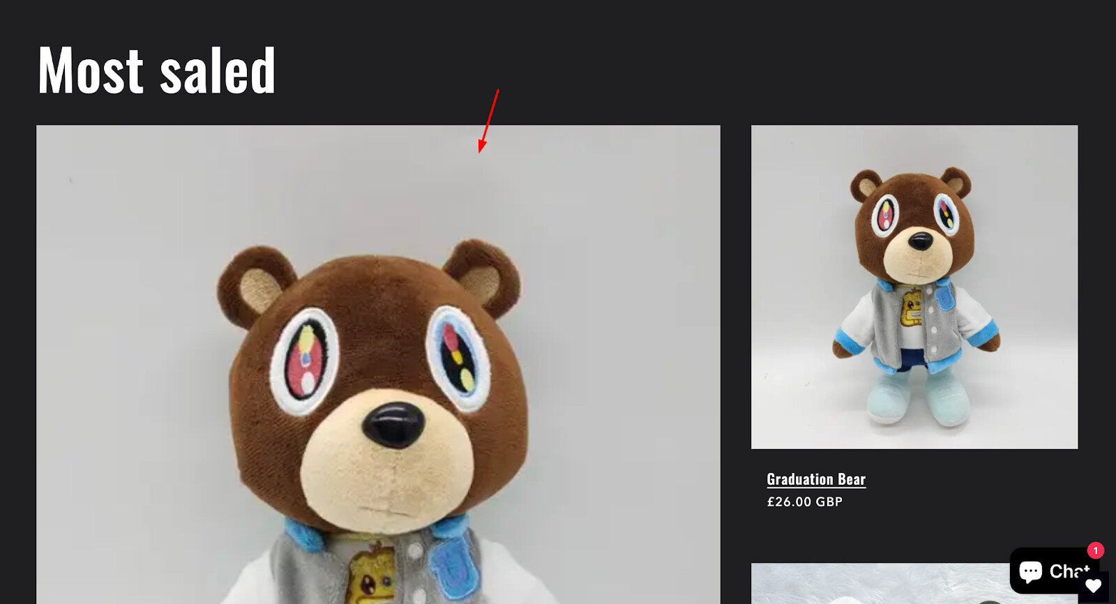
Instead of saying “Most saled”, you can replace it with such more popular words as “Bestsellings”, “Top sellings”,…
The image below is broken so I suggest you check the image quality again to make it fit
Putting all the product media in round shape makes it hard for your visitors to get a full view of your products. So please redesign this part.
At least, you should have the Shipping and Refund policies in this part.
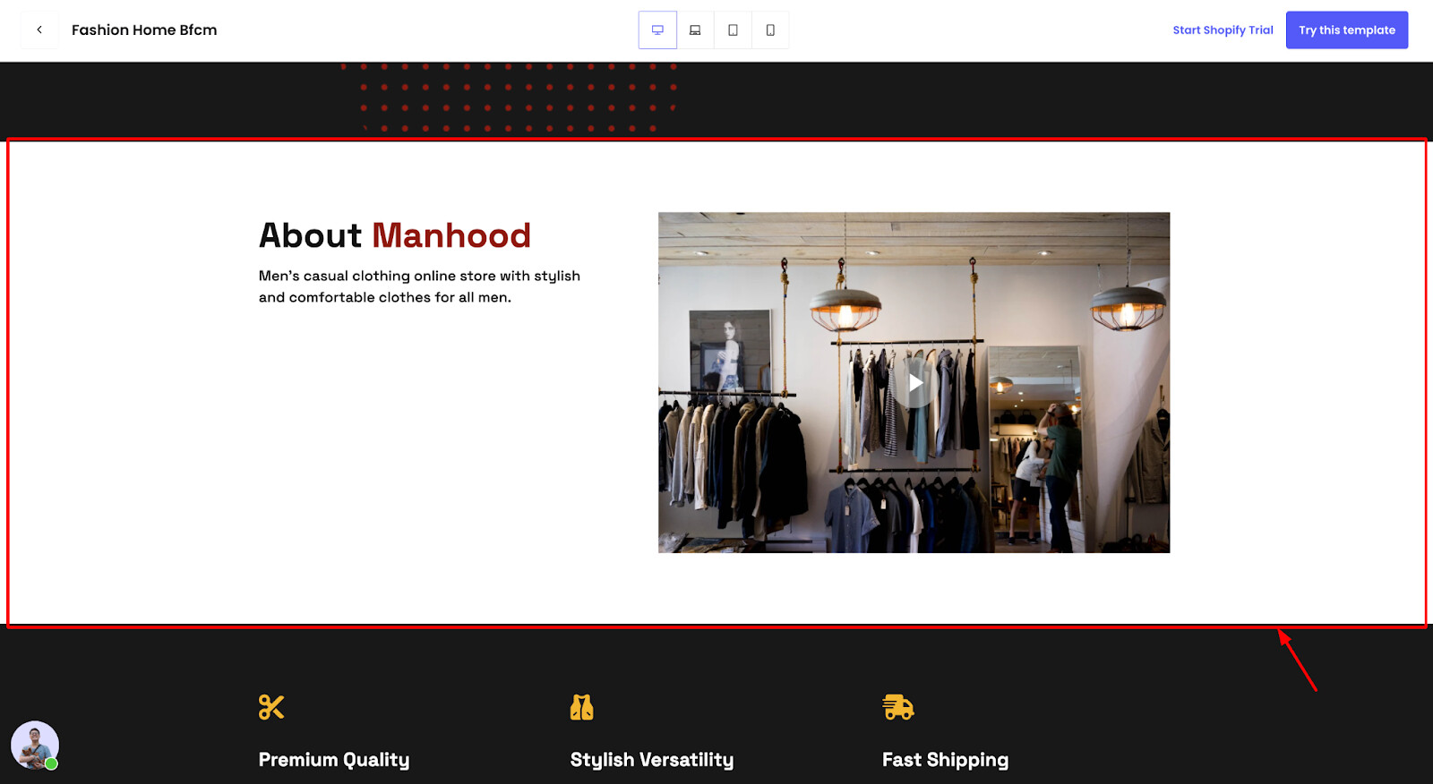
Crafting a narrative about the soap-making process and your journey into this specialized market will captivate your customers, forging a strong connection with your brand and leaving a lasting impression. Therefore, it’s essential to dedicate a section of your homepage to share this compelling story.
This section gives your customers a reason to purchase from you instead of the competition.This helps reduce the bounce rate and increase the likelihood of purchase. Here is a demo for you:
2. Product page
Product color swatches enhance conversion rate by reducing the number of clicks for customers to find the product they want. The shorter and easier a customer’s path to the desired product is, the more likely they will make a purchase.
What can be improved in this part is the quality of the images you are using. By using high quality images, I believe that your store would become much more professional.
It might be a big obstacle in UX. You can optimize it by using a tab or accordion element for your users’ convenience.
Display the key product benefits and deep dive on product details to answer customer’s logical questions. For instance:
And that’s my feedback! Hope it helps you boost the conversion rate.
Cheers!
Garcia | PageFly Team
Thank you, i will take your feedback!
@Anonymous You are welcome!