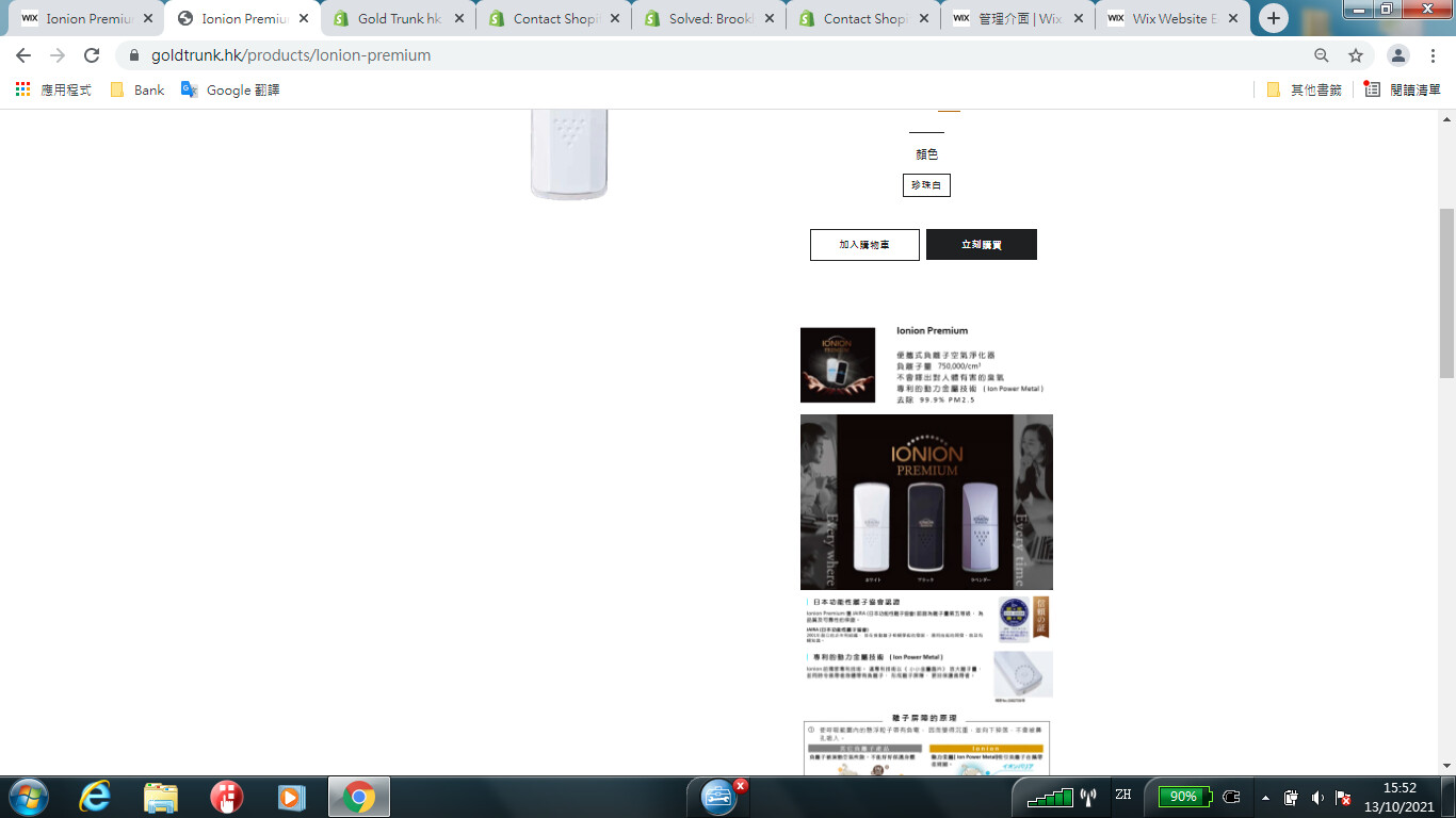
My site all information in right hand side and so small in desktop mode, I would you like use up the page area. How can I fixed it.
-
In your Shopify Admin go to: online store > themes > actions > edit code
-
Find Asset > timber.scss.liquid and paste this at the bottom of the file.
@media only screen and (min-width: 769px){
.template-product .large--seven-twelfths { width: 50%;}
.template-product .large--five-twelfths { width: 50%;}
.template-product .wrapper {
    max-width: 100%;
    margin: 0 auto;
    padding: 0 15px;
}
}
Thanks!
1 Like
-
In your Shopify Admin go to: online store > themes > actions > edit code
-
Find Asset > timber.scss.liquid and paste this at the bottom of the file.
@media only screen and (min-width: 769px){
.template-product .large--seven-twelfths { width: 50%;}
.template-product .large--five-twelfths { width: 50%;}
.template-product .wrapper {
    max-width: 100%;
    margin: 0 auto;
    padding: 0 15px;
}
}
Thanks!
1 Like
May I duplicate or backup my site before I make a edit?
1 Like
yes
1 Like
It seem better, if I would like the right hand side description area bigger, would you tell how can I do this.
After I paste statement in Asset > timber.scss.liquid , I feel the product photo move to left hand side. I would like move back in central.

Please Remove previous css & add following css
@media only screen and (min-width: 769px){
.template-product .large--seven-twelfths { width: 50%;}
.template-product .large--five-twelfths { width: 50%;}
}
1 Like
This is better, the layout is more users friendly, love it

Thanks for screenshot but this is code customization work Please share Sections/product-templete.liquid file code otherwise
hire shopify expert or conatact to shopify support.
Thanks Again!
Thank you for your advise, I copy Sections/Product-template.liquid as a word file. Would you help me again.