mbhlg
1
Hello,
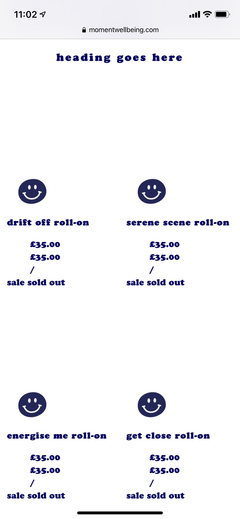
I’m using debut theme and am having some issues when trying to access my product pages in mobile view.
My product section currently looks like this:
Would someone be able to help me align the products on the page/remove the double pricing and the sale/sold out part and make the links work?
Thanks
1 Like
@mbhlg
Please share your store URL.
1 Like
mbhlg
3
@dmwwebartisan I’ve dropped you a message 
@mbhlg
Please add the following code at the bottom of your assets/theme.css.liquid file
@media only screen and (min-width: 750px){
.template-collection .price {
    display: block !important;
    text-align: center !important;
}

.template-collection .product-card__title {
    display: block !important;
    text-align: center !important;
}

.template-index .price {
    display: block !important;
    text-align: center !important;
}

.template-index .product-card__title {
    display: block !important;
    text-align: center !important;
}
}

@media only screen and (max-width: 749px){
.price__sale {display: none;}
.price__regular {display: block;}
.price__badge {display: none;}
.price-unit-price{ display: none;}
.template-collection .price {
    display: block !important;
    text-align: center !important;
}

.template-collection .product-card__title {
    display: block !important;
    text-align: center !important;
}

.template-index .price {
    display: block !important;
    text-align: center !important;
}

.template-index .product-card__title {
    display: block !important;
    text-align: center !important;
}
}
Thanks!
1 Like
mbhlg
5
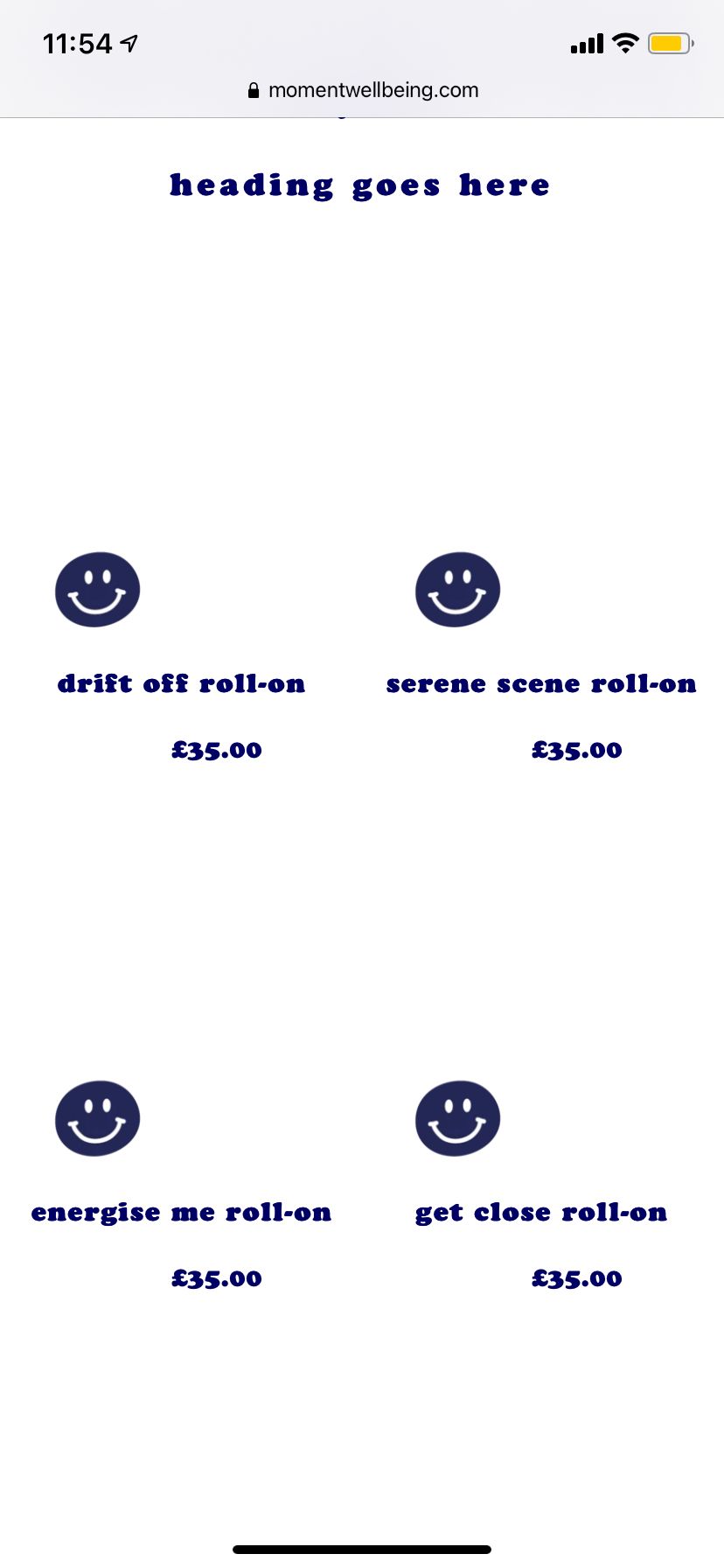
! Thanks so much, looks a lot better.
However could the listings be centralised and the pricing moved to the left?
Also unfortunately the product links still don’t work.
This is what I’d like it to look like please
Thanks!
@mbhlg
Remove previous code add this code
@media only screen and (min-width: 750px){
.template-collection .price {
    display: block !important;
    text-align: center !important;
}

.template-collection .product-card__title {
    display: block !important;
    text-align: center !important;
}

.template-index .price {
    display: block !important;
    text-align: center !important;
}

.template-index .product-card__title {
    display: block !important;
    text-align: center !important;
}
}

@media only screen and (max-width: 749px){
.price__sale {display: none;}
.price__regular {display: block;}
.price__badge {display: none;}
.price-unit-price{ display: none;}
.template-collection .price {
    display: block !important;
    text-align: center !important;
}
}
mbhlg
7
Thank you, just tried this and unfortunately am still having the same issues and it doesn’t look any different.
Is there an alternative I can try please?
@mbhlg
Not remove previous css add this new css code
@media only screen and (max-width: 749px){
.template-collection .price {
    display: block !important;
    text-align: left !important;
}

.template-collection .product-card__title {
    display: block !important;
    text-align: left !important;
}

.template-index .price {
    display: block !important;
    text-align: left !important;
}

.template-index .product-card__title {
    display: block !important;
    text-align: left !important;
}

.product-card__image-wrapper {
margin:0 auto;
text-align:center;
}
}
1 Like
mbhlg
9
@dmwwebartisan I’m afraid it’s still the same and nothing has changed