Hello,
I am trying to reduce the size of a video section for just the desktop version of my site. The video is on the main page at micrologicals.com
So far, the closest I’ve gotten is add this line of code to theme.liquid, but it still isn’t quite right.
<style>
@media screen and (min-width: 770px) {
.video-section__media.deferred-media{
max-width: 500px;
text-align: center;
--ratio-percent: 45%!important;
margin: auto;
}
.video-section__media video{
max-width: 500px;
height: auto!important;
left: 0!important;
}
}
</style>
Does anyone have any other code suggestions?
Thanks!
Hi @Micrologicals ,
Can you kindly share the details of your problem (screenshot/ record) with us? We will check it and suggest you a solution if possible.
Hi @Micrologicals ,
I have reviewed your requirement , I think you just need edit css script in base.css and the issue will be resolved. You can follow my instructions!
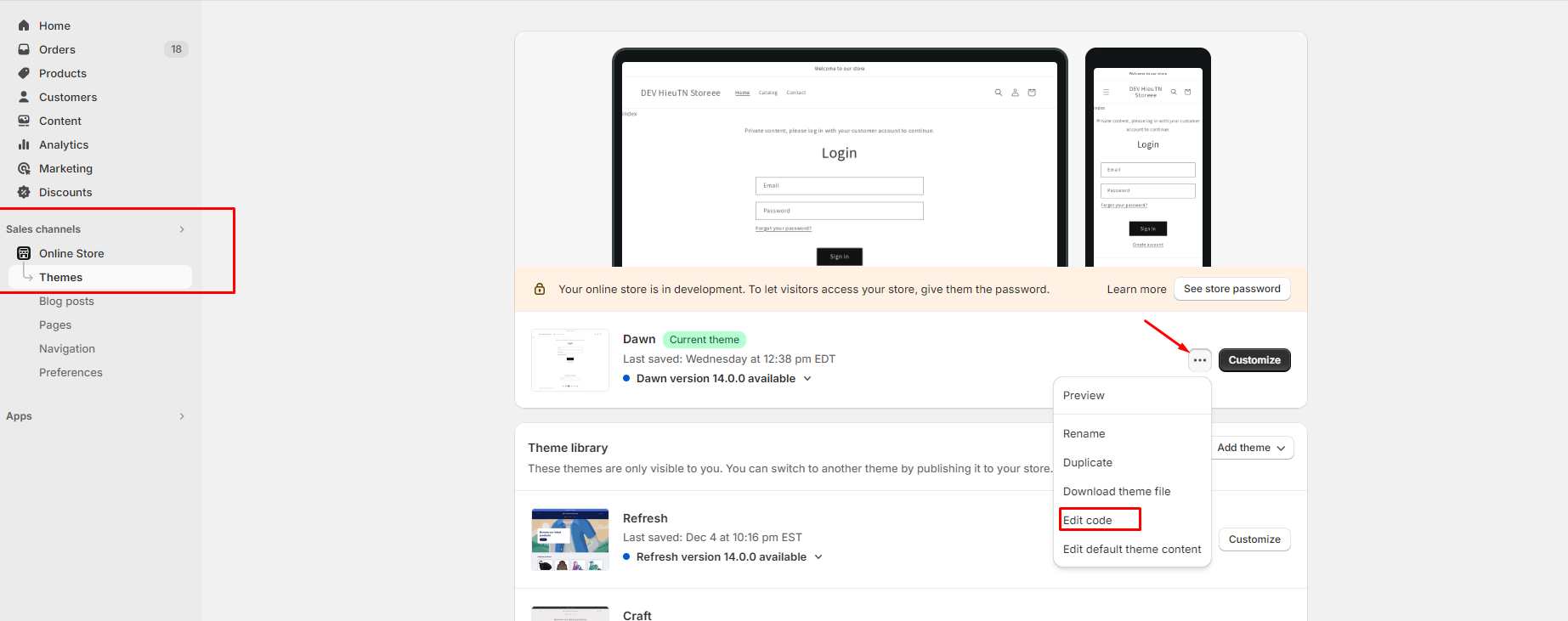
Step 1: Go to Admin → Online store → Theme > Edit code:
Step 2: Search base.css and add the script css custom font in the end of file:
@media screen and (min-width: 770px) {
    .video-section__media.deferred-media.no-js-hidden.gradient.global-media-settings {
        max-width: 500px !important;
        text-align: center !important;
        padding-bottom: 70% !important;
        left: 25%;
    }
}
Step 3: Save and reload page in storefront.
=> The result:
I hope these instructions will help you. If they are helpful, don’t forget to like and mark as the solution.
Have a nice day sir!
Hi @Micrologicals ,
I have reviewed your requirement , I think you just need edit css script in base.css and the issue will be resolved. You can follow my instructions!
Step 1: Go to Admin → Online store → Theme > Edit code:
Step 2: Search base.css and add the script css custom font in the end of file:
@media screen and (min-width: 770px) {
    .video-section__media.deferred-media.no-js-hidden.gradient.global-media-settings {
        max-width: 500px !important;
        text-align: center !important;
        padding-bottom: 70% !important;
        left: 25%;
    }
}
Step 3: Save and reload page in storefront.
=> The result:
I hope these instructions will help you. If they are helpful, don’t forget to like and mark as the solution.
Have a nice day sir!
Hello!
Thank you for your prompt response! The video is a great size now!
However, when I press the play button, the video section pops out and shifts to the right a little. Is it possible to prevent that from happening?