Hello all. I’d like to remove the white space on the Mobile version of my website. I am using the Dawn template. I’m happy with the Desktop version - the background image is covering the whole screen with no issues. I don’t know how to fix the Mobile landing page.
Any help is appreciated.
Hi @lyanthelabel ,
Step 2: Search file theme.liquid
Step 3: Inside head tags. You need create style tags. After insert my code inside style tags
@media only screen and (max-width: 749px) {
    body.password .banner--large:not(.banner--mobile-bottom):not(.banner--adapt) .banner__content {
        min-height: 100vh !important;
    }
}
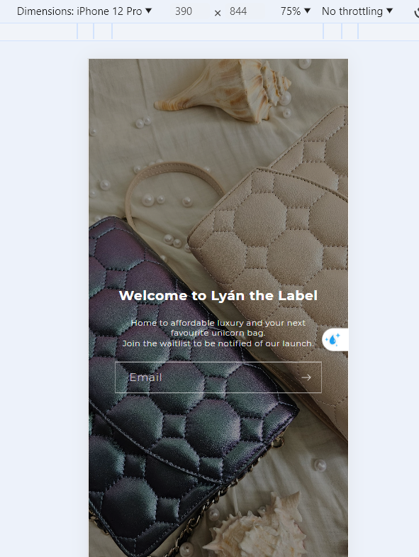
Here is result:
Hope this can help you,
If our suggestions are useful, please let us know by giving it a like or marking it as a solution. Thank you
Thanks for your response. Unfortunately, still not working… wondering if it has to do with the image dimensions itself?
1 Like
Hi @lyanthelabel , It is a problem of the image size being too small in height. This results in a lot of white space at the bottom.
Can I send a collaborator access to your theme? Then I can check and directly add code to help your issue.
Please share your collaborator request code from the Users and permissions page.
216tae
June 26, 2024, 6:15am
5
hello im having trouble with the same thing could you help me as well ? feel free to email me taereleslie@gmail.com


