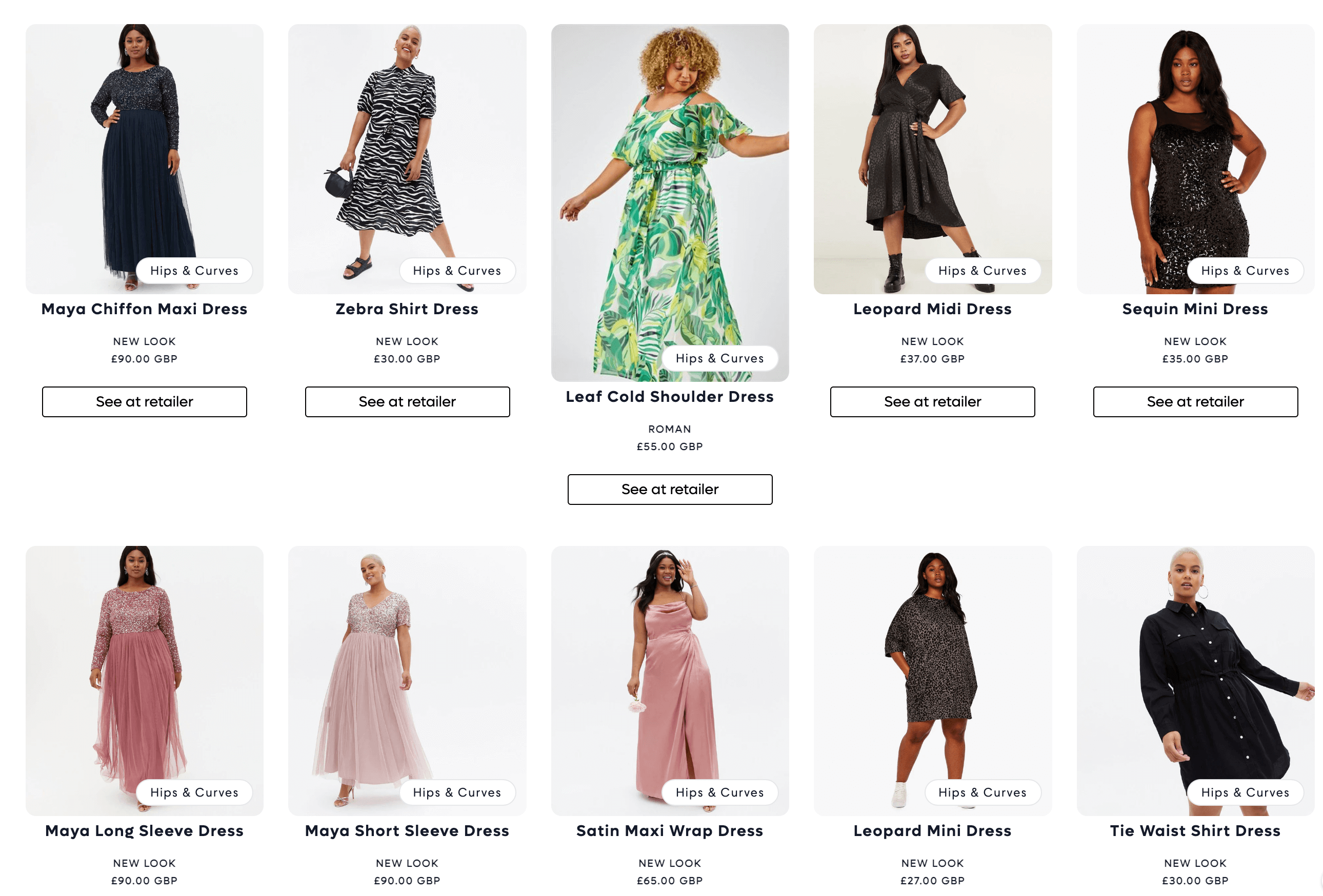
I have a regular Shopify collection product grid that looks like this:
I’d like to make it look more this feed (e.g. Pinterest-style grid, eliminating the white space under product 1, 2, 4 and 5):
Desired Product Grid Alignment
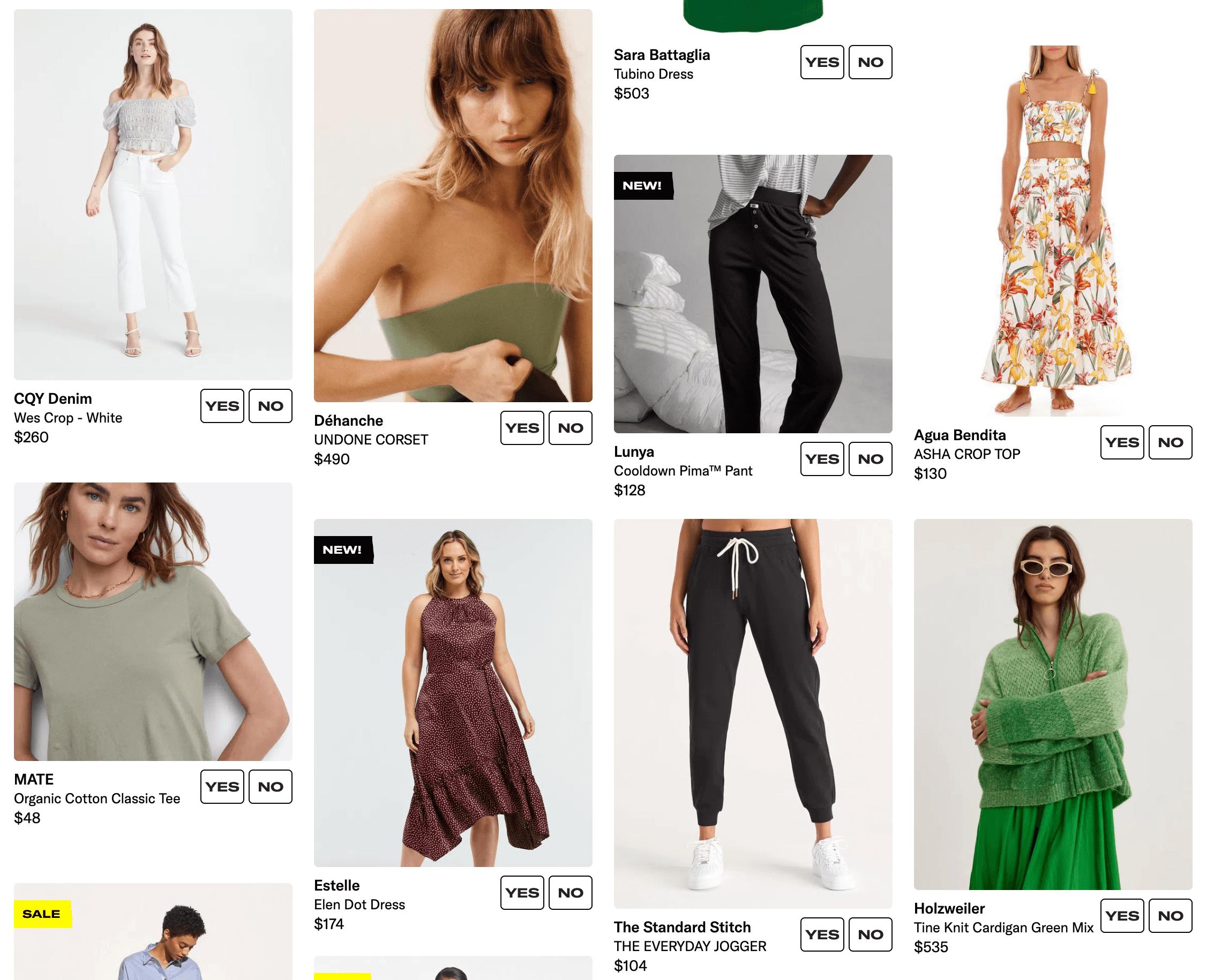
How can I do that? I’m using the Taste theme, this is the link to my collection page: https://ragtag.style/collections/tag-hips-curves
Below my grid css right now:
.grid {
  display: flex;
  flex-wrap: wrap;
  margin-bottom: 2rem;
  padding: 0;
  list-style: none;
  column-gap: var(--grid-mobile-horizontal-spacing);
  row-gap: var(--grid-mobile-vertical-spacing);
}
@media screen and (min-width: 750px) {
  .grid {
    column-gap: var(--grid-desktop-horizontal-spacing);
    row-gap: var(--grid-desktop-vertical-spacing);
  }
}

.grid:last-child {
  margin-bottom: 0;
}

.grid__item {
  width: calc(25% - var(--grid-mobile-horizontal-spacing) * 3 / 4);
  max-width: calc(50% - var(--grid-mobile-horizontal-spacing) / 2);
  flex-grow: 1;
  flex-shrink: 0;
  height: flex;
}