Hello there.
https://nobaanimal.myshopify.com/
Password: aopahy
On my website I had help to arrange te text and button section on the mobile version so it would go under the image.
The code is great but it seem to have a bit too much of a space on top. I’ve tried to play a bit with the code but didn’t amount to much unfortunatly. Is there a way for each of these section to have a “normal” amount of spacing.
If i change the images later those will be in the same format too!
Thanks or your help again !
- Here is the solution for you @GabrielNoba
- Please follow these steps:
- Then find the theme.css file.
- Then add the following code at the end of the file and press ‘Save’ to save it.
.content-over-media {
         padding-bottom: 25vh !important;
}
- Please press ‘Like’ and mark it as ‘Solution’ if you find it helpful. Thank you.
1 Like
Maybe I copied it wrong but the desktop version is now looking like this ?
It doesn’t seem to change the mobile version too
@media only screen and (max-width: ̃̀750px) {
  .content-over-media {
         padding-bottom: 21vh !important;
 }
}
can you try it @GabrielNoba
1 Like
Hi @GabrielNoba ,
You can follow these steps to make the effect
-
Open Online Store > Theme > Edit Code
-
Find and open the theme.css (or base.css, custom.css) file
-
Paste the code snippet below at the bottom of the file and hit save
@media only screen and (max-width: 699px) {
    #block-slide-1 .prose {
        position: relative;
        top: -50px;
    }

    image-banner .prose {
        position: relative;
        top: -50px;
    }
}
Here is the result
Hope this helps you solve the issue.
Please don’t forget to Like and Mark it as an Accepted Solution if you find this helpful. Thank you!
1 Like
Hello again !
This seems to fix the problem on the desktop version.
Is it possible that the code the first person provided me for the theme.css could conflict with yours?
Cause it does not look like your example
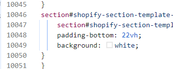
can you try to change line 10048 22vh to 18vh
1 Like
@media only screen and (max-width: 749px) {
#shopify-section-template--16421253939311__image-with-text-overlay .content-over-media {
 padding-bottom: 28vh !important;
}
}
This code is for editing the 3rd section specifically. You can shorten the distance and use this code to make the 3rd section wider.
1 Like