Hi everyone,
I had so many visitors but no sales what do think it is the problem.
My store is :bulletbase.store
Best regards.
Youssef
A store owner is receiving traffic but no conversions and seeks feedback on their tech accessories shop (bulletbase.store).
Key Issues Identified:
Recommended Actions:
Status: Discussion remains open; the store appears to be offline as of the last comment, with unclear whether improvements are ongoing.
Hi everyone,
I had so many visitors but no sales what do think it is the problem.
My store is :bulletbase.store
Best regards.
Youssef
hi @Bulletbase
There could be several reasons why you’re getting traffic but no sales.
Here are some key things to consider:
Hi @Bulletbase
I can see you’ve got a great foundation with a variety of tech accessories, love the range from smartphone kits to humidifiers!
Your homepage looks clean, but it’s missing a strong hook. Maybe add a bold banner with a discount or free shipping offer to grab attention right away. Navigation is smooth, but the product categories could be more specific; for example, “Accessories” is too vague. Try breaking it into “Phone Accessories,” “Audio,” etc., so customers find what they need faster.
Also, your checkout process might be a hurdle, consider enabling guest checkout or adding more payment options to make it easier. Maybe try a small pop-up with a discount for first-time buyers to nudge those visitors into action.
Furthermore, I see the site displays prices in Swiss Francs (CHF). Ensure that this aligns with your target market or consider adding multi-currency support to cater to international customers. You also can analyze your traffic sources to ensure you’re attracting relevant visitors. Utilize tools like Google Analytics to gain insights into visitor behavior and demographics.
Hello @Bulletbase !
I have been looking at your website from a customer perspective. I have noticed a few things that would discourage me from purchasing:
As a customer, I’d be hesitant to make a purchase because the store lacks credibility.
I’d recommend adding more details about your store, creating social media accounts, sharing videos and collecting customer reviews to build trust.
Hello Cristina,
Thank you for your advice and have a Nice day.
Best regards,
You’re very welcome! I hope you get your first sales soon.
Best wishes.
Thank you so much for your answer.
Best regards.
Hi @Bulletbase ,
We appreciate your inquiry in the Shopify Community. We are MooseDesk, a comprehensive Live Chat, FAQ & Helpdesk App designed to elevate your customer support experience.
Congrats on your new store! I can tell you have put a lot of effort into building this. Especially, your product page is really informative and comprehensive with lots of medical illustrations with the consistency of a safe medical vibe delivered through your store ![]()
However, I have some comments to boost sales. Here are some of my recommendations, please kindly check.
1. Add CTA link for banner and a sales boost pop-up window
I see you put the banner “Welcome to our store” at the top of the website that shows the very first touchpoint with newcomers. But for sales boost, you can leverage it to attach the link of product page/discounts/purchase, etc.
It could be more incentivizing if you add a timing countdown (20 hours:30 minutes left…). Also, leverage Social Proof and Scarcity by displaying low-stock alerts (e.g., “Only 3 left in stock!”) to create urgency and highlighting recent purchases (e.g., “X people bought this in the last hour”) to encourage action.
2. Optimize Hero banner
With just a glance over the hero banner, I can decide whether to continue exploring a shop or not. At my first view of your website, the main product (the pillow) is hidden by the text which could be placed in a different place. Also, the Hero banner is being cut though.
Therefore, I recommend that you optimize Hero Banner with the most captivating image of your products along with your tagline (benefits offered to your customers) (like “Transform your sleep”)
3. Modify & complete Homepage structure
I would say that you really understand your product’s strengths and unique points as Value proposition is delivered nicely through the Homepage.
However, I suggest some small modification to the flow: Enhance your sleep experience → The science behind weighted sleep masks → Testimonials (add this as it is very crucial to build trust in customers) - Transform your sleep today (final CTA button).
4. Add Live chat widget
I can see that your website is lacking a live chat widget feature and a contact us page to allow customers to contact you immediately, which can really bring you closer to customers by chatting and emailing, then converting them into buyers.
I suggest exploring MooseDesk, a FREE Live Chat, WhatsApp & FAQ App. You can easily reach customer support via WhatsApp, ensuring immediate assistance for inquiries. Also, the widget provide multi self-Service options such as Order tracking, Translation and FAQ section empower customers to resolve common questions on their own, reducing the need for direct support.
So those are some of my suggestions for your store as an UX expert. If this is helpful for you, please let me know by giving me a ‘LIKE’. If your question is answered please mark this as 'SOLUTION’.
Once again, keep up the fantastic work, and I wish you the best of luck in the future!
Hi @Bulletbase ! I’m Tracy from BON Loyalty, the essential Shopify loyalty program app.
I’ve had the chance to explore your website, and I must say the design is clean and organized, the product is fantastic, and the images are full of useful details. There are a few things I’d suggest to make your website even better:
1. Contrast
The text uses a lot of blue, and this unintentionally makes your CTA less noticeable since it blends in with the rest of the text. This might make it harder for your customers to find the ‘buy’ button. I’d recommend reducing the amount of green text and improving the contrast to make the CTA stand out more.
2. This section needs some improvement
Using GIFs can be a great way to give customers a more visual understanding of the product, but having too many GIFs at once is actually distracting. It can make it harder for customers to focus, and they might skip this section instead of stopping to take a closer look at the product. My suggestion is to use one GIF in the main frame and place other GIFs on the side, so customers can click to view them.
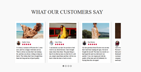
3. Reviews need to feel more authentic
The reviews in the images may make customers feel doubtful, as they can tell these might not be real. You should adjust them to look more genuine, as this will help build trust and encourage more customers to make a purchase.
These are just a few suggestions for improving the UX/UI of your website. I really hope they help you make your site even better and boost your sales. Best of luck!
Cheers,
Tracy
Hello,
Thank yous so much d’or your advices.
Best regards.
Yes, it’s our pleasure to send some little advice to you. You’re doing great with the consistent safe vibe delivered, just some UX modifications more. Keep going ![]()
Hey @Bulletbase ,
Have you tried using tools like Hot Jar or Microsoft Clarity along with your analytics to figure out why people are dropping off?
A lot of the advice in here is great but you can’t just make random changes and hope for the best.
It’s a good idea to take a step back and analyze what people are doing when they get to your store.
@Dotsquares made you a checklist of things you can go through to figure out where customers are dropping off.
Assuming your ads or traffic strategies are targeting the right audience, you need to get a better understanding of what your website visitors are doing once they get to your store.
Also I noticed that your store isn’t live anymore so are you still working on improving it or have you moved on to something else?