Hi!
I have added previous and next buttons to my blog posts (main-article.liquid - Dawn theme). However, I just noticed that they are not displaying well on mobile.
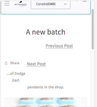
I’d really like to keep them in some form because otherwise the visitor has to navigate ‘back to blog’ each time they want to see another post and my blog posts are very short.
This is the code I added. Perhaps I can adapt for mobile or, if necessary, remove it just from mobile? I’d really appreciate any help with this.
<div>
{% if blog.previous_article -%}
<a
href="{{ blog.previous_article }}"
class="btn"
style="padding-left: 180px; padding-bottom: 40px; float: left; cursor: pointer; display: inline-block; border: none; box-shadow: none; text-decoration: underline; text-underline-offset: 0.3rem; color: rgb(var(--color-link)); background-color: transparent; font-size: 1.8rem; font-family: inherit"
>Previous Post</a
>
{%- endif %}
{% if blog.next_article -%}
<a
href="{{ blog.next_article }}"
class="btn"
style="padding-right: 180px; padding-bottom: 40px; float: right; cursor: pointer; display: inline-block; border: none; box-shadow: none; text-decoration: underline; text-underline-offset: 0.3rem; color: rgb(var(--color-link)); background-color: transparent; font-size: 1.8rem; font-family: inherit"
>Next Post</a
>
{% endif %}
</div>