Hey All  ,
,
I’m using Dawn Theme.
I’ve been trying to achieve this kind of collection grid design. For now it dosent matter if the border goes around the product card or the product picture.
current code in case.css :
@media (max-width: 767px){
slider-component {
padding: 0 !important;
}
ul.product-grid {
column-gap: 0;
row-gap: 0;
}
.card__inner {border: 1px solid #000000 !important;}
current result: URL: https://derstacheldraht.com/
The middle border is thinker than the outer ones because the left and right border combines.
I want to try to only use: border-left or right: 1px solid black; and somehow have it not show on the very edge of the page (marked yellow in ref.) but only in the middle between the two products.
For the top and bottom border i could use a border between sections without padding and only border-top: 1px solid black;.
If you have and lead/idea, please let me know.
Thanks in advance!
Hi @AndreyGutthard ,
You can try this code by following these steps:
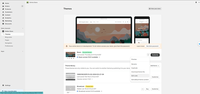
Step 1: Go to Shopify Admin → Online Store ->Theme → Edit code
Step 2: Search file base.css, theme.css or styles.css
Step 3: Insert the below code at the bottom of the file → Save
.collection .grid__item:nth-child(3n + 2) {
    border-left: 1px solid black !important;
     border-right: 1px solid black !important;
  }

  .collection .grid__item {
    border-top: 1px solid black !important;
    border-bottom: 1px solid black !important;
  }

.grid {
   column-gap: 0 !important;
   row-gap: 0 !important;
}
Here is result:
Hope this can help you,
If our suggestions are useful, please let us know by giving it a like or marking it asa solution. Thank you 

1 Like
Hey @BSSCommerce-HDL ,
Thank you for replying so fast.
Im sorry i should have mentioned that I need the design to be optimized for smartphone view. It should have 2 collums
This is the current result with your suggested code:
Idealy she padding on the sides is 0px.
(The code for removing the padding on the sides still works. I just took it out to make sure it’s not messing anything up.)
@media (max-width: 767px){
slider-component {
padding: 0 !important;
Thank you for taking the time so far!
Hi @AndreyGutthard ,
This code for your mobile :
@media only screen and (max-width: 767px) {
  .collection .grid__item:nth-child(2n) {
     border-left: 1px solid black !important;
  }

  .collection .grid__item {
    border-top: 1px solid black !important;
    border-bottom: 1px solid black !important;
  }

  .grid {
   column-gap: 0 !important;
   row-gap: 0 !important;
  }
}
Here is result:
Hope this can help you,
If our suggestions are useful, please let us know by giving it a like or marking it asa solution. Thank you 
1 Like
Thank you so much @BSSCommerce-HDL .
What a great improvemt! 
Current result:
There is still a small gap on the right side. It comes from removing the side padding whit:
@media (max-width: 767px){
slider-component {
padding: 0 !important;
and closing the collum gap to 0 after.
.grid {
column-gap: 0 !important;
the the collum gap just gets pushed to the right side.
If you have any suggestion to remove it, I will be exremely greatfull.
But I can also try myself and open a new discussion on it.
Thank you for all the great help!
![]() ,
,


