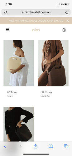
Hello, I have removed the Collection headers and now just need to add a bit of space between the header and the product images so they don’t look so close together.
I’d also like to know how to make the product name and price left aligned instead of centred.
Thanks, Elyse
www.nimthelabel.com.au
1 Like
#shopify-section-collection-template .collection-template{
padding-top:30px;
}
@media only screen and (min-width: 750px){
.card__info {
    padding: 26px 0 !important;
    text-align: left;
}
}
put that code in your theme.scss.css
Hi @elysemiddleton
This is Victor from PageFly - Shopify Page Builder App, I’d like to suggest this idea:
Online Store ->Theme ->Edit code
Assets ->Theme.scss.css
.collection-template {
    margin-top: 20px !important;
}
Hope you find my answer helpful!
Best regards,
Victor | PageFly
I am happy to help you and if my answer has solved your problem, you can mark my answer as solved. Thank you!
They still seem to be centre aligned on the mobile view?
Then update it to the following code
#shopify-section-collection-template .collection-template{
padding-top:30px;
}

.card__info {
    padding: 26px 0 !important;
    text-align: left;
}
Can I also be a pain and ask how to reduce the space between the image and the product name? So they are a little closer together?
#shopify-section-collection-template .collection-template{
padding-top:30px;
}
.card__info {
    text-align: left;
}
@media only screen and (min-width: 750px){
.card__info {
    padding: 26px 0 !important;
}
}
@media only screen and (min-width: 750px){
.card__info {
    padding: 20px 0 !important;
}
}
try this
That didn’t seem to work, its pushed them to the right on the mobile view.
#shopify-section-collection-template .collection-template{
padding-top:30px;
}
.card__info {
    text-align: left;
}
@media only screen and (min-width: 750px){
.card__info {
    padding: 26px 0 !important;
}
}
@media only screen and (max-width: 750px){
.card__info {
    padding: 10px 0 !important;
}
}
Sorry! My problem, try this
yeah that worked on the mobile view. thank you
can we do the same on the desktop view?
Hi @elysemiddleton
I hope you are doing good and welcome to the Shopify Community!
I am Santanu from MS Web Designer (Top Rated Shopify Certified Experts and eCommerce Consultant from Singapore).
Please add this css in your bottom of the css file:
@media only screen and (min-width: 749px) {
.template-collection .collection-template {padding-top: 80px;}
}
Regards,
Santanu
What kind of things do you want to do?
If it’s to reduce the spacing between the image and the product name, you can adjust the padding above:26px 0 !important; to reduce the 26 to 15
@media only screen and (min-width: 750px){
.card__info {
    padding: 15px 0 !important;
}
}
Hello There,
Admin go to online store → themes → actions → edit code
Find Asset >theme.scss.css and paste this at the bottom of the file:
.card__info {
padding: 10px 0!important;
}


