ECO88
October 13, 2021, 7:25am
1
Hi,
I did success to edit the script for the 'add to cart 'button and the row is too close. how can I make the row space in between look neat and nice.
also, how can I do with when click on add to cart it still on the same page and no open to your cart page, please
1 Like
@ECO88
Sorry you are facing this issue, it would be my pleasure to help you.
Welcome to the Shopify community!
Please share your site URL,
1 Like
@ECO88
In your Shopify Admin go to: online store > themes > actions > edit code.
Find Asset > theme.scss.liquid and paste this at the bottom of the file.
.grid__item--1588572906201{padding-bottom: 35px;}
Thanks!
@ECO88
Second solution
In your Shopify Admin go to: online store > themes > actions > edit code.
Find Asset > theme.scss.liquid and paste this at the bottom of the file.
#shopify-section-1588572906201 .product-card+form {
    padding-bottom: 35px;
}
@ECO88
thanks for it
Go to Online Store->Theme->Edit code
Asset->/theme.scss.liquid ->paste below code at the bottom of the file.
.product-card+form {margin-bottom: 50px !important;}
@ECO88
Third solution
In your Shopify Admin go to: online store > themes > actions > edit code.
Find Asset > theme.scss.liquid and paste this at the bottom of the file.
.product-card+form {margin-bottom: 50px !important;}
ECO88
October 29, 2021, 11:30pm
8
Thank you so much, the homepage it ok now the category page is uneven, could you please help
@ECO88
In your Shopify Admin go to: online store > themes > actions > edit code.
Find Asset > theme.scss.liquid and paste this at the bottom of the file.
@media only screen and (min-width: 750px) {
.template-collection .grid-view-item { min-height: 20rem !important;}
}
Thanks!
1 Like
@ECO88
yes please try this code
.product-card__title {display: inline-block; min-height: 50px ;}
.grid-view-item__image-wrapper div {
    padding-top: 100% !important;
}
.grid-view-item__image-wrapper .grid-view-item__image {height: 100%;
    object-fit: contain;}
1 Like
ECO88
October 30, 2021, 8:49am
12
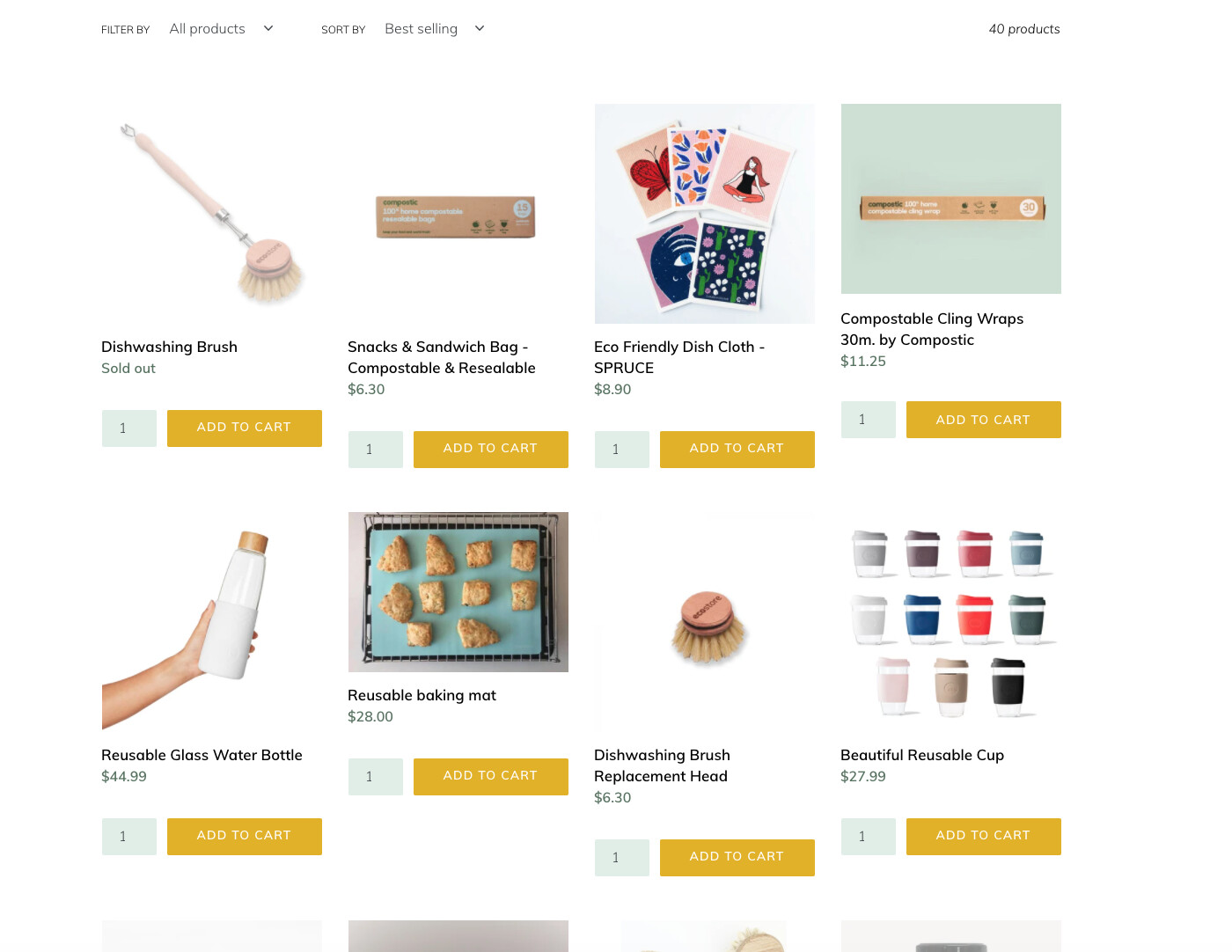
Hi @dmwwebartisan Thank you, It is getting closer to line up but still a bit uneven as the photo.
ECO88
October 30, 2021, 9:26am
13
Hi @KetanKumar I have change this code
@media only screen and (min-width: 1080px) {
from 20rem to 21 rem now it all line up.
Another thing this everything when you click add to cart to take you to the check out page, thing I can do to have the pop up on the side instead so people still can continue shopping while one the page
and our pagespeed score is pretty low do you have anyway to fix it please?
ECO88
October 30, 2021, 9:54am
14
@KetanKumar another question is can photo of the product have the carousel rather than have to click as individual
?
1 Like
ECO88
November 14, 2021, 4:25am
16
@KetanKumar No , I don’t. Do I have to add it anywhere?
ECO88
November 14, 2021, 4:27am
17
Also on the mobile version,
it’s not even looking. Could you please help guide me to fix it please.
1 Like
@ECO88
try this code
@media only screen and (max-width: 749px) {
.product-card+form input {
    width: 64%;
}
.product-card+form input#quantity {
    width: 34%;
    padding: 8px 4px;
font-size: 9px;
  }
.product-card {min-height: 236px;}
}