Hello,
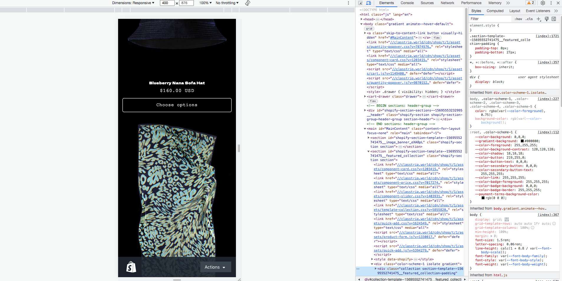
I’m having some trouble with the way my product images are displayed and aligned on the homepage. As you can see there is a massive gap between the product name of the bucket hat and the choose options button.
I have been informed that to manually adjust the gap, this will require an expertise with coding and wanted to see if anyone could help me with that! Thank you!
@Sangeetanahar here you go - but it’s currently password protected.
https://classtrip.world/
How about this? @Sangeetanahar would this be helpful?
@mandysuen ,
Step 1. Go to Admin → Online store → Theme > Edit code
Step 2. Find the file theme.liquid.
Step 3. Add this code above tag
Result
Hi @mandysuen
Check this one.
From you Admin page, go to Online Store > Themes
Select the theme you want to edit
Under the Asset folder, open the main.css(base.css, style.css or theme.css)
Then place the code below at the very bottom of the file.
.card__content {
    flex-grow: 0;
}
.card:not(.ratio) {
    display: flex;
    flex-direction: column;
    height: 100%;
    gap: 10%;
    justify-content:flex-end
}
And Save.
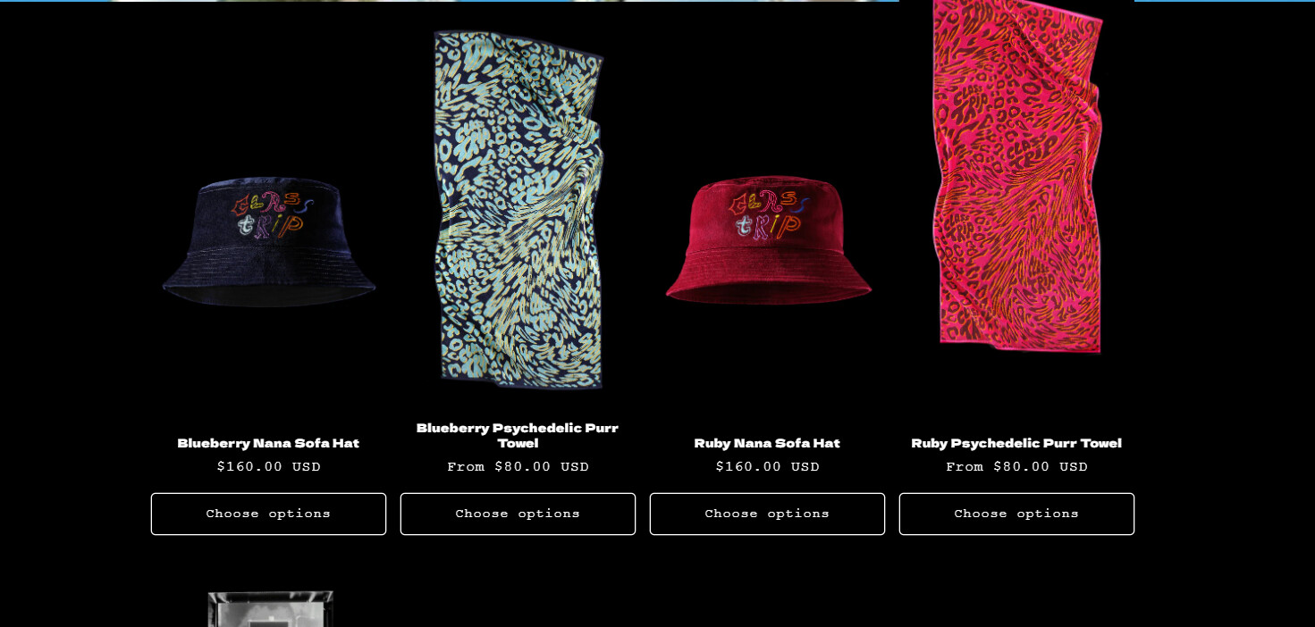
Result:
Please don’t forget to Like and Mark Solution to the post that helped you. Thanks!
Hi @Made4uo-Ribe
The above is not working. Screen capped what I have added to see if I’m doing something wrong?
@BSSCommerce-B2B this has worked but what if I want to also move the hats?
@mandysuen , you want to move it to bottom or center?
@mandysuen , change the previous code like this
Result:
@mandysuen , change the code like i mention below