Hello,
how can make product image in left side in large screen. Like this
right now

Url: https://www.zisthi.com/
pass:Zisthi0206
Goal: Move product thumbnails to the left of the main product image on desktop in Shopify’s Dawn theme.
What was done: A helper provided custom CSS (added at the end of the theme’s main/base/style CSS file) that, on screens ≥749px, converts the product media area to a two-column CSS grid, places the main slider in the right column, and stacks the thumbnail list vertically in the left column.
Result: Layout change works, but a new issue appears—image/gallery height mismatch causes the product media area to exceed the main image height, leaving excess whitespace/spacing.
Additional input: Another participant linked a YouTube tutorial showing how to place thumbnails on the left; no direct code fix for the new spacing/height problem was provided.
Status: Partially resolved. Thumbnails are now left-aligned, but the height/spacing issue remains unresolved and needs further CSS adjustments (e.g., constraining gallery/thumbnail column height or alignment). Screenshots are central to understanding the visual issue.
Hello,
how can make product image in left side in large screen. Like this
right now
Url: https://www.zisthi.com/
pass:Zisthi0206
Hi @Sohan2198
check this one.
From you Admin page, go to Online Store > Themes
Select the theme you want to edit
Under the Asset folder, open the main.css(base.css, style.css or theme.css)
Then place the code below at the very bottom of the file.
@media only screen and (min-width: 749px){
media-gallery[data-desktop-layout="thumbnail_slider"] {
    display: grid;
    grid-template-columns: .5fr 2fr;
    gap: 10px
}
slider-component.slider-mobile-gutter {
    grid-column: 2;
}
.product--thumbnail_slider .thumbnail-slider {
    display: grid;
    grid-template-columns: auto;
    grid-column: 1;
    grid-row: 1;
    align-self: baseline;
}
.thumbnail-slider .thumbnail-list.slider--tablet-up {
    height: auto;
    flex-direction: column;
    justify-content: center;
}
.product--small .thumbnail-list.slider--tablet-up .thumbnail-list__item.slider__slide {
        width: 80%;
}
    }
And Save.
Result:
Please don’t forget to Like and Mark Solution to the post that helped you. Thanks!
@Made4uo-Ribe
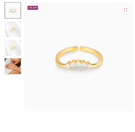
Your code is working fine but the we are face one more problem. The product image cross the main product image height. create lot of space.
please check and resolve.
You can display in the left side the thumbnail images:


