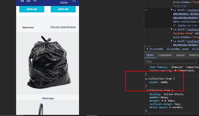
I’m using Shopify theme and on mobile view collection list shows horizontally. I want to make the collection list vertical instead of horizontal showing 3 collections and a button to expand to see the rest of the collections.
Thank you in advance.
Store URL: https://www.ozonzone.com/
The second section is the collection list.
Hello @Digital_Imran
Its Artzen Technologies! We will be happy to help you today.
Follow the below steps to solve the issue:-
- Go to your Online Store
- Edit Code
- Find base.css file
- Add the following CSS at the bottom of the file
5.) Save the File
@media screen and (max-width: 768px) {
.collection-list {
    display: flex;
    flex-direction: column;
    width: 100%;
    align-items: center;
}
a.collection-item {
    width: 100%;
}
}
These simple CSS will solve your problem.
Let me know if need further assistance
Regards,
Artzen Technologies
Thank you @Artzen_tech for the solution. It looks large on the phone. Can I make it two collections per row?
Hello @Artzen_tech Any solution


