Hi there,
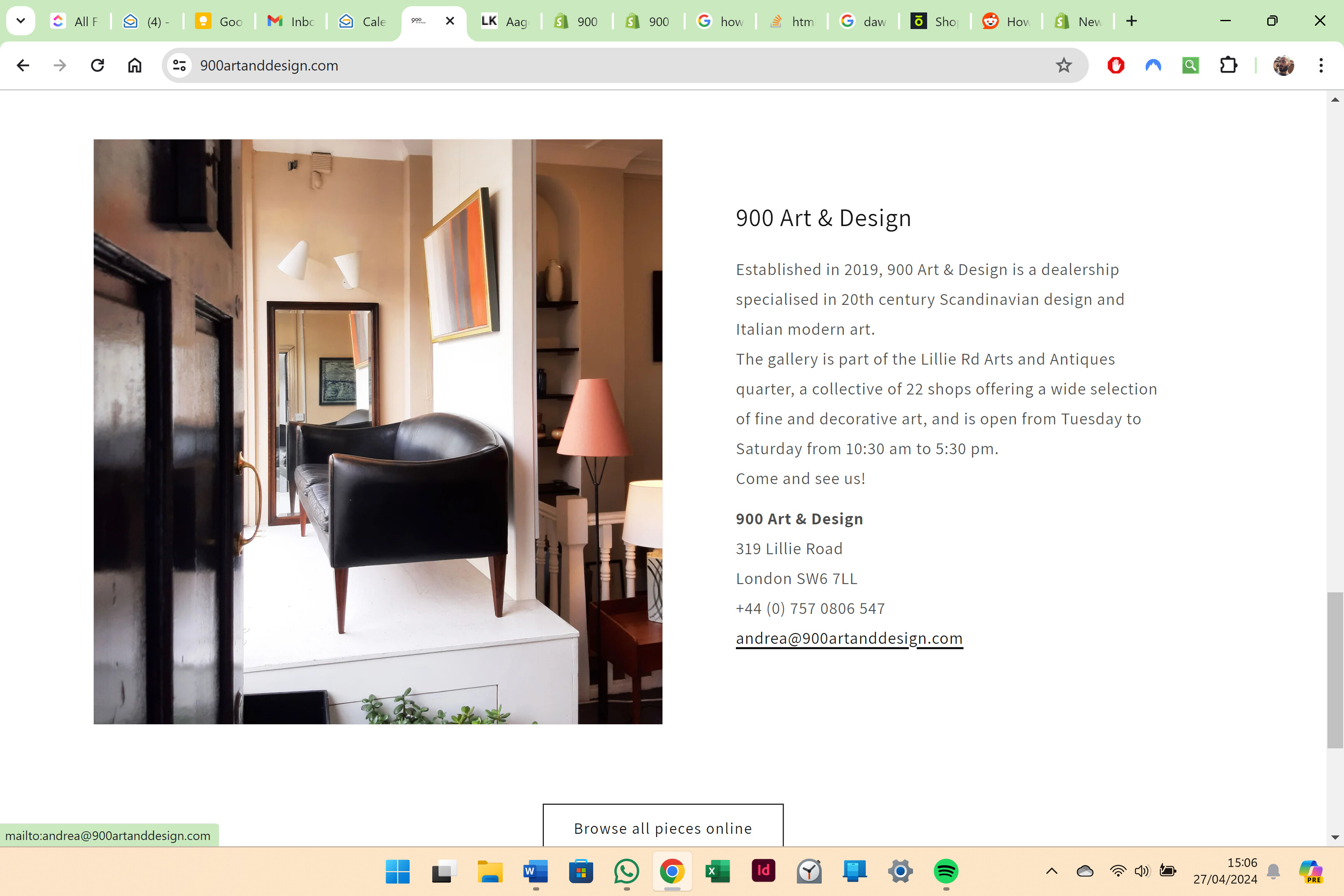
I have a problem with the last section of the home page of the website, it’s a ‘Image with text’ section and I would like to reduce the left margin on mobile only and the top margin on desktop only, see screenshots below. There aren’t options to control this spacing on the editor, so I think I would need to add some code. Any suggestions?
I used Dawn theme 12.0.0, below the link to my website:
https://900artanddesign.com/
2 Likes
@Andrecolap
oh sorry for that issue can you please try this code
- Go to Online Store->Theme->Edit code
- Asset->/component-image-with-text.css ->paste below code at the bottom of the file.
@media (max-width: 749px) {
.image-with-text__content {
    padding-left: 0;
    padding-right: 0;
}
}
Hi @Andrecolap
Check this one.
From your Shopify admin dashboard, click on “Online Store” and then “Themes”.
Find the theme that you want to edit and click on “Actions” and then “Edit code”.
In the “Assets” folder, click on “base.css, style.css or theme.css” file, depending on which file your theme uses to store its CSS styles. At the bottom of the file, add the following CSS code:
.image-with-text__content {
    padding-top: 2rem;
}
@media only screen and (max-width: 749px){
.image-with-text__content {
    padding-left: 2rem;
}
}
And Save.
Result:
Note: You can adjust the padding size you like.
Please don’t forget to Like and Mark Solution to the post that helped you. Thanks!
hello @KetanKumar
Thanks for your message.
That worked for the mobile version, thank you, but didn’t work on the desktop, where I would still like to get rid of the top margin above the title and align it to the picture to the left (see screenshot below). Any idea?
hello @Made4uo-Ribe
I tried to paste this in base.css but didn’t work.
Thank you anyway
Try to paste in component-image-text-with-text.css.
And Save. Thanks!
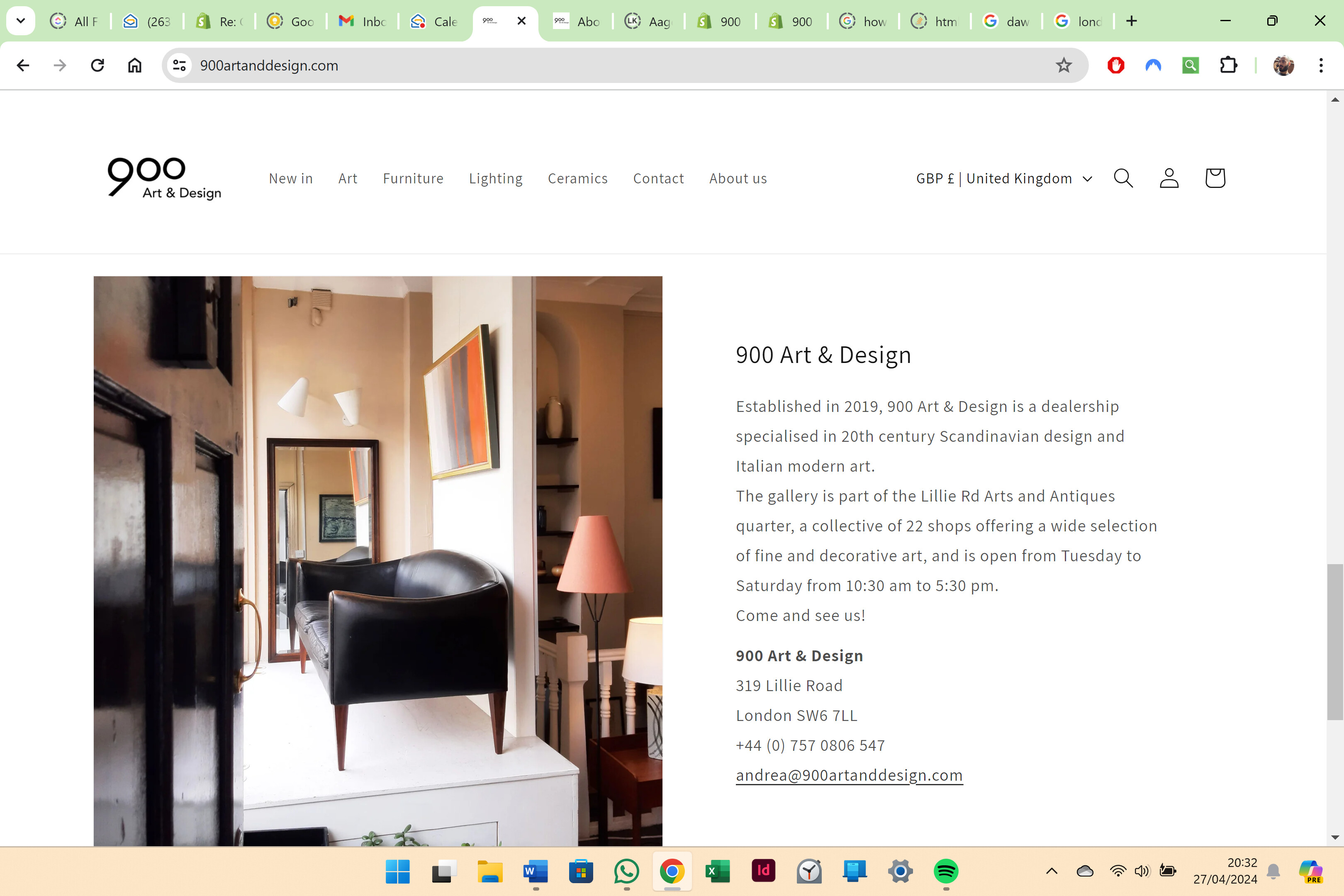
Thank you @Made4uo-Ribe
That works well, I adjusted the padding size and I think now it is better than before.
Thank you
1 Like