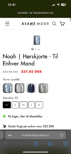
Hi,
Can someone help me please with the next case? I did some research and tried some offered solutions, but none of them worked for me.
I want to centre the Newsletter Form at the footer on the mobile version. On the desktop version it’s placed on the left and that’s fine. But the mobile version is ugly.
And i want it like this:
This is my webshop: https://asam-e.com/.
Can someone please help me?
Hello @BettoM14
You can add code by following these steps
-
Go to Online Store → Theme → Edit code.
-
Open your theme.liquid file
-
Paste the below code before on theme.liquid
@media screen and (max-width: 767px) {
.footer-block__details-content {
display: flex !important;
flex-direction: column;
justify-content: center;
align-items: center;
}
.footer-block.grid__item {
margin: unset !important;
}
.footer__blocks-wrapper {
width: 100% !important;
}
.grid--1-col .grid__item {
max-width: 100% !important;
width: 100%;
display: flex !important;
justify-content: center;
align-items: center;
flex-direction: column;
}
.footer-block--newsletter {
width: 100% !important;
margin-top: unset !important;
}
}
Was my reply helpful? Click Like to let me know!
Was your question answered? Mark it as an Accepted Solution.
1 Like
Hi @niraj_patel
I marked it as solution, but it gave me troubles viewing my product pictures on the product page. It was like this:
And the picture of a other collection dissapeared as well. Do you maybe have an other solution?
But I only gave you the footer adjustment code which was not related to any collection, maybe it is happening due to some other code.
Nope, just tested it again and the same problem came forward. Is it maybe because it is in combination with another code?
This also happend because i used your code:
Replace code with this
You can add code by following these steps
-
Go to Online Store → Theme → Edit code.
-
Open your theme.liquid file
-
Paste the below code before on theme.liquid
@media screen and (max-width: 767px) {
#shopify-section-sections--22981104140630__footer .footer-block__details-content {
display: flex;
flex-direction: column;
justify-content: center;
align-items: center;
}
#shopify-section-sections--22981104140630__footer .footer-block.grid__item {
margin: unset !important;
}
#shopify-section-sections--22981104140630__footer .footer__blocks-wrapper {
width: 100% !important;
}
#shopify-section-sections--22981104140630__footer .grid--1-col .grid__item {
max-width: 100%;
width: 100%;
display: flex;
justify-content: center;
align-items: center;
flex-direction: column;
}
#shopify-section-sections--22981104140630__footer .footer-block--newsletter {
width: 100% !important;
margin-top: unset !important;
}
}
Was my reply helpful? Click Like to let me know!
Was your question answered? Mark it as an Accepted Solution.
1 Like
Yes, this is the one. Thanks again! 
1 Like


