Hey,
I want to move the text in the picture slideshow on mobile (Dawn Theme). But whenever I change the padding in the CSS code, the background image also gets bigger. Am I doing something wrong?
My website is: https://meme.london
Hey,
I want to move the text in the picture slideshow on mobile (Dawn Theme). But whenever I change the padding in the CSS code, the background image also gets bigger. Am I doing something wrong?
My website is: https://meme.london
Hi @annamichielan ,
Please go to Actions > Edit code > Assets > base.css file and paste this at the bottom of the file:
@media screen and (max-width: 749px) {
.slideshow__text.banner__box {
    min-height: 39rem;
    justify-content: flex-start;
}
.slideshow__text.banner__box .banner__buttons {
margin-top: 12rem;
}
}
Hi,
Thank you for your response. Unfortunately, the layout didn’t seems to change at all 
Hi @annamichielan ,
Please change code:
@media screen and (max-width: 749px) {
  .slideshow__text.banner__box {
    min-height: 39rem !important;
    justify-content: flex-start !important;
  }
  .slideshow__text.banner__box .banner__buttons {
    margin-top: 12rem !important;
  }
}
it will display like this:
Hi Namphan,
sorry I wasn’t clear.
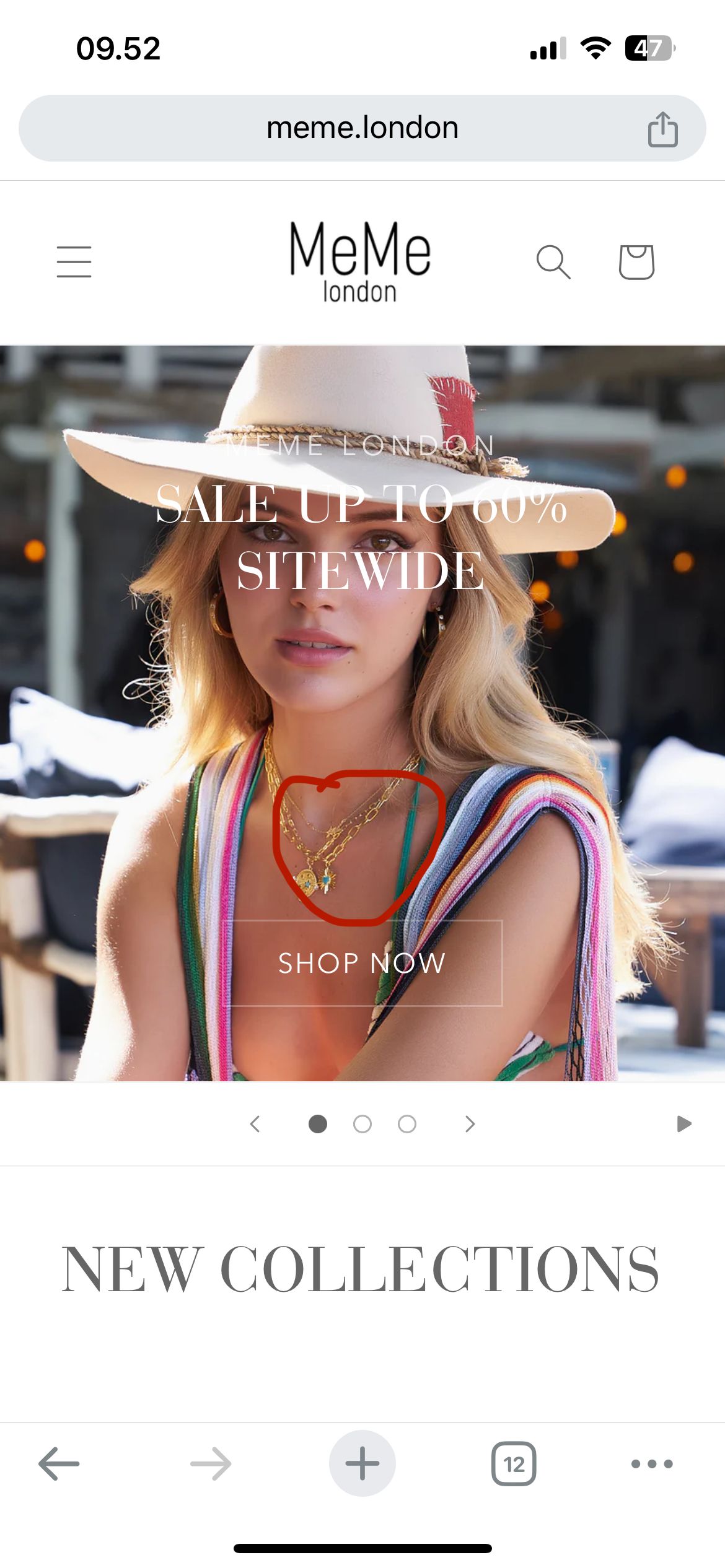
I meant I would like the “meme london sale up to 60% sitewide” to be on the location marked 
Thank you 
Hi @annamichielan ,
Please change code:
@media screen and (max-width: 749px) {
  .slideshow__text.banner__box {
    min-height: 39rem !important;
    justify-content: flex-end !important;
  }
  .slideshow__text.banner__box .banner__buttons {
    margin-top: 3rem !important;
  }
}
That’s perfect! Thank you so much