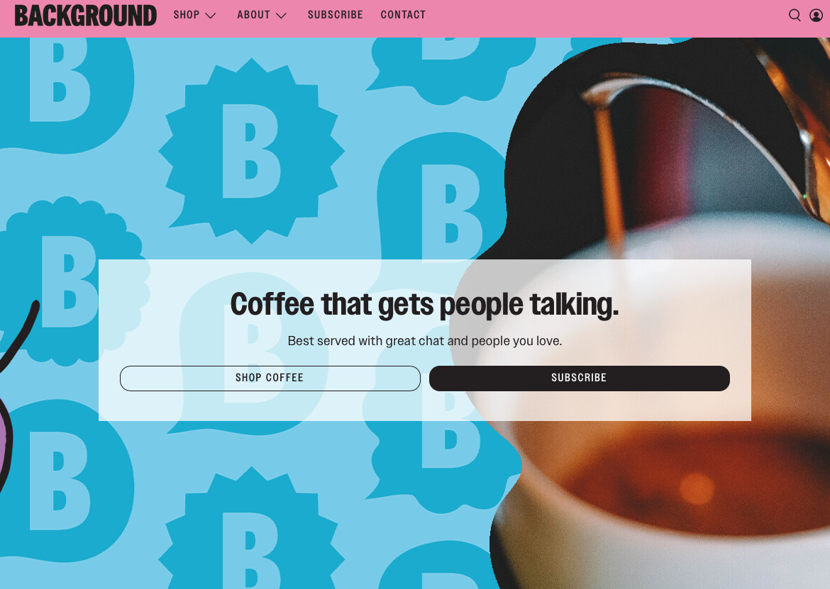
Does anyone know how I can change the size of these 2 buttons on the top of my website (first image - shop / subscribe) I want them to fit the text more like the other buttons on website do (second image)

Hi!
Could you post the URL to your store and I’ll take a look for you 
1 Like
@WoodyDev yes sure! it’s: bitofbackground.com
Thanks
Awesome!
Add these to the bottom of your styles.css file:
.button--secondary, .action_button--secondary, a.button--secondary.button {
    max-width: 20% !important;
    margin: 0 auto !important;
}

.button--primary, a.button--primary.button {
    max-width: 20% !important;
    margin: 0 auto !important;
}
1 Like

Please add below css code in bottom of assets/styles.css file
.image-with-text-overlay__buttons {
justify-content: center;
}
.image-with-text-overlay__buttons .button {
flex: none;
margin: 0 5px !important;
}
Thank you.
No problem!
Replace the previous code with these:
.button--primary, a.button--primary.button {
    max-width: 20% !important;
    margin: 0 auto !important;
    margin-left: 100px !important;
}

.button--secondary, .action_button--secondary, a.button--secondary.button {
    max-width: 20% !important;
    margin: 0 auto !important;
    margin-right: 0 !important;
}
1 Like


Try this:
@media only screen and (min-width: 750px){
.button--primary, a.button--primary.button {
    max-width: 20% !important;
    margin: 0 auto !important;
    margin-left: 100px !important;
}

.button--secondary, .action_button--secondary, a.button--secondary.button {
    max-width: 20% !important;
    margin: 0 auto !important;
    margin-right: 0 !important;
}
}

@media only screen and (max-width: 749px){
.button--primary, a.button--primary.button {
    max-width: 100% !important;
    margin: 0 auto !important;
    margin-left: 100px !important;
}

.button--secondary, .action_button--secondary, a.button--secondary.button {
    max-width: 100% !important;
    margin: 0 auto !important;
    margin-right: 0 !important;
}
}