Hey guys,
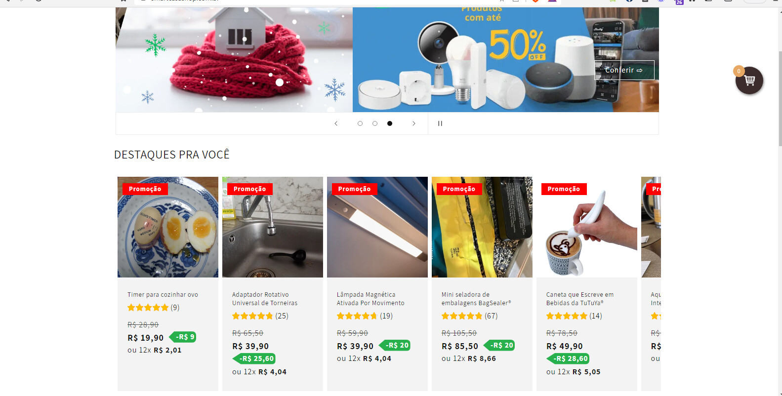
Can anyone help me with this problem? I set the maximum number of products to be shown in the carousel to 5. However, I wouldn’t want the sixth product to show halfway, and also for the margins to align with the size of the session banner. How do I adjust this? Both on desktop and mobile. Thanks!
My URL: smartcasashop.com.br
@Danielpochapski add below css into base.css file
.collection.section-template--18972734619962__featured_collection-padding {
    width: 70% !important;
    margin: 0 auto !important;
}
@Ujjaval thanks for you response.
Howerver, this code only works on mobile. On desktop, this does not work
@Danielpochapski by adding below css you can center it
@media (min-width:725px)
{
.collection.section-template--18972734619962__featured_collection-padding {
    width: 85%;
}
.collection__title.title-wrapper--self-padded-tablet-down {
    margin-left: 14%;
}
}