Hi,
I’m trying to make the gap between my collection cards smaller but can’t find a solution. The collections scroll and will be similar to the buttons on Instagram for stories or highlights.
Do you know how to make them closer together? I have custom CSS already running on them to make them the shape and size.
I’ve looked around on the community but I can’t seem to find an answer for this.
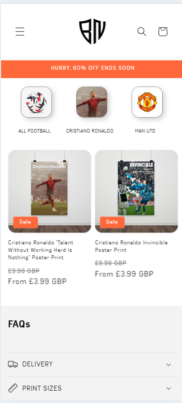
Screenshot below is how it would look on mobile, ignore the grey border.
Thanks!
1 Like
Hello @SilentWizard .
Our team is ready to help you.
Please share your website address and access password (if necessary) so that we can check and assist you.
1 Like
Hi, the current address is sent to you
- Here is the solution for you @SilentWizard
- Please follow these steps:
- Then find the base.css or theme.css file.
- Then add the following code at the end of the file and press ‘Save’ to save it.
@media only screen and (max-width: 600px) {
.collection-list__item {
 min-width: 28% !important;
}
.collection-list__item .card__inner {
     width: 60% !important;
}
}
- Here is the result you will achieve:
- Please press ‘Like’ and mark it as ‘Solution’ if you find it helpful. Thank you.
1 Like
That’s so much better, thank you! Is there a way to make the extra icons ‘peek’ from the right to indicate there are more available?
1 Like
If you want like this.
change 28% to 27%
@media only screen and (max-width: 600px) {
.collection-list__item {
 min-width: 27% !important;
}
.collection-list__item .card__inner {
     width: 60% !important;
}
}
1 Like
Thank you for all your work!
1 Like
Glad to help you. Have a good day.