Hi,
I’m looking to reduce the thickness of my store header on mobile only. I’d like it to be the same thickness as this example from a store called ‘Magnitone’.
My site link - https://lavishlab.co.uk/
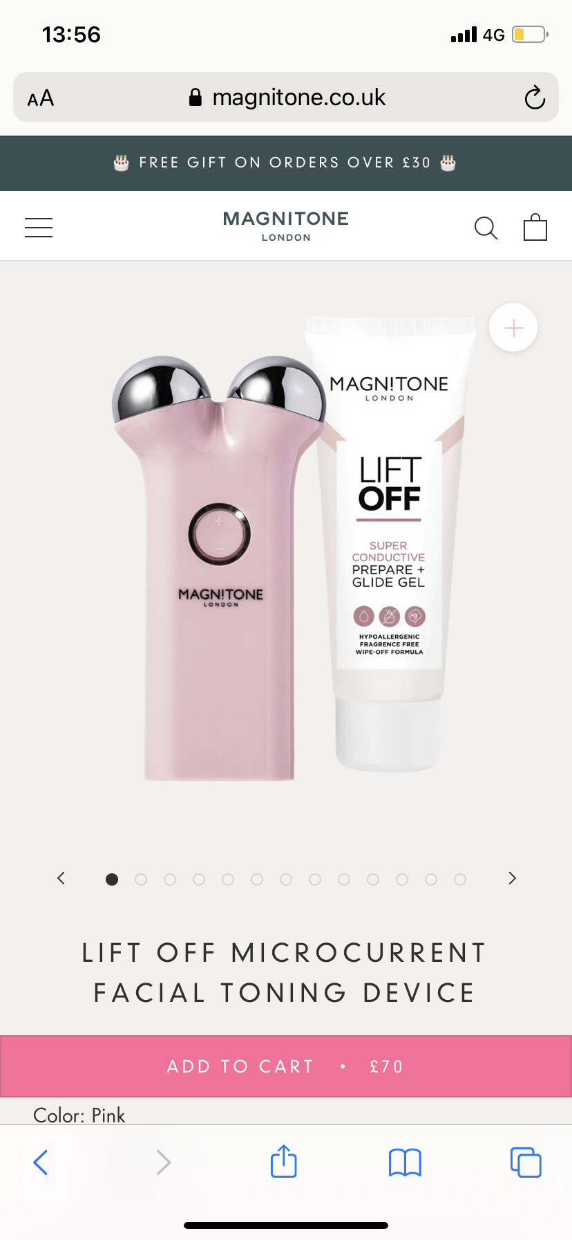
Example:
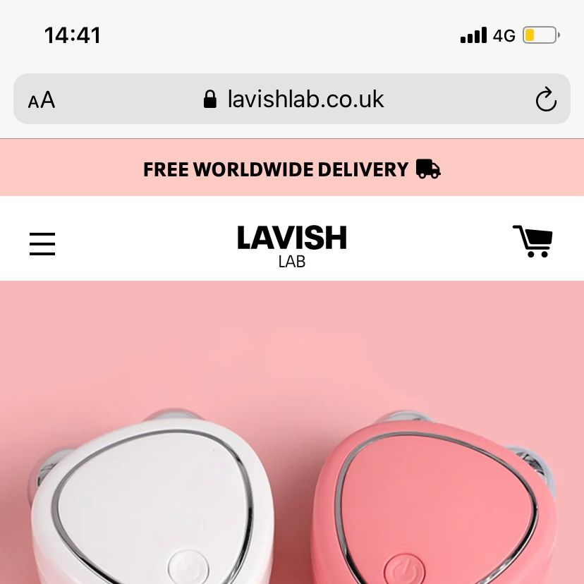
My store:
Hi,
I’m looking to reduce the thickness of my store header on mobile only. I’d like it to be the same thickness as this example from a store called ‘Magnitone’.
My site link - https://lavishlab.co.uk/
Example:
My store:
Hey @SlickTok ,
Welcome to the Shopify community!
You can follow the instruction below:
please add this to your CSS file.
@media only screen and (max-width: 768px) {
  .site-header .grid--table {
      height: 60px !important;
  }
.cart-link  {
    padding: 0 15px !important;
}
.main-content {
    padding-top: 109px !important;
}
.site-header__logo img {
    margin-bottom: 0 !important;
}
}
If you feel like my answer is helpful, please Like and mark it as a solution. Let me know if you have any further questions.
Thank you!
Raman
Hi @ReturnPrime , this is looking great.
When at the top of the homepage it’s centrally alligned quite nicely. However, if you scroll down the cart, burger menu and logo are no longer centrally alligned. This is the same on my product page, even when at the top of the page.
See screenshots below. As you can see in the first photo. The icons and logo seem to be closer to the bottom of the header, rather than in the centre. Whereas the last screenshot it appears perfectly in the middle.
Could you help with this?
Thanks so much. 