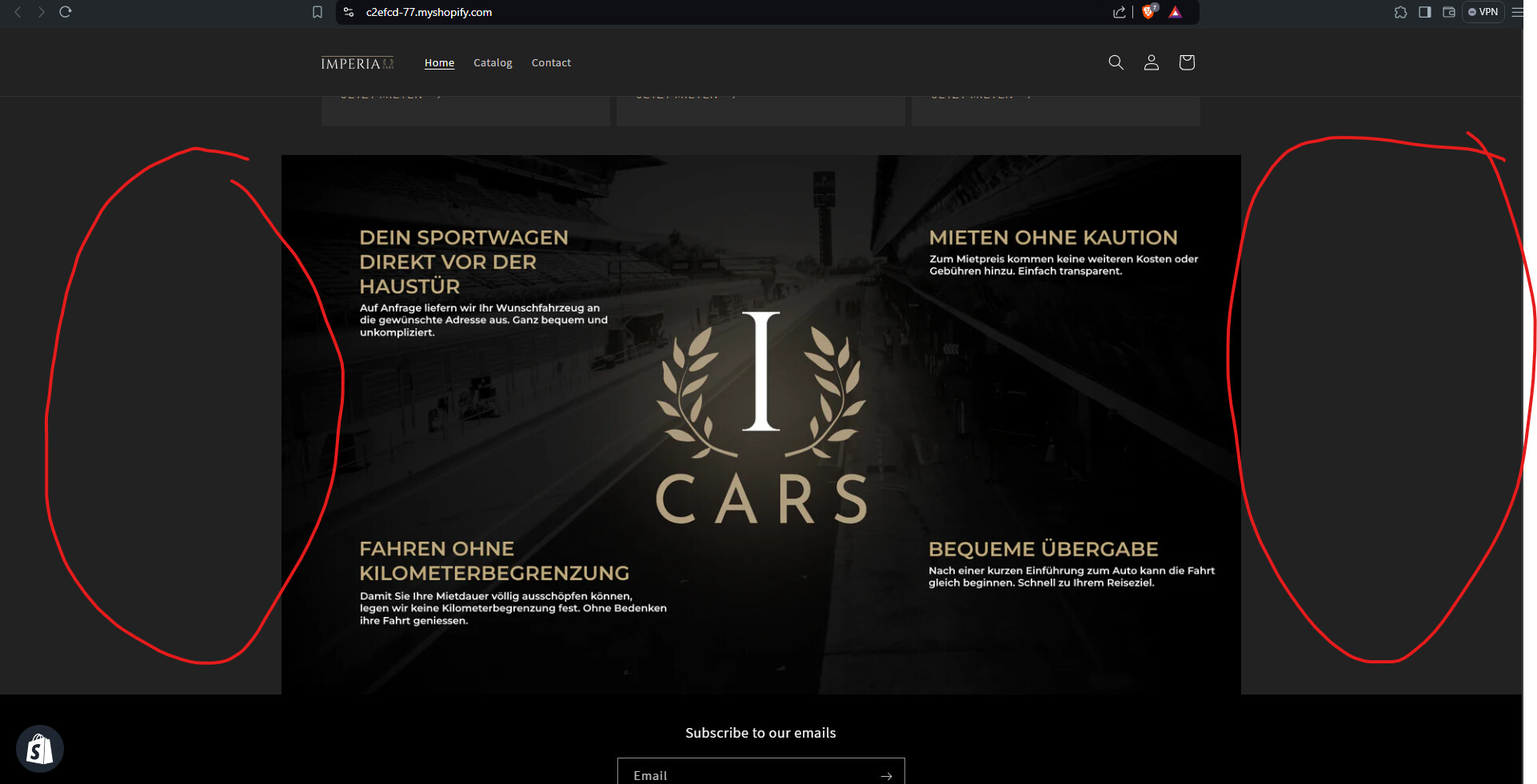
can someone help with? i want my image in collage fit the whole screen in width on mobile and on pc.
I use the theme dawn
https://c2efcd-77.myshopify.com/
password: 123
can someone help with? i want my image in collage fit the whole screen in width on mobile and on pc.
I use the theme dawn
https://c2efcd-77.myshopify.com/
password: 123
Hi @LeuchTii1337 ,
Please go to Actions > Edit code > Assets > base.css file and paste this at the bottom of the file:
.section-template--23331434168650__collage_VF4rXR-padding {
    padding: 0;
    max-width: none;
}
Hi @LeuchTii1337 ,
Step 1: Go to Shopify Admin → Online Store ->Theme → Edit code
Step 2: Search file theme.liquid
Step 3: Insert this code above tag:
Here is result:
Hope this can help you,
If our suggestions are useful, please let us know by giving it a like or marking it as a solution. Thank you 
Hi @LeuchTii1337 ,
If you have any questions, you can contact me directly.
Nice to meet you 
that worked thx but there is a quality loss on the image why?
Step 1: Go to Shopify Admin → Online Store ->Theme → Edit code
Step 2: Search file theme.liquid
Step 3: Insert this code above tag:
Here is result:
Hope this can help you, If our suggestions are useful, please let us know by giving it a like or marking it as a solution. Thank you
.section-template--23331434168650__collage_VF4rXR-padding {
        padding: 0 !important;
        max-width: 100% !important;
    }
it worked but there is a massive quality loss why?
Hi @LeuchTii1337 ,
I have checked and the image is responsive to the browser width, so if you want to display the exact size, please send me the code of the collage.liquid file, i will guide you to change it
Because all the instructions stretch the image, forcing a change to it’s aspect ratio.
Either add a larger width image, or the above styles need to be adjusted to change the background attachment type, or other methods to avoid resolution issues.