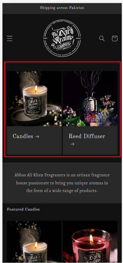
Hello i have a collection list on my home page and i want to significantly reduce the size of the images for the two collections so that they are displayed side by side on the mobile rather than on top of each other.
My you URL, www.thedarkrealmcandles.com the collects are candles and diffusers
Thanks
Abby
1 Like
Hi @finalecho ,
Go to Assets > base.css and paste this at the bottom of the file:
@media screen and (max-width: 749px){
.collection-list .collection-list__item {
    width: calc(50% - 3rem) !important;
}
}
Hope it helps!
Hi @finalecho
Please follow these steps:
- Open the code editor: Online store > Themes > Edit code

- Find the file “base.css” and paste the following code at the bottom of the file and save:
.grid--1-col .grid__item {
    max-width: calc(50% - var(--grid-mobile-horizontal-spacing) / 2) !important;
}
- Go back to your site and see the results
I hope that it works for you.
1 Like
That worked like a charm, than you so much
Abby
Is there a way to get rid of the arrows after candles and diffusers and also reduce the height of the blocks that say candles and diffusers? Also Maybe even reduce the font size by 3 points
Also Now there is another problem this new code has messed up 2 text and image block below on the home page on the mobile . for which i want the text to be below the image not on the side. on the laptop its fine to be side by side but on the moble the text should be below the image
The alignment for the Quick links is also out now, the links should be left aligned but the are placed in the center now
Hi @finalecho ,
You just need to add the code according to my first tutorial, it will work fine and not affect the other sections.
Hope it helps!
Hi thats exactly what i did, but let me try again
1 Like
Hi @finalecho ,
Can you add the code, if it doesn’t work please keep the code, I will check it for you
Hi @finalecho
In the previous comment, we skipped your product page. So we would like to give you a solution to fix it and suggestions for your next requirements.
- For the first request, please follow these steps:
-
Go to Edit Code like the steps we guided
-
In the file ‘base.css’, replace the old code:
.grid--1-col .grid__item {
    max-width: calc(50% - var(--grid-mobile-horizontal-spacing) / 2) !important;
}
by the following code:
.collection-list .collection-list__item {
    max-width: calc(50% - var(--grid-mobile-horizontal-spacing) / 2) !important;
}
For your next requirements, please follow these steps:
- Hide the arrow and reduce the height of the blocks.
In the file “base.css”, please add the following code at the end of the file:
.collection-list__item .icon-wrap {
display: none;
}
.collection-list__item .card__content {
padding: 0;
}
I hope that it will work for you.
Hello, i added all of these codes but its making no difference to anything.
Hi @finalecho ,
Please go to Actions > Edit code > Assets > section-collection-list.css file and paste this at the bottom of the file:
@media screen and (max-width: 749px){
  .collection-list .collection-list__item {
    width: calc(50% - 3rem) !important;
  }
}
it will work fine