I need assistance with coding (I believe) my womens collection page.
I would like the collection list at the top of the page to remain in a grid (possibly 2 across) while on mobile. It currently auto changes to only 1 and the customer needs to scroll through all.
The website I am using as a model - their collection lists adjust from 5 across on desktop to 2 across on mobile. How can I do this? Mine currently is only 1 across and it is lengthy for the customer to scroll.
My website URL: www.gloriapatricollective.com
3 images attached
1- The website on mobile that I want to model mine by
-
My mobile view currently
-
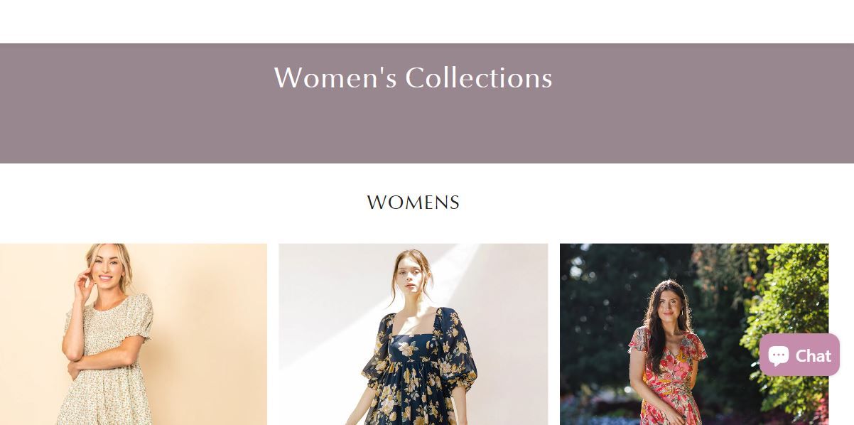
My desktop view currently
-
Here is the solution for you
-
Please follow these steps:
-
Then find the theme.css file.
-
Then add the following code at the end of the file and press ‘Save’ to save it.
.collection-loop__item {
 grid-column: auto / span 6 !important;
}
- Here is the result you will achieve:
- Please press ‘Like’ and mark it as ‘Solution’ if you find it helpful. Thank you.
Thanks for your quick response! It unfortunately isn’t working. It is still only one across on mobile.
To clarify on mobile view, I would like it to show 2 collections lists side by side. The desktop view requires no change, I would like it to show 3 or 4 across.
Thank you!
At the moment, I still haven’t seen you successfully add the code to the theme.css file. Could you try again so I can check?
Certainly - it has been added. The file is “06/22 NEW BASED ON AUDIT” not on my live site.
To clarify, I am looking to make this change on my “womens page”, not the homepage.