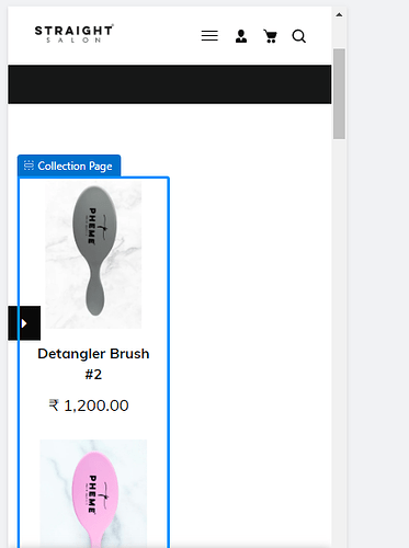
Hi, my collection page is showing the products 1 by 1 (refer image 1) in mobile. I need 2 products in a row (refer image 2) in collection page. Currently, I did a custom CSS in home page so I got what I wanted there but collection page seems different.
I tried following code but shrink the whole page (refer image 3)
@media only screen and (max-width:500px) {
.collection-grid {
width: 50%;
} }
Need help, thanks in advance.
Website link - https://straight-studio.com/collections/hair-care
I am using Savon theme.
Theme Link - https://savon-theme.myshopify.com/
image 1
image 2
image 3


