Hello Everyone!
I am using the Shopify dawn theme. I want to keep the Country/Region and Language on the same line in the footer section in mobile mode. Is it possible? Please help me. Thank you.
URL: https://puppies-paws-shop.myshopify.com/
Password: Admin
1 Like
Hi @dreamtechzone_5
Do you mean align in the left? Like this.
if it is check this one.
From your Shopify admin dashboard, click on “Online Store” and then “Themes”.
Find the theme that you want to edit and click on “Actions” and then “Edit code”.
In the “Assets” folder, click on “base.css, style.css or theme.css” file, depending on which file your theme uses to store its CSS styles. At the bottom of the file, add the following CSS code:
@media only screen and (max-wdith: 376px){
.footer__column.footer__localization.isolate {
    justify-content: left;
}
}
And Save.
Please don’t forget to Like and Mark Solution to the post that helped you. Thanks!
1 Like
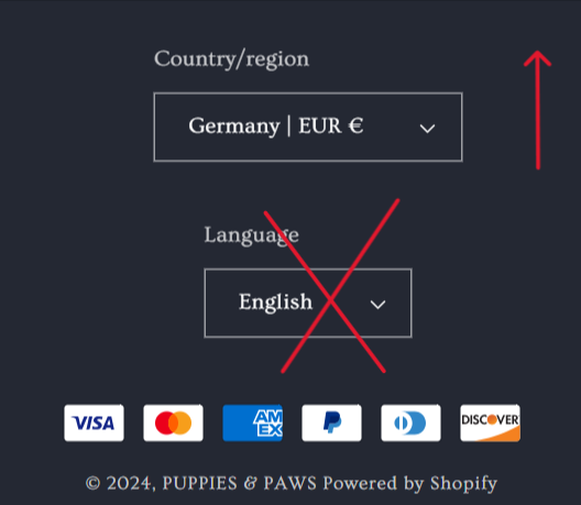
I want to keep the language box on top in mobile mode.
Okay, you said same line. And you showing different instruction now. Like this?
If not like this would you mind to give us clear decription want do you like? Thanks!
1 Like
Thank you. Can country/region and language be kept like this in mobile mode?
Oh you like same on the desktop and higher screen size. We can do that but youll have a problem on more smaller screen size.
The size of this screen in mobiles is 376px its is where is started the language go down. We can continue like that but when the screen size goes to 280px;
it will be like this.
Going on smaller sizes.
Here is the code is used.
@media only screen and (max-width: 376px) {
.footer__localization {
    flex-wrap: nowrap;
}
And Save.
Please don’t forget to Like and Mark Solution to the post that helped you. Thanks!
1 Like