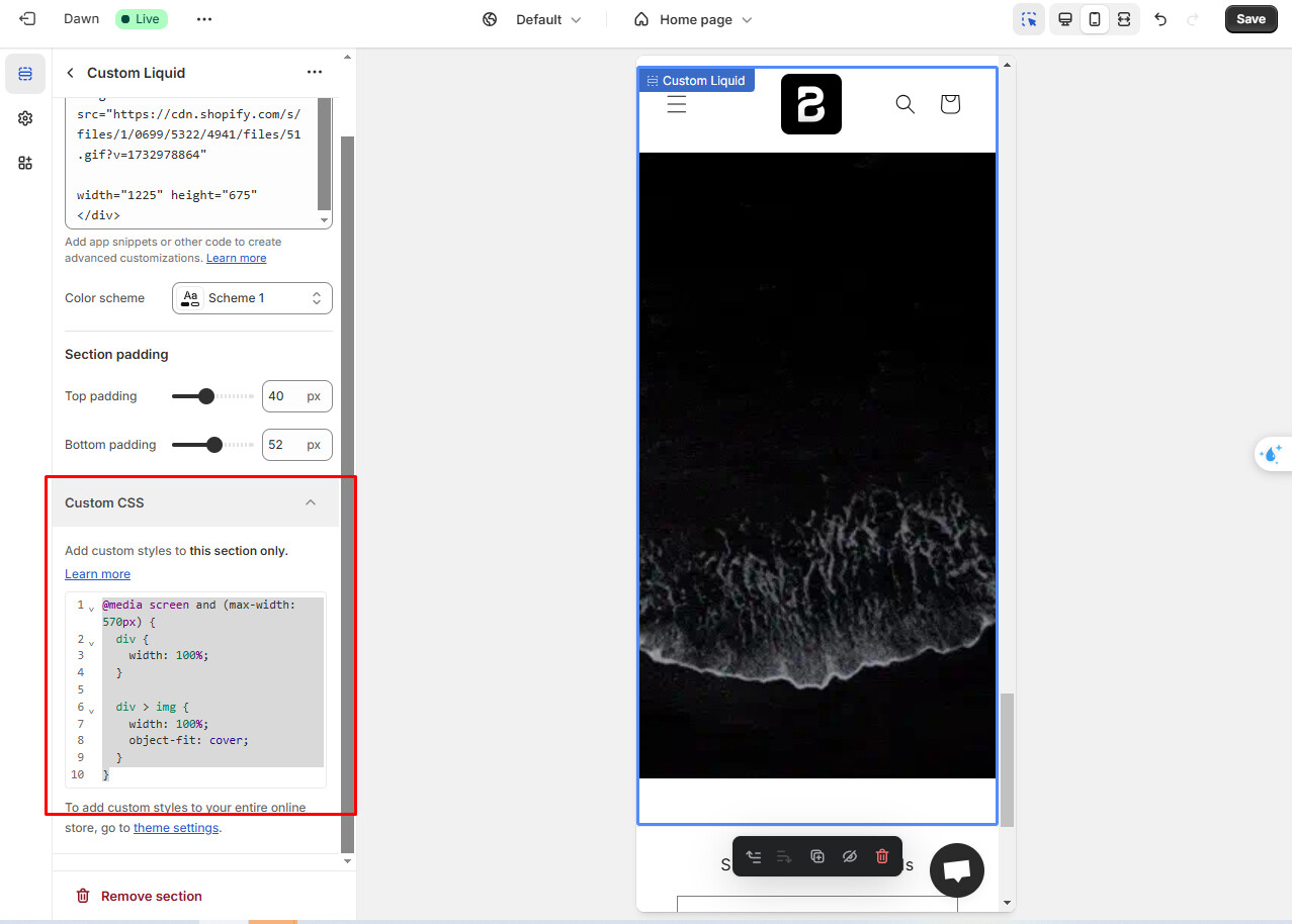
I’m currently using the Dawn theme for reference and I’ve added a custom liquid GIF on my home page, here is the custom CSS code for it:
<img src="[https://cdn.shopify.com/s/files/1/0699/5322/4941/files/51.gif?v=1732978864](https://cdn.shopify.com/s/files/1/0699/5322/4941/files/51.gif?v=1732978864)"
width=“1225” height=“675”
It works correctly on the desktop layout but whenever I switch towards the mobile layout, or preview the website on my mobile phone; the GIF doesn’t automatically adjust in size. I’ve attached a small picture here to show what I’m dealing with.

If needed, I can share my website link to give more insight as to what I’m having issues with.