I have Dawn theme and the footer on mobile puts the newsletter signup out of place that causes the screen to stretch. Can it be made smaller or moved to under the links but above the social icons?
Hi @thediybride
Can you please provide your store URL and password as well if applicable, so that I can provide you solution that can work for you.
Best regards
Sahil
Hi @thediybride Please follow the steps so that you can design the Newsletter.
First you need to remove this code in base.css file.
.footer__content-top.page-width {
    display: flex;
}
Just search this code and remove it.
and now you need to add this code.
@media only screen and (max-width: 600px) {
h2.footer-block__heading.inline-richtext {
    text-align: left !important;
}
}
If you are not sure where is your base.css file please follow the steps:
- Login in shopify admin.
- Click on the Online Store.
- Then click on the button next to Customize in Refresh Theme.
- Click Edit Code.
- Search Base.css in the code in left hand side.
- Add the code given above.
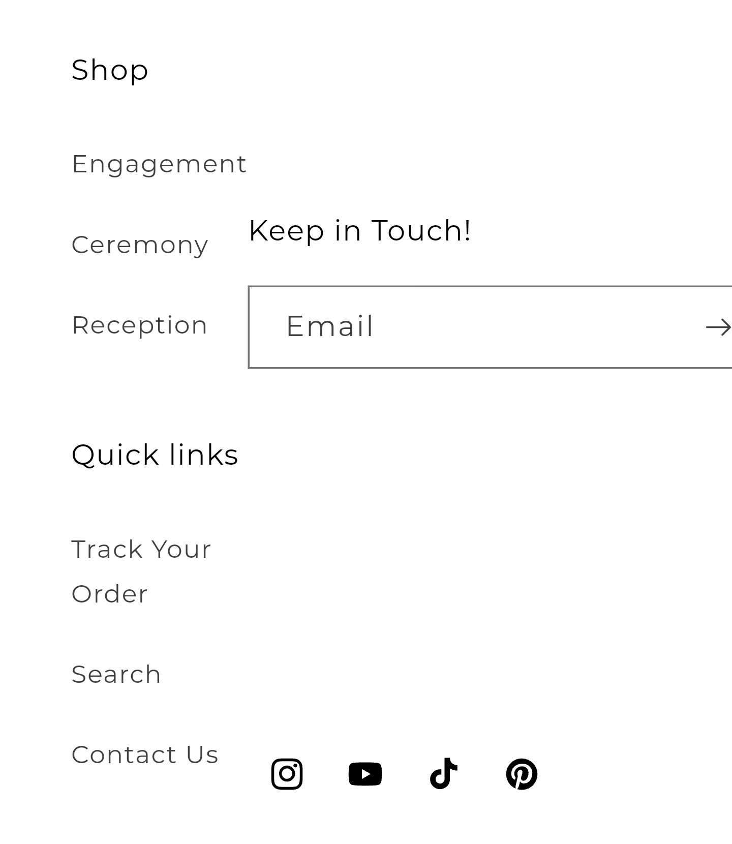
Result:

If you will unable to implement the same then I’m happy to do this for you, let me know. I can implement the code changes so that this will work well for you.
Hopefully it will help you. If yes then Please don’t forget hit Like and Mark it as solution!
Best Regards
Sahil
Hi, this works great for mobile, thank you! However it makes the desktop version look off with the location of the email sign up.

Hi @thediybride add this code in the same place where you have added the previous code.
@media only screen and (min-width: 620px) {
.footer__content-top.page-width {
    display: flex;
}
}
Hopefully it will help you. If yes then Please don’t forget hit Like and Mark it as solution!
Best Regards
Sahil