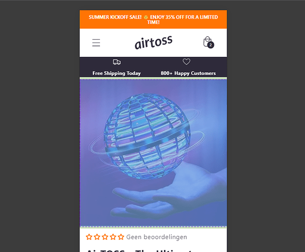
I want to remove the padding around my product images on the mobile view and cannot seem to figure out how to do it. I have looked for help everywhere and have tried every bit of code.
This Is What I Have
This is what I am trying to do
If you can figure this out you are a life saver
Thank you!
Of course! Here you go:
https://525515-2c.myshopify.com/products/airtoss
Somebody already gave me this code
@media screen and (max-width: 749px) { .grid–peek.slider .grid__item:first-of-type { margin-left: 0px; } .slider.slider–mobile .slider__slide { margin-top: 0px; } section#MainProduct-template–21669477941572__main .page-width { padding-right: 0px; } }
But what this also does is make the whole page wider, so you can scroll to the right and you would see a whole white line being diplayed on the right side of the page and some words wont be visible and/or buttons are attached to the side… If it’s not completly clear let me know and I’ll provide you with some pictures
You Try This Code I hope This Code Is You wish Like
add This Code edit Code > base.css File
@media screen and (max-width: 749px) {
    .product .grid--peek.slider .grid__item:first-of-type {
        margin: 0;
    }
    .product .product__media-list .product__media-item {
        width: 100%;
    }
}
1 Like
Wow! You are the greatest my friend! Just one last thing and I will leave you alone for ever:
Do you know how to remove the upper white line above the product image (file 1)? Because when I inspect that part I can see it´s part of the product image and I get this id from it (file 2):
Slide-template–21669477941572__main-49800357183812
File 1
File 2
Thanks in advance!
Have a great day
Add This css in your edit code > base.css File
@media screen and (max-width: 749px) {
    .product .grid--peek.slider .grid__item:first-of-type {
        padding-top: 0;
    }
}


