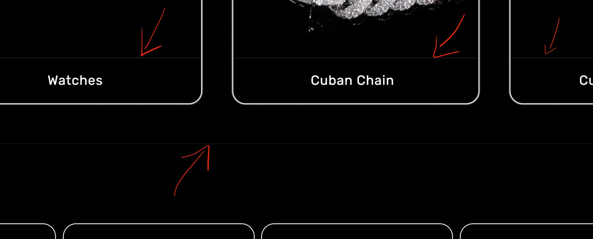
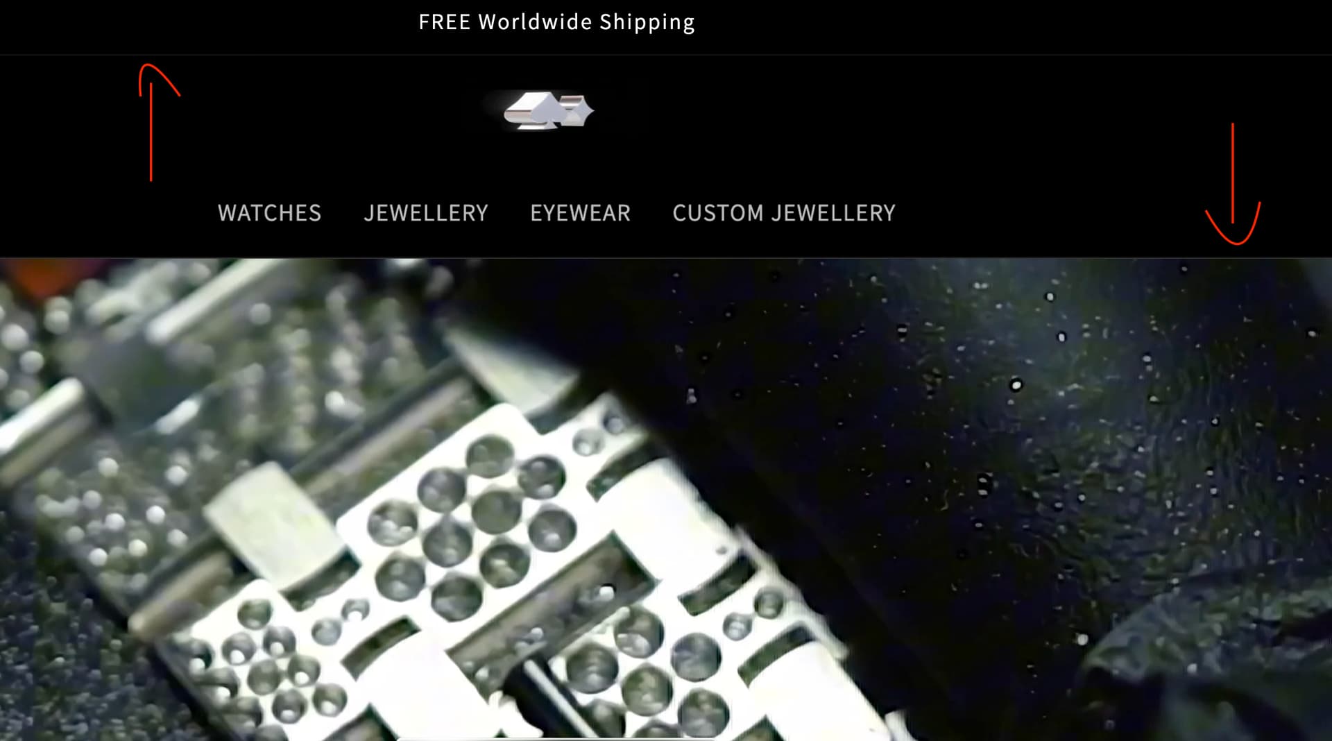
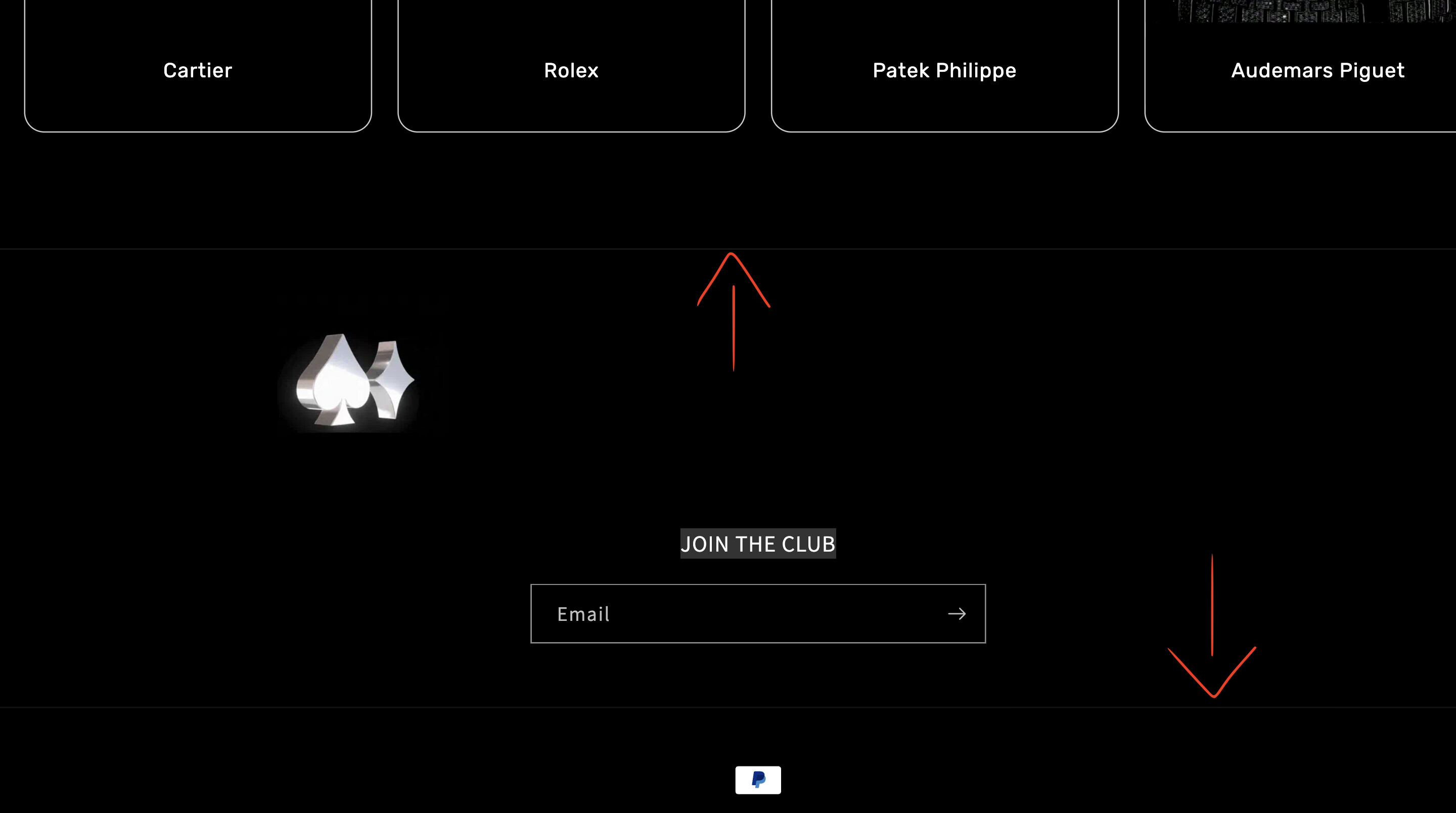
Hi, I’m using Dawn 15.0.0 with a black background, and I’m seeing a thin white line (hairline gap) between sections. It only appears between sections, not inside cards or content blocks, and it shows on both desktop and mobile.
Does anyone know the best way to remove this gap while keeping all section spacing intact?
Hi @AceDiamond ,
I hope this message finds you well .Please share your store url and password if password protected, So i can give you exact solution.
Thanks
Manoj
Welcome to Shopify Community! Can you share your Store URL so I can have a look on it? Also, if you have password enabled then please share the password as well. Your cooperation would be greatly appreciated.
Hi @AceDiamond
Yes! That thin white line between sections in Shopify Dawn (especially with a dark background) is usually caused by subpixel rendering issues or default borders/margins on sections. Since you want to keep the section spacing intact, we can remove it without collapsing your layout. Here’s how:
Check for border-bottom or border-top on sections
Dawn sometimes applies a border on sections for visual separation:
/* Remove any thin borders on sections */
.section {
  border-top: none !important;
  border-bottom: none !important;
}
Force background-color to cover full width
Sometimes the white gap is caused by subpixel gaps when sections are rendered. You can use background-clip and box-shadow trick:
/* Make sure the background covers every pixel */
.section {
  background-color: #000000; /* your black background */
  background-clip: padding-box;
}
Use negative margin hack (only if the line persists)
If the hairline is still visible, you can slightly overlap sections:
/* Slightly pull sections together to hide subpixel gaps */
.section + .section {
  margin-top: -0.5px; /* adjust if needed */
}
Usually -0.5px is enough; don’t use large values, it can break spacing.
Ensure gap on parent containers isn’t causing it
Check if your layout containers have a gap or row-gap:
.main-content {
  gap: 0; /* if Dawn uses a flex/grid layout for sections */
}
Tip: On Retina screens, subpixel rounding can create these lines. Using background-color on body or .main-content in addition to sections often fixes it:
Welcome to the Shopify Community! Please share your store URL and password (if it’s password-protected), so I can check and provide you with the exact solution.
Hi, I added this code, below and it removed the line within the columns on mobile version only. However, the lines between sections is still visible on the homepage on desktop and mobile
code: /* Slightly pull sections together to hide subpixel gaps */
I’ve checked on multiple devices, and the lines still persist. From your screenshot, it looks like you weren’t zoomed in. Could you please zoom in closer? You’ll then be able to see the lines between the sections, header, and footer.
I have checked on both mobile and desktop devices, but it is not visible to me. It might be device-specific. Can you please confirm if this is still visible to you or is there any specific page where the lines are visible to you? I have checked at home page.
Also, please confirm if you have checked on a real mobile device too.
The requested changes requires to do the custom code in your theme file. Could you please share the Store url and collab code in the p/m so that i can take a look and implement the requested changes. Waiting to hear back from you. Thanks