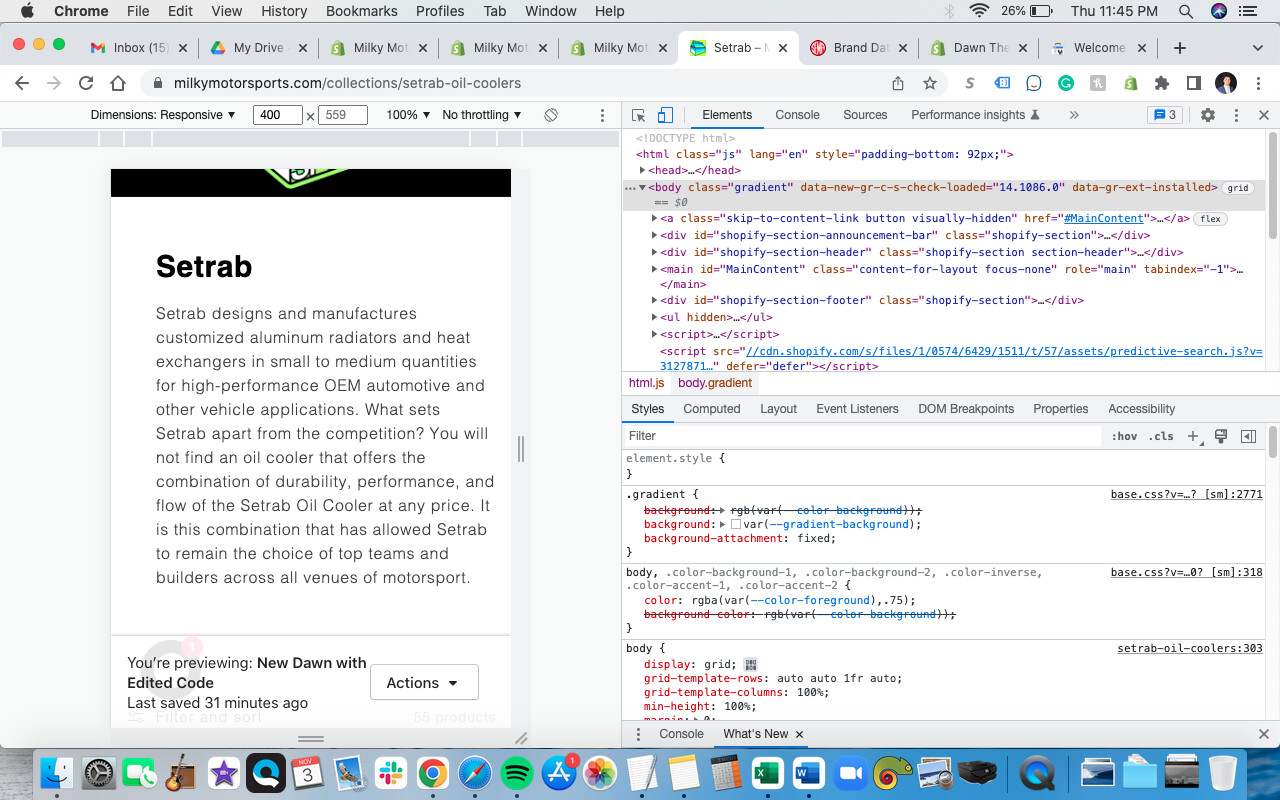
My site preview
It’s probably best to start by saying I’m ultimately looking to have my collections look this way, but maybe this isn’t the best method. In my screenshot below is the way I would like my collections - on desktop I want the collection image on the left and to the right of that the collection title and collection description beneath that. On mobile I want collection image stacked over title and description beneath title.
The method I’m trying (which may not be the best method) is add the “Image with text” block (2nd screenshot) and I figured I could add {{ collection.description }} in place of where I have the words “DESCRIPTION COPY” (as seen in my 1st screenshot) in collection.json, but no luck.
My other issue is that I want the collection image to contain - ie keep its aspect ratio, but resized to fit within the given dimension. In simpler terms, not get cut off on the sides.
Hi @milkymotorsport
You can try follow this path:
Themes => edit code => asset => component-collection-hero.css
and add this code to bottom of the file component-collection-hero.css
@media(min-width: 750px){
	.collection-hero__inner {
		flex-direction: row-reverse;
		gap: 30px;
	}
	.collection-hero__image-container {
		margin: 0;
	}
	.collection-hero__image-container img {
		object-fit: contain;
	}
}
1 Like
That didn’t make any change, unfortunately. I tried adding !important; too and still nothing.
Hi @milkymotorsport
The URL expired Can you share the url again,
Hi @milkymotorsport
If you want to add a section image with collection description for the collection page, you only need to use the section collection header, instead of the section image with text.
The code above is for case you use the collection header not image with text
1 Like
@ExpertRookie Ahh ok that worked for the most part! Only issues now are that on mobile the logo is at the bottom and I would like it at the top, and the image is still getting cut off on the sides.
Hi @milkymotorsport
You only need to replace I sent above with this:
.collection-hero__inner {
		flex-direction: row-reverse;
		gap: 30px;
	}
	.collection-hero__image-container {
		margin: 0;
	}
	.collection-hero__image-container img {
		object-fit: contain;
	}
@ExpertRookie That code removed the image on mobile
Hi @milkymotorsport
please try to use this code.
.collection-hero__inner {
		flex-direction: row-reverse;
		gap: 30px;
	}
	.collection-hero__image-container {
		margin: 0;
	}
	.collection-hero__image-container img {
		object-fit: contain;
	}
@media(max-width: 749px){
.collection-hero__inner {
		flex-direction: column-reverse;
gap: 0;
	}
}
1 Like
@ExpertRookie That worked great! Is it possible to get collection images that are squares to be larger? If not that’s ok.