Hello all,
How can I adjust the layout and arrangement of the footer menu from dawn theme?
I’d like to split the items below Navigation in two columns, like this:
Suchen Versand & Rückversand
Kontakt Rückgaberecht
Impressum AGB & Wiederrufsbelehrung
Datenschutz
And then I’d like to have the newsletter sign up box to move up and be right the right text box and aligned vertically. also the email button should be aligned vertical with the header text
Many thanks for your help. 
2 Likes
@blueberryhutch
Sorry you are facing this issue, it would be my pleasure to help you.
Welcome to the Shopify community! 
Thanks for your good question.
Please share your site URL,
I will check out the issue and provide you a solution here.
@blueberryhutch
can you please try this code
- Go to Online Store->Theme->Edit code
- Asset->/section-footer.css->paste below code at the bottom of the file.
@media screen and (min-width: 750px) {
ul.footer-block__details-content.list-unstyled {
    display: grid;
    grid-template-columns: 1fr 1fr;
}
}
2 Likes
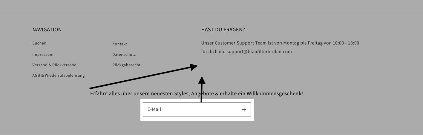
many thanks Ketan. the navigation items have now changed but the newsletter part is still at the wrong place.
The header (“Erfahre alles…”) should move up and vertically aligned below the “für dich da..” part and also the email button should move up and be vertically aligned (see file attached).
thx,
1 Like
Hello @KetanKumar . I am trying to do this but on mobile view for the dawn 2.0 theme. I want to split my footer into 2 columns. I’ll appreciate the help. Thanks
2 Likes
@Intulani
store url and issue images?
1 Like
That is what the footer looks like. I am trying to make it two columns for mobile view. I am using the dawn 2.0 theme. Thank you @KetanKumar
hi ketan, I thought I’ve already submitted the screenshot but here again:
thanks
@KetanKumar in addition, Im also interested in having 2 columns in mobile view if possible… thanks
@KetanKumar any update on this?
thx
1 Like
@blueberryhutch @Intulani
yes please give me store url here
Hii, @Intulani
Kindly share your store URL so,
@media screen and (max-width: 749px) {
.footer-block__details-content {
display: grid !important;
    grid-template-columns: 1fr 1fr;
}
}
Add this code in theme.scss or style.css
1 Like
the url is shophomwala.com. password is nowshi
@KetanKumar @Zworthkey
Thank you for the assistance
1 Like
I have removed the password page.
@Intulani
yes please try this code
- Go to Online Store->Theme->Edit code
- Asset->/base.css->paste below code at the bottom of the file.
@media screen and (max-width: 749px) {
.footer-block__details-content {
display: grid;
    grid-template-columns: 1fr 1fr;
}
}
Hii, @Intulani
Paste this code in the section-footer.css file or theme.scss file.
@media screen and (max-width: 749px){
.footer-block.grid__item {
    width: 50% !important;
}
.footer-block.grid__item.footer-block--menu {
    display: inline-block !important;
}
.footer-block.grid__item.footer-block--menu:last-child {
    position: relative !important;
    top: -90px !important;
}

}
Thank You.
2 Likes
Thank you so much it worked!
1 Like
@Zworthkey @KetanKumar How can I reduce the footer height and make it more smaller on mobile view? Especially the bottom part
@Intulani
Paste this code on top of the section-footer.scss file.
@media screen and (max-width: 749px){
.footer__content-top.page-width {
    height: 287px !important;
}
}
Thank You.
2 Likes