Hi Guys,
I’m currently struggling with a banner on the dawn theme.
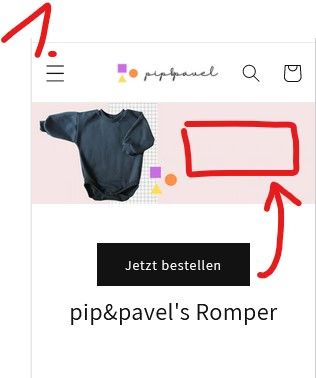
To make it short-> Desktop looks perfect (see below “desktop1”)
However, on the mobile version the buttons with the white backround moves down. Then it looks too big.
My first preferable solution is → let the banner look the same on mobile → Just scale it down (see “version1” below)
My second preferable solution is → Shrink the Banner on mobile, because its just to much space (see “version2” below)
Would love to get some help 
thank you guys!
Solutions:
Version1:
Version2:
1 Like
Hello There,
Please share your store URL and password.
So that I will check and let you know the exact solution here.
Hello There,
- In your Shopify Admin go to online store > themes > actions > edit code
- Find Asset >theme.css and paste this at the bottom of the file:
@media screen and (max-width: 749px){
.banner .banner__content.banner__content--middle-right.page-width {
position: absolute;
width: 50%;
right: 0;
}

.banner .banner__content.banner__content--middle-right.page-width .banner__box {
padding: 30px 8px;
}
.banner .banner__content.banner__content--middle-right.page-width .banner__box .banner__buttons a.button.button--primary {
padding: 0 5px;
min-height: 31px;
}

.banner .banner__content.banner__content--middle-right.page-width .banner__box h2.banner__heading.h1 {
font-size: 20px;
}

.banner {
align-items: center;
}
}
Thank you for your response. It’s good to know that it’s worked for you. Kindly feel free to get back to me if you need any further assistance.