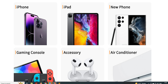
Hi while i was changing the code setting of the store. I noticed my multicolumn for desktop went from 3 to 2. I want only want to change desktop back to 3 column, and not touch the mobile side.
If possible it’ll be great if there’s a way to reduce the gap of the columns between each other as well!.
Website: https://fonpintar.myshopify.com/
Password: taclau
1 Like
Hello @KelvinLeow
You can try this code: it will be helpful to you
Go to the Online Store->Theme->Edit code->Assets->base.css>Add this code at the bottom.
.grid--2-col-tablet .grid__item {
    width: calc(33% - var(--grid-desktop-horizontal-spacing) / 2);
}
Hello There,
- In your Shopify Admin go to online store > themes > actions > edit code
- Find Asset > base and paste this at the bottom of the file:
@media screen and (min-width: 749px){
  .multicolumn.background-none.no-heading .page-width {
    max-width: initial;
}
.multicolumn-list__item.grid__item.center {
    width: 33%;
}
}
Hi thank you so much!
Do you mind guiding me on how to reduce the spacing between the multicolumns as well?
I just added this code
.background-none .multicolumn-card__image-wrapper{
    margin: unset;
}
which did the job at reducing the spacing between the columns but not the rows. It would be best if the spacing between the row and column can be as close as the picture above.
Thank you!
1 Like
Hello There,
- In your Shopify Admin go to online store > themes > actions > edit code
- Find Asset > base and paste this at the bottom of the file:
@media screen and (min-width: 749px){
.background-none .grid--2-col-tablet .multicolumn-list__item {
    margin-top: 2rem!important;
}
.multicolumn-list .grid {
    column-gap: 18px!important;
}
}
Remove this css:-
.background-none .multicolumn-card__image-wrapper {
    margin: unset;
}
Hi i’ve added but dont seems to be working and it reverted back to before after removing the code from section-multicolumn.css
1 Like
Hello @KelvinLeow
You have to remove which space please share the proper screenshot.
Sorry I meant to remove the spaces highlighted in blue so that all the columns are next to each other, with maybe a spacing of 1px or 2px
1 Like
Hello There,
- In your Shopify Admin go to online store > themes > actions > edit code
- Find Asset > base and paste this at the bottom of the file:
@media screen and (min-width: 749px){
.multicolumn-card__image-wrapper.multicolumn-card__image-wrapper--full-width {
    margin-left: 0!important;
    margin-right: 0!important;
}
.media.media--transparent.media--square {
    position: inherit!important;
}
}


